
This post contains affiliate links. We may earn a commission if you click on them and make a purchase. It’s at no extra cost to you and helps us run this site. Thanks for your support!
The Vonca Typeface is the Minimalist Font That Speaks Volumes
The search for a truly versatile minimalist font can feel endless for designers. A typeface must communicate a brand’s ethos with precision and clarity. The Vonca font family, a thoughtful creation from Asenbayu, answers this call directly. It presents a compelling solution for creatives seeking sophistication without unnecessary embellishment. Vonca arrives at a moment when design trends overwhelmingly favor clean, purposeful aesthetics. Its existence is relevant because it embodies the principles of modern design while offering remarkable flexibility.
You can download the complete family for a very low budget on these platforms:
This exploration will examine the distinct qualities of the Vonca font. We will look at its structure, its features, and its ideal applications. Moreover, we will consider why it stands out in a crowded field of minimalist typefaces.
You can download the complete family for a very low budget on these platforms:
The Anatomy of Vonca: A Study in Minimalist Design
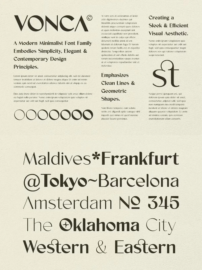
Vonca is a modern font family rooted in minimalism. It uses clean lines and precise geometric shapes to build its letterforms. This approach creates a sleek, highly functional visual aesthetic. The font avoids decorative elements, instead finding its personality in its pristine structure. Consequently, this simplicity provides a powerful canvas for a wide range of creative projects. You can effectively use this font for both contemporary and vintage-inspired designs.

Why does a font like Vonca resonate so strongly today? In an age of constant information, clarity is paramount. Minimalist typography cuts through the noise. It delivers a message with confidence and directness. Vonca exemplifies this philosophy perfectly. The font’s design choices prioritize legibility and order, offering a sense of calm to the viewer. It proves that simplicity can be more impactful than complexity.
Unpacking the Versatility of the Vonca Font
The true power of the Vonca font family emerges from its comprehensive and well-considered features. Designers can unlock its full potential by understanding these key components.
A Spectrum of Seven Styles
Vonca is not a single font but a family of seven distinct styles. The weights range from a delicate Extra Light to a strong and assertive Extra Bold. This variety gives designers a complete typographic toolkit. Subsequently, you can establish a clear visual hierarchy with ease. The lighter weights work beautifully for body copy, while the bolder styles create impactful headlines. This adaptability makes Vonca an excellent choice for building cohesive design systems across web and print.
The Creative Edge of OpenType Features
The font includes powerful OpenType features like stylistic alternates and ligatures. Stylistic alternates provide different variations of characters, which allows for typographic customization. These alternates can add a unique and memorable touch to a logo or a headline. Furthermore, ligatures combine two or more letters into a single, elegant glyph. They improve the natural flow of the text, enhancing overall readability. These features elevate typography from a simple tool to an art form.
Designed for a Global Audience
Effective communication today often crosses linguistic borders. Vonca supports multiple languages, making it a practical choice for international brands. This feature ensures that a company can maintain a consistent and professional visual identity in different global markets. It is a crucial consideration for any brand with a worldwide reach.
Where Vonca Shines: Practical Applications in Design
The clean, modern aesthetic of the Vonca font makes it a remarkably adaptable tool. Its potential uses are limited only by a designer’s imagination.
Building a Contemporary Brand Identity with Vonca
For any business aiming to project a modern and professional image, Vonca is an outstanding selection. Its geometric and minimalist nature communicates innovation, trust, and quality. When applied to logos, business cards, and websites, the Vonca font helps establish a strong and cohesive brand presence. Its inherent elegance makes it suitable for a wide array of industries, including technology, fashion, architecture, and consulting. How can a typeface communicate trust before a single word is read? Vonca provides an answer.
Making an Impact in Packaging and Editorial Design
Vonca is also exceptionally well-suited for packaging and poster design. In a competitive retail space, product packaging must grab attention instantly. The font’s excellent legibility and clean appearance ensure that information is both beautiful and easy to read. Similarly, for posters and editorial layouts, the various weights of Vonca allow for the creation of dynamic and engaging compositions that feel both modern and timeless.
A Personal Take on Vonca’s Place in Typography
What impresses me most about Vonca is its quiet confidence. It does not need to shout to be heard. Its strength lies in its meticulous construction and its elegant simplicity. While many minimalist fonts can feel cold or impersonal, Vonca retains a sense of warmth and character. This balance is incredibly difficult to achieve.
You can download the complete family for a very low budget on these platforms:
In my opinion, the Vonca font has the potential to become a modern classic. It is not tied to a fleeting trend. Instead, it is built on the enduring principles of good typographic design. Its versatility, combined with its robust feature set, makes it a reliable workhorse for any serious designer. It provides a sophisticated foundation for creative work, allowing the designer’s message to shine. Ultimately, Vonca is more than just a font; it is a tool for clear and beautiful communication.
Check out other amazing typefaces here at WE AND THE COLOR, or take a look at our selection of the 100 best fonts for professional designers in 2026.
Subscribe to our newsletter!


