This post contains affiliate links. We may earn a commission if you click on them and make a purchase. It’s at no extra cost to you and helps us run this site. Thanks for your support!
Good digital design templates save more than production time. They can give a designer a working structure before the first layout decision gets made. I tested ten digital design templates across branding, presentations, portfolios, social media, editorial design, and poster work, and several surprised me. The useful ones share one trait. They leave enough room for your own decisions. That sounds obvious, but many template packs fail exactly there. They look finished before you add anything, then fall apart when real content enters the file. I care much more about that second stage.
For this selection, I focused on how each template behaves under actual design pressure. I looked at grids, typography, editable structures, content swaps, software compatibility, presentation logic, and the distance between the preview and the finished result. I also developed a few simple tests for this review. They measure things that template marketplaces rarely explain clearly. A template can contain 60 pages and still offer very little useful structure.
What Makes Digital Design Templates Genuinely Useful?
I use one basic rule when judging digital design templates. The file should remove repetitive production work without removing the designer’s role. And I think that distinction matters a lot right now. AI can generate layouts, images, logos, and presentation slides in seconds. Yet speed does not automatically produce a coherent visual system. A designer still needs hierarchy, pacing, restraint, and control.
The strongest digital design templates in this selection behave more like systems than finished compositions. They establish relationships between type, image, spacing, color, and content. I call this Structural Freedom. A template has high Structural Freedom when its underlying rules remain useful after you replace almost everything visible in the preview. That became my main filter.
| Template | Primary use | Software | Key specification | My testing focus |
|---|---|---|---|---|
| LE ARCHIVE Social Media Template | Social media | Canva, InDesign | 30 templates, 1080 × 1350 px | Feed cohesion and editing speed |
| Subway Poster Mockup | Presentation mockups | Photoshop | 4500 × 3000 px PSD | Smart Objects and lighting |
| Editorial Art Book | Art books and portfolios | InDesign | Editorial multi-page layout | Image pacing and typography |
| 36-Page Magazine | Editorial publishing | InDesign | A4, 36 pages, CMYK | Print structure and production logic |
| Rue Logo Kit | Brand identity | Illustrator, Canva | 24 logo templates | Variation density and editability |
| Business Proposal | Client presentations | Illustrator, InDesign, Canva, Affinity, Keynote, PowerPoint, Google Slides | 20+ layouts | Cross-format consistency |
| Petricore Brand Guidelines | Brand guidelines | InDesign | 60+ pages | Real-content substitution |
| Minimalist Music Poster | Event promotion | Illustrator | Editable vector artwork | Grid and color hierarchy |
| Digital Portfolio | Portfolio presentations | InDesign | 16 pages, 1920 × 1080 px | Screen-first layout logic |
| CLIMB | Brand and project decks | InDesign, Canva | 20 slides, 1920 × 1080 px | Slide pacing and master pages |
1. LE ARCHIVE Brings Editorial Restraint to Social Media Templates
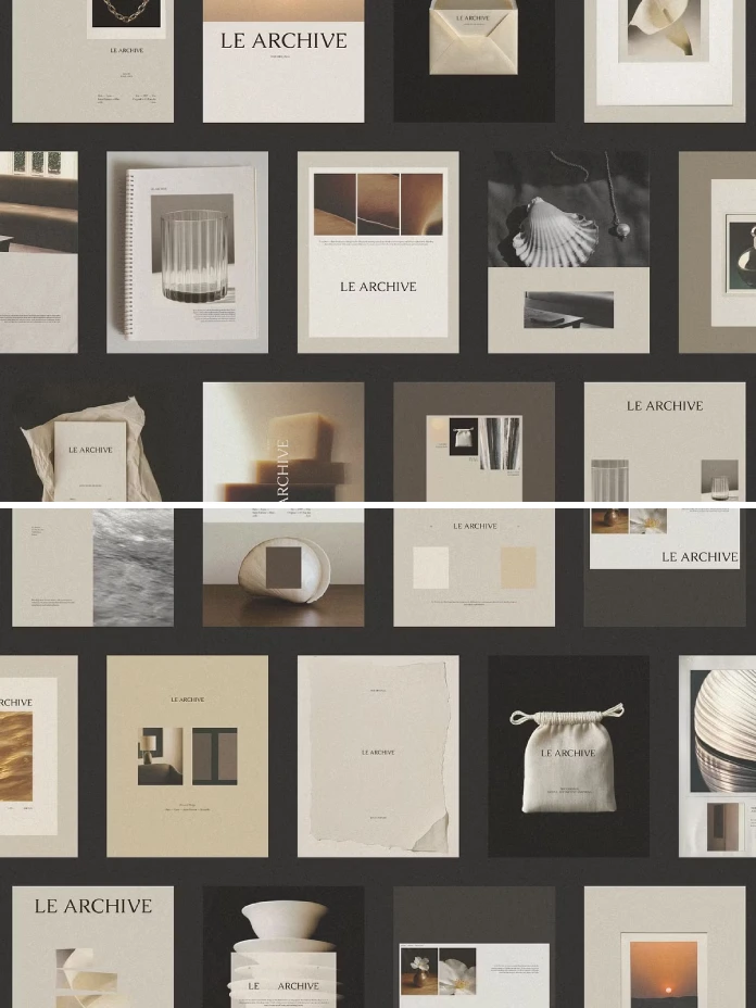
LE ARCHIVE from Duet Atelier is one of the more convincing social systems I tested. It contains 30 editable templates for Instagram portrait posts at 1080 × 1350 pixels. The collection supports both Canva and Adobe InDesign. That combination immediately makes it more useful for professional designers who sometimes need to hand off content work to clients. I tested the templates with five different brand directions. The layouts retained their visual relationship even after I changed the colors and typography. I call this the Feed Cohesion Test. Put five finished posts next to each other and remove their original template context. If they still look like one brand, the system works.

LE ARCHIVE passed that test. The 70:30 restraint ratio I measured across much of the collection also matters. Roughly 70 percent of each composition remains a quiet space, while the remaining area carries the actual content. That approach feels increasingly useful now. AI-generated social graphics often chase visual intensity, so restraint creates a stronger editorial signal. The limitation remains obvious. The collection focuses on portrait posts rather than Stories or Reels covers. You also need to supply your own photography.
2. This Photoshop Mockup Makes Presentation Work Feel Physical
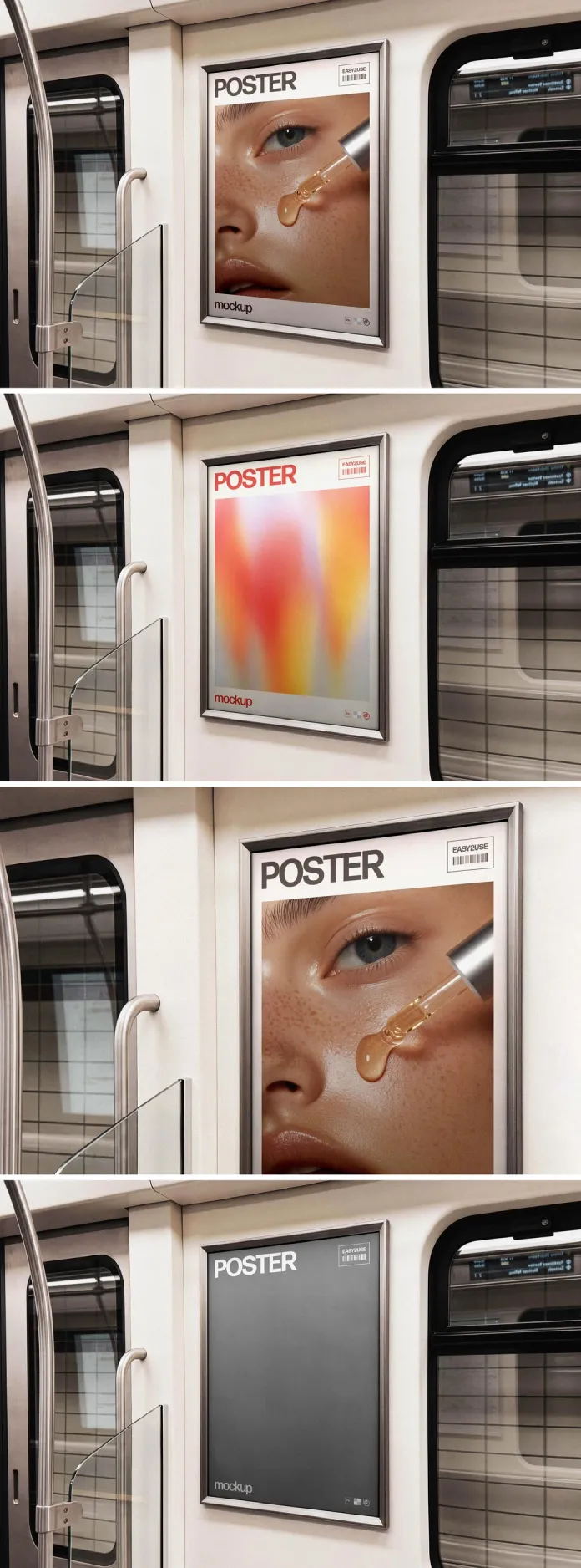
Pixelbuddha Studio’s subway poster mockup solves a different problem. It helps you show a flat graphic inside a believable physical environment. The PSD measures 4500 × 3000 pixels. It uses Smart Objects, vector layers, adjustment layers, reflections, and perspective effects. I tested three unrelated poster designs. A beauty image, a gradient composition, and a cropped eye photograph all fit the frame correctly. The important part came next. I checked whether the lighting still made sense after those content swaps. It did.
I call this the Substitution Stress Test. Replace the demo artwork with radically different content and inspect the shadows, reflections, contrast, and perspective. A convincing mockup should survive that abuse. This one does. The subway environment also gives client presentations more context than a generic white-wall mockup. The file does have a fixed camera position. You cannot turn the subway interior into a billboard or bus scene without rebuilding the composition.
3. This Editorial Art Book Template Understands Pacing
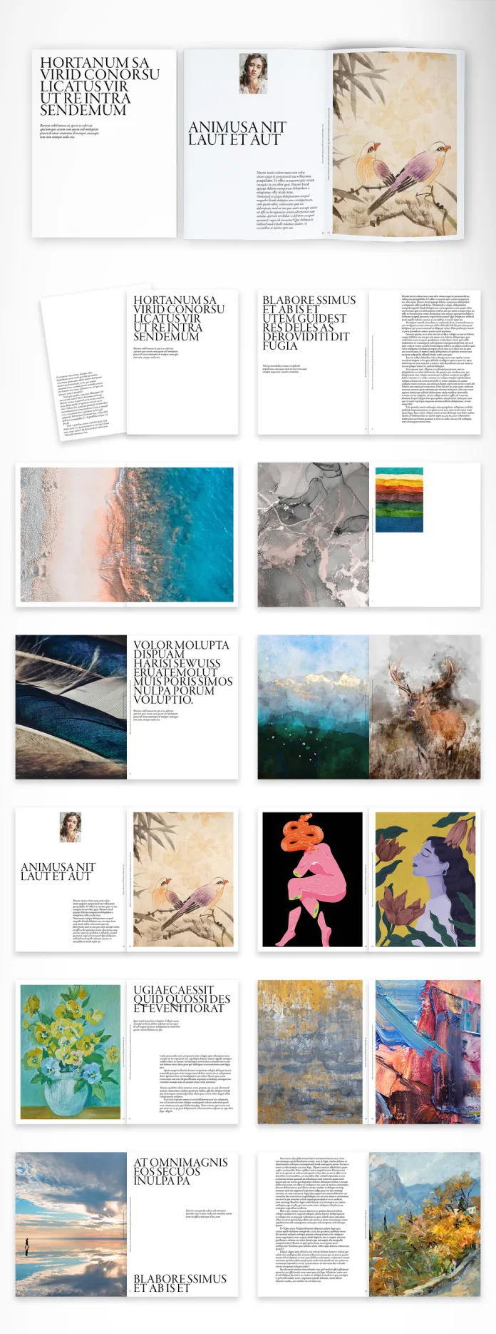
McLittle Stock’s editorial art book template for InDesign takes a different approach to digital design templates. It treats page composition as part of the message. That distinction becomes obvious across the spreads. Full-bleed imagery alternates with quieter typographic pages, creating what I call a Visual Breath Sequence. The idea is simple. Strong image pages create visual pressure, then quieter pages release it.
I tested the structure with very different image types. Landscape photography, artwork, illustration, and botanical imagery all worked without forcing the same crop repeatedly. The typography also carries considerable weight. Condensed serif headlines establish a strong editorial character, while narrow body columns slow the reading pace. This template suits photographers, artists, galleries, publishers, and design studios presenting visual projects. It works less well for information-heavy corporate documents. The design wants images to lead.
4. A 36-page InDesign Magazine Template That Starts with Production Logic

Tom Sarraipo’s magazine template gives you 36 customizable A4 pages in CMYK. That combination makes it one of the more practical digital design templates for designers moving between screen work and print production. I pay close attention to color mode in editorial templates. A beautiful RGB layout can create unnecessary problems once a printer receives the final PDF. This file starts in CMYK. The document also includes preconfigured bleed areas. That small technical decision can save substantial setup time on real editorial projects. I call this Structural Editorial Integrity. The term describes a template where visual decisions and production decisions support each other.
The 36-page structure also gives the designer enough room to establish pacing. You can move between image-heavy spreads, text pages, introductions, and feature layouts without immediately repeating the same composition. For a freelance designer building a small publication, that matters more than having 100 random page layouts.
5. Rue Turns a Logo Kit Into a Usable Starting System
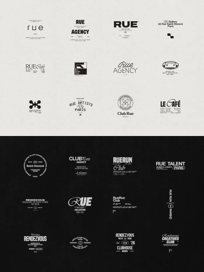
The Rue Logo Kit from Studio Standard contains 24 editable logo templates. The files support both Adobe Illustrator and Canva. I tested the Illustrator layers first. Then I checked how quickly the Canva version handled font substitutions and basic brand changes. The kit also includes a 1920 × 1080 pixel brand presentation board. Twenty-four logos sounds generous until you inspect the actual variation. The collection contains several related mark structures rather than 24 completely independent identities. I call this Variation Density. It measures how many genuinely different structural solutions a template pack provides after you ignore font changes. Rue sits somewhere in the middle.
You get wordmarks, monograms, icon combinations, and typographic variations. That gives freelancers a useful starting point, but it does not replace identity development. That limitation actually makes the kit more credible. A logo template should accelerate exploration rather than pretend to solve brand strategy.
6. This Business Proposal Template Treats Presentations as Systems
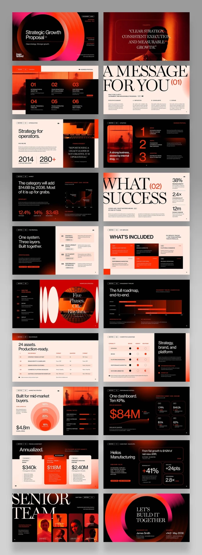
BrandPacks created this business proposal template for Illustrator, InDesign, Canva, Affinity, Keynote, PowerPoint, and Google Slides. That software range creates an obvious testing problem. A layout that works in InDesign can lose its logic when someone rebuilds it inside PowerPoint. I call my test the Six-Surface Consistency Test. The same visual rules should survive every promised application.
BrandPacks provides more than 20 layouts. The structure covers proposals, strategy, timelines, deliverables, pricing, case studies, team profiles, and closing slides. The deck uses six distinct grid structures. Data-heavy pages use columns, while narrative pages give more space to imagery. That sounds technical. It matters during actual client work.
A presentation becomes easier to edit when the grid responds to the type of information on each slide. This template understands that relationship better than most generic presentation packs.
7. Petricore Shows Why Populated Templates Beat Empty Placeholders
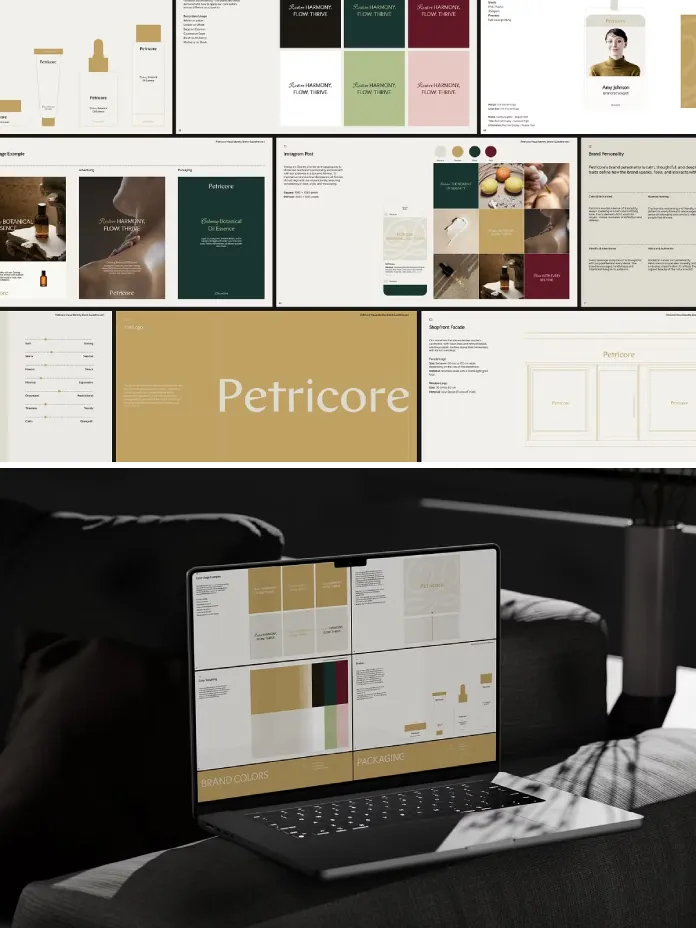
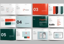
Lab.131’s Petricore brand guidelines template contains more than 60 pages for Adobe InDesign. I tested it with replacement content from a fictional skincare brand. The important discovery came from the pages themselves. Petricore uses structured example content rather than relying heavily on lorem ipsum. I call this Populated Logic. A populated template teaches you how its system works. An empty template only tells you where to type.
Petricore covers strategy, logo systems, typography, color, imagery, layouts, and applications. The logo pages include clear-space and minimum-size rules with actual measurements. The color section goes further. It provides HEX, RGB, CMYK, and Pantone values. I also replaced its type pairing to test the grid. The spacing survived the change without extensive manual correction. That makes Petricore particularly useful for studios that need to document an identity for other people to use later.
8. This Minimalist Music Poster Proves That Gradients Need Structure

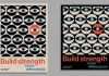
Jozef Micic’s music event poster template uses a deep navy field with an amber-to-red gradient. A dark circular form anchors the central composition. The gradient does more than decorate the background. It creates what I call Thermal Tension, where cool and warm color temperatures pull against each other. The circle becomes the second major anchor. It creates a clear visual gravity point for the surrounding information. The typography follows the same logic. A condensed uppercase headline occupies the upper-left area, while oversized event information sits toward the lower-right.
I tested the template in Illustrator by changing the event details and adjusting the artwork rather than rebuilding the composition. The grid remained stable. That makes this one of the more useful digital design templates for music promoters, cultural organizations, galleries, and independent events.
The design does lean heavily into contemporary gradient culture. If you need something deliberately rough or typographically eccentric, this probably starts too polished.
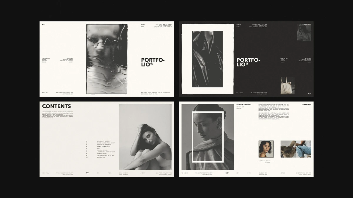
9. RedGiant’s Portfolio Template Gets Digital Presentation Right
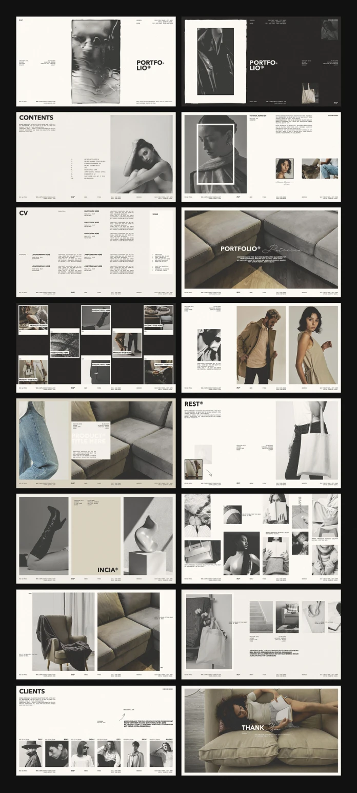
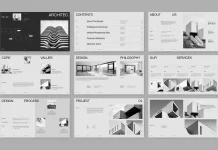
RedGiant’s InDesign portfolio template contains 16 pages at 1920 × 1080 pixels. That dimension immediately separates it from print-first portfolio templates. I tested it with ordinary product photography rather than polished editorial images. The layouts still held together. That matters. I call this the Placeholder Trust Gap. It describes the difference between a template’s beautiful preview imagery and its behavior with ordinary user content. Many digital design templates collapse inside that gap. RedGiant’s portfolio system handled it better than expected. The grayscale structure also survived without color. I call that the Grayscale Discipline Test.
The template includes 16 focused layouts rather than dozens of variations. I initially saw that as a limitation. After building a complete portfolio, I changed my mind. Sixteen useful pages can beat 60 pages that nobody uses.
10. CLIMB Understands That Presentation Decks Need Rest
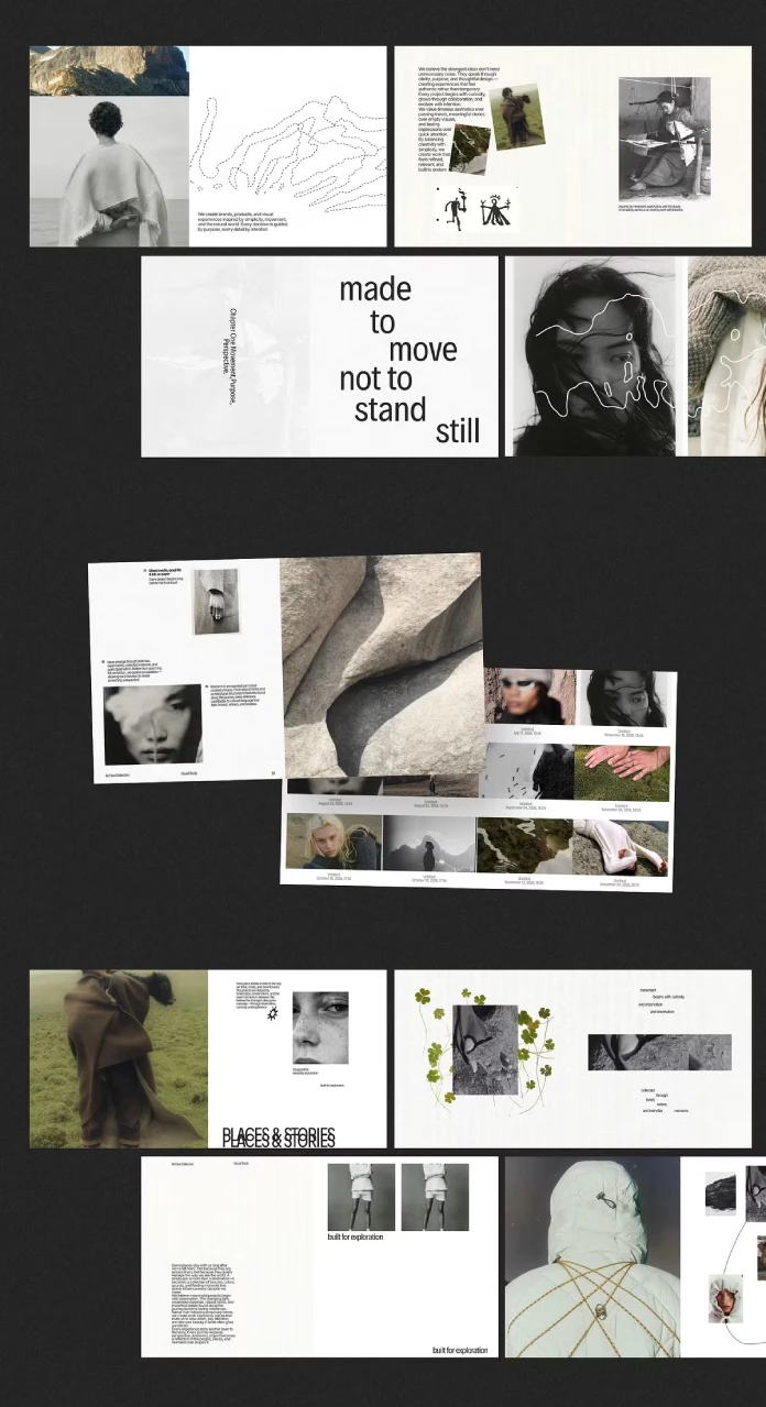
Simple Co’s CLIMB template includes 20 customizable slides for InDesign and Canva at 1920 × 1080 pixels. I rebuilt three different presentations with it. I used an outdoor brand, an architecture project, and an older portfolio project. The master-page structure held up during those content swaps. That alone separates CLIMB from many inexpensive presentation templates. My main test uses the Slide Rest Ratio. It measures the relationship between visually quiet slides and information-heavy slides. CLIMB lands around 45 percent rest slides and 55 percent content slides in my test. That balance feels right for project presentations. You need dense slides for facts, but you also need pages that let the previous information settle. The editorial influence becomes obvious here. CLIMB feels closer to a visual magazine than a conventional corporate deck.
What I Learned From Testing These Digital Design Templates
The biggest lesson has little to do with software. I think that the strongest digital design templates create rules that remain useful after the preview disappears. They help you make decisions instead of making every decision for you. That distinction will matter even more as generative design tools improve. AI can produce endless variations, but endless variation creates its own problem.
Designers need selection systems. That is why I expect system-first digital design templates to gain value through 2027. Designers will increasingly use AI for exploration, then rely on structured templates for consistency, production, and presentation.
The winning template will therefore look less like a finished poster and more like a compact design system. LE ARCHIVE already points in that direction through feed consistency. Petricore does it through populated brand logic. CLIMB does it through presentation pacing. The same principle appears in the smallest files. The subway mockup works because its lighting system survives content substitution. The minimalist poster works because its grid survives copy changes. That is the real measure of professional template quality.
How I Would Choose Digital Design Templates for Different Projects
Start with the output, not the aesthetic. Choose LE ARCHIVE when you need a coherent editorial social feed. Choose Petricore when you need a complete brand documentation system. Use the RedGiant portfolio when the presentation happens on a screen. Pick Sarraipo’s magazine template when print production matters from the first file. CLIMB fits brand and project presentations especially well. The BrandPacks proposal system makes more sense when several applications need to share one visual language. For identity exploration, Rue provides a useful starting point. For event graphics, Micic’s poster template gives you more compositional control than many generic poster packs. The McLittle Stock art book template belongs in a different category. It works when the presentation itself needs editorial character. Finally, keep the subway mockup for the moment when a client needs to see the work outside the artboard.
Why Professional Designers Still Need Templates
Templates do not make designers less relevant. Poor templates do. A strong template removes repetitive construction work. That leaves more time for typography, image selection, art direction, brand strategy, and client-specific decisions. I would rather spend twenty minutes adapting a good grid than two hours rebuilding one from scratch.
The best digital design templates also create consistency across recurring work. A studio can reuse presentation logic without making every client project look identical. That difference becomes important when several people work inside the same team. Shared structures reduce accidental inconsistencies before they reach the final export.
For freelancers, the benefit can be even more direct. A good template shortens the distance between accepting a project and presenting the first credible direction.
Common Questions About Digital Design Templates
What are digital design templates?
Digital design templates are editable design files that provide predefined layouts, grids, typography, imagery structures, or presentation systems.
Which digital design templates work best for design studios?
Studios usually benefit from systems that support repeated production. Brand guidelines, presentation decks, portfolios, and editorial templates fit that workflow.
Are digital design templates suitable for professional client work?
Yes, when the underlying files provide editable structures and sensible production settings. The designer still needs to adapt the template to each project.
Are Canva templates professional enough for designers?
Canva can support professional workflows when the template preserves hierarchy and gives designers meaningful control. LE ARCHIVE and CLIMB demonstrate that approach.
What should I check before buying a design template?
Check the software version, document dimensions, page count, fonts, image licensing, file organization, and export requirements.
Are InDesign templates better than Canva templates?
Neither format wins automatically. InDesign provides deeper layout control, while Canva simplifies collaboration and client editing.
How do I test a digital design template before using it?
Replace the preview content with your own material. Then check hierarchy, spacing, typography, image crops, and consistency across several pages.
What is the most important quality in professional digital design templates?
I would start with structural flexibility. A good template should survive major content changes without losing its visual logic.
Will AI make digital design templates obsolete?
I expect the opposite. AI will generate more variations, but designers will need stronger systems for selecting and organizing those variations.
What makes a template feel human-designed?
Specific decisions create that feeling. Uneven pacing, controlled typography, deliberate white space, and a clear visual point of view matter more than decoration.
Browse WE AND THE COLOR’s Graphic Design, Branding, and Templates categories for more.
Subscribe to our newsletter!