
Graphic design and branding by 碧池 夫人 and 3% 先生 for 炎空间 (Yan Space), a comprehensive space integrating exhibitions, theme salon, joint office, and cafe.
碧池 夫人 and 3% 先生 have produced this amazing brand identity for 炎空间 (Yan Space), an area of 3,000 square meters integrating exhibitions, theme salon, joint office, and cafe. Please read more below the following image.

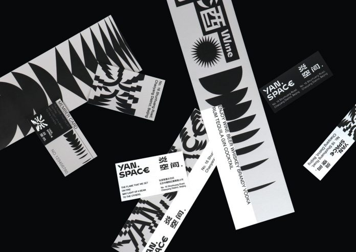
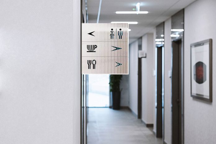
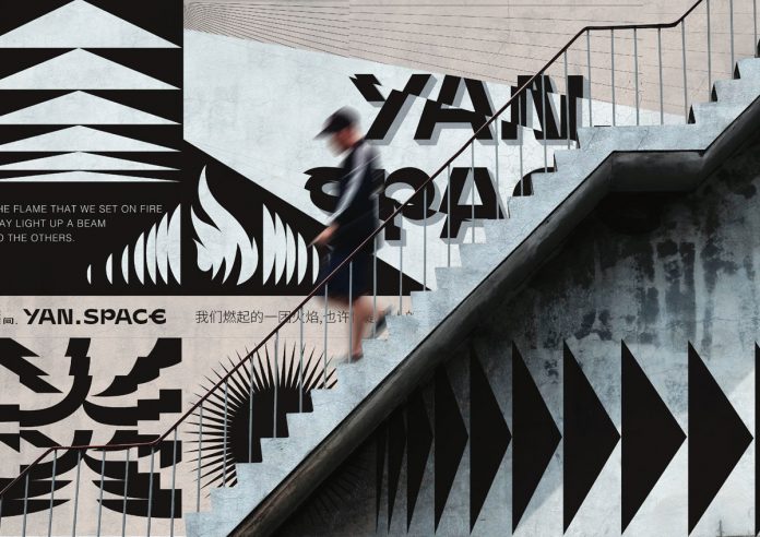
The logo is derived from the Chinese character for “inflammation”. It creates a three-dimensional sense of space by diverging and overlapping the text area. The text also abstractly expresses the state in which a flame is burning as well as the power of light. The entire brand identity is based on a visual language that uses bold graphic shapes to express a contemporary look and feel. Furthermore, the complete design has been created in simple black and white. Just have a look at the following images.


All images © by 碧池 夫人 and 3% 先生. Check out other inspiring projects in our popular Graphic Design and Branding categories.


