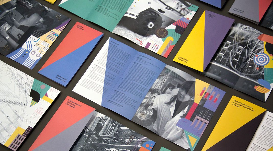
A new visual experience developed by Podpunkt for the Warsaw University of Technology.
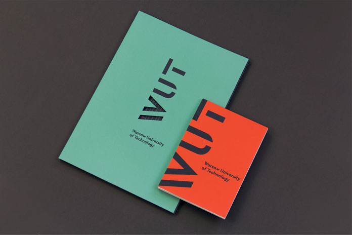
Polish brand and graphic design studio Podpunkt was commissioned to develop a new visual identity for the Warsaw University of Technology. The new logotype is based on simple typography. The idea was to transform the letter “W” into “≥” in order to underline the scientific character of the university. When rotated by 90 degrees, the “PW” and “WUT” monograms become part of the university’s motto “imagination is greater (/equal) than knowledge.” Please read more below.
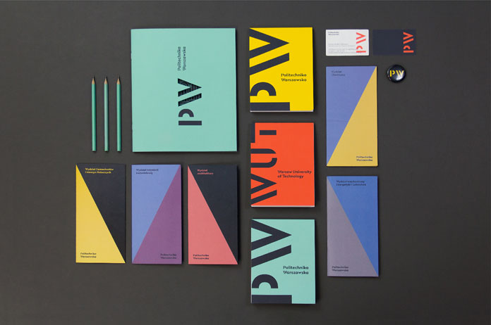
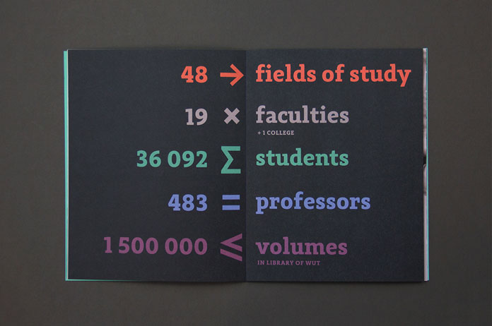
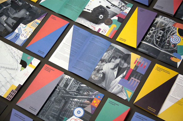
In cooperation with Nico Inosanto of Nootype, a custom typeface has been developed. With its distinctive stencil capitals and numerals, the typeface serves as unique visual system for the lock-up and the Faculty names. Furthermore, the custom typeface perfectly matches with Adagio Slab, which has been chosen as the official font of the University. A vivid mix of eight colors has been chosen to meet the needs of all individual units within the University. Podpunkt’s creative team has developed a wide range of stationery and printed collateral. The uniform design reflects the school’s position as one of the best universities in Poland. Feel free to see more of studio Podpunkt’s creative work on their website.
All images © by studio Podpunkt.

