
Sometimes change is subtle, other times it’s a bold transformation. Introducing major changes to long-established cultural events or institutions cherished by the public can often seem like a risky move. How do you evolve without losing the essence of what people cherished? It’s a fascinating challenge, isn’t it? Balancing history with a vision for the future requires careful thought and a clear understanding of identity.
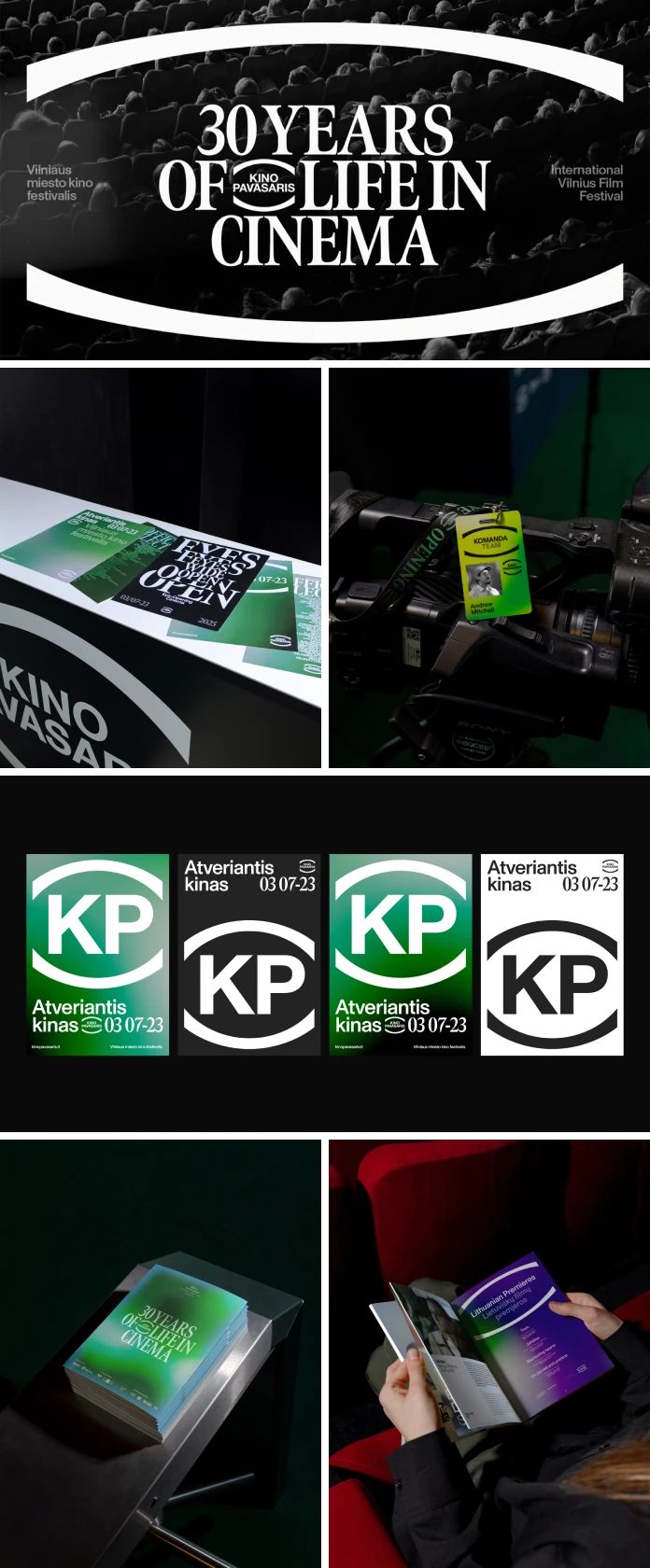
Let’s talk about a specific, really interesting example: Lithuania’s International Movie Festival, known fondly as Kino Pavasaris. This isn’t just any film festival. For three entire decades, it’s been a major fixture in Lithuania’s cultural landscape. Think about that – thirty years of bringing global cinema to audiences, sparking curiosity, and building a dedicated community around impactful films. It established itself as a place for thoughtful, engaging movie experiences. But the world doesn’t sit still, and neither does the way we watch films. We have screens in our pockets, streaming services galore, and access to content like never before. Lithuania’s International Movie Festival recognized this shift. The team knew the festival needed to be more than just a springtime event; it needed to become a year-round source of cinematic discovery. This realization arrived just as they hit their big 3-0 anniversary. What a moment for reflection, right? They faced a crucial question: How could the festival visually represent this evolution while still honoring its impressive legacy? The answer wasn’t a simple touch-up. It required a complete reimagining of its brand identity.
The Need for a New Identity
For thirty years, Kino Pavasaris built a reputation for curating exceptional global cinema. Audiences came expecting intellectually stimulating films. Yet, as the festival expanded its reach, moving beyond traditional cinema halls to embrace digital platforms and everyday screens – its existing visual presence started to feel constrained. Imagine trying to use the same language for a massive outdoor banner and a tiny app icon. It gets tricky. Lithuania’s International Movie Festival needed a visual system that felt cohesive and clear, no matter where people encountered it. Furthermore, this identity needed the strength to represent the festival throughout the year, solidifying its role as a constant cultural companion. The challenge was clear: create something timeless yet modern, something that could support the festival’s growth and aspirations for decades to come.
Crafting a Lasting Vision
To undertake this significant transformation, Lithuania’s International Movie Festival collaborated with the creative agency andstudio. Their task went far beyond designing a new logo. They were asked to build a comprehensive, durable visual system. This system needed to be built on pillars of clarity, genuine emotion, and long-term relevance. andstudio immersed themselves in the festival’s history, its values – like quality, discovery, and intellectual engagement – and its ambitious future plans. The goal was to translate this essence into a visual language that would connect with loyal fans and attract new audiences simultaneously. It required looking past fleeting trends to establish something truly meaningful and enduring for Lithuania’s International Movie Festival.
The Eye of Discovery
Central to the rejuvenated brand identity is a striking new logo: an elegantly simple shape resembling an eye. Why an eye? Think about it. It’s how we perceive the world, how we absorb stories, how we witness the magic of cinema. The eye perfectly encapsulates the festival’s promise of delivering “eye-opening cinema.” It speaks directly to the film’s power to shift perspectives and broaden our understanding.
Moreover, andstudio cleverly animated the logo. As the digital eye opens, intricate graphic layers are revealed within. Doesn’t that beautifully mirror the experience of watching a profound film? Layers of meaning, emotion, and insight unfold, expanding your perception. This dynamic element transforms the logo from a static mark into an active symbol of Lithuania’s International Movie Festival’s core mission: to reveal, enlighten, and inspire through cinema.

Navigating Cinema Through Emotion with a Unique Color System
Festivals often present a huge variety of content. How do you help audiences find what resonates with them within Lithuania’s International Movie Festival’s diverse program? andstudio devised an inspired solution: a visual categorization system using color as an emotional compass.
This wasn’t about slapping predictable colors onto genres (like red for thrillers, perhaps). Their approach was far more nuanced. The team extracted specific color palettes directly from carefully chosen movie frames. The aim wasn’t to represent a single scene, but rather to capture the lingering feeling a film leaves behind – that distinct mood or atmosphere you carry with you after the credits roll. Each palette acts as a subtle emotional signifier, helping viewers navigate the vast offerings based on the feeling they seek. It’s an intuitive, sophisticated way to enhance the discovery process, connecting audiences to films on a deeper level.
Style Meets Substance: Typography for Every Platform
A brand’s voice needs to be consistent, whether shouted from a billboard or whispered on a smartphone screen. Recognizing this, andstudio implemented a thoughtful typographic strategy for Lithuania’s International Movie Festival. They selected a combination of fonts: a distinguished serif typeface, lending an air of classic sophistication and acknowledging the festival’s rich history, paired with a clean, minimalist sans-serif typeface. This ensures optimal legibility and clarity, particularly vital for digital applications.
This pairing gives the festival a unique visual signature – one that feels both established and contemporary, refined yet accessible. From large-format posters and pre-film animations to website banners, social media graphics, and even staff materials, the typographic system ensures a coherent and instantly recognizable presence. This consistency is key to building and maintaining the brand’s identity across every single touchpoint, strengthening the connection with its audience year-round.
The Rebrand’s Impact on Lithuania’s International Movie Festival
Did this ambitious rebrand achieve its goals? The results speak volumes. The new visual identity successfully repositioned Lithuania’s International Movie Festival as more than just an annual event. It cemented its status as a continuous, year-round platform for discovering outstanding cinema. The message became clear: curated, high-quality film experiences from Kino Pavasaris are always accessible. The branding carefully balanced respect for the festival’s three-decade legacy with a clear signal of its forward-thinking vision.
Crucially, the positive effects were seen in attendance figures. The first festival held under the new brand identity saw a remarkable surge in audience numbers. Attendance leaped from 105,408 the previous year to a record-breaking 130,000 movie watchers. While various factors always influence festival turnout, such a substantial increase strongly suggests the effectiveness of the unified, emotionally engaging, and strategically deployed brand identity. It’s compelling proof that smart, insightful design can directly contribute to real-world success and audience growth for Lithuania’s International Movie Festival.
Lessons from an Eye-Opening Transformation
The journey of Lithuania’s International Movie Festival’s rebrand by andstudio offers valuable lessons. It highlights how a cherished cultural institution can embrace change successfully by deeply understanding its core identity, its audience, and its future direction. The project demonstrates the impact of a powerful central concept (the eye-opening logo) combined with a thoughtfully executed system (emotive colors, balanced typography) that works seamlessly across all channels.
This transformation was clearly about more than just appearances; it was strategic vision made tangible. The rebrand brought clarity, evoked the right emotions, built stronger audience connections, and ultimately delivered measurable results. It stands as a powerful case study for any organization considering a brand evolution, showing how a human-centered, thoughtful design approach can genuinely open eyes and draw unprecedented crowds. Makes you appreciate the subtle, yet powerful, influence of branding, doesn’t it?
Adobe Creative Cloud tools such as Adobe Illustrator, After Effects, and Photoshop have been used for this rebrand design.
All images © by andstudio. Feel free to browse WE AND THE COLOR’s Graphic Design and Branding categories for more.
Subscribe to our newsletter!


