This post contains affiliate links. We may earn a commission if you click on them and make a purchase. It’s at no extra cost to you and helps us run this site. Thanks for your support!
The digital landscape is becoming increasingly uniform. As AI tools generate polished, predictable content, the role of typography has fundamentally shifted. It is no longer just about readability; it is a powerful act of distinction. The fonts a brand or creator chooses are now a primary vehicle for conveying personality, emotion, and human touch. Consequently, understanding the key typography trends in 2025 is not just an aesthetic exercise—it is a strategic necessity for anyone looking to communicate with clarity and impact.
This guide moves beyond surface-level observations. It analyzes the cultural and technological forces shaping the letters we see, read, and feel. Here, we explore which styles are defining the visual language of tomorrow and which are beginning to fade into the background.
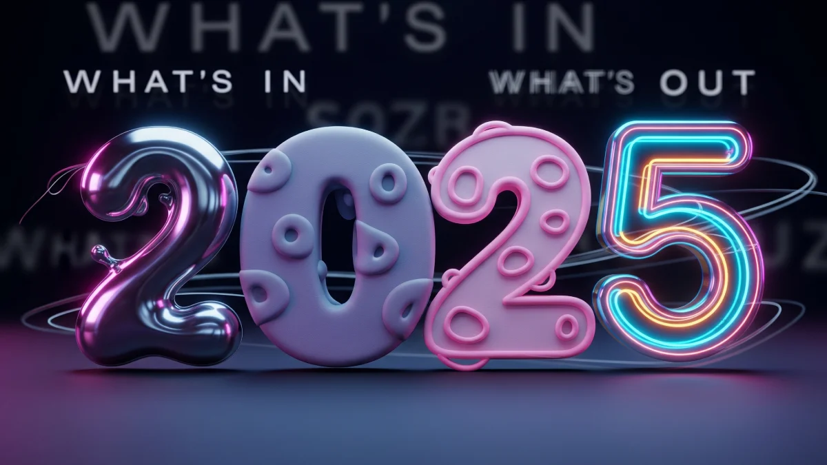
What’s Defining Typography in 2025: The In-List
The prevailing typography trends for the upcoming year share a common thread: a deliberate move toward expression, character, and humanity. Designers are seeking tools that do more than just present information; they want fonts that tell a story.
1. Handwritten & Imperfect Letterforms

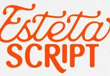
The search for authenticity has led directly to the embrace of imperfection. Hand-drawn, smudged, and wobbly letterforms offer a direct counterpoint to the sterile precision of digital and AI-generated visuals. These fonts feel crafted and personal.
- What it is: Typefaces that retain the organic qualities of handwriting or block printing, complete with irregular lines, varied textures, and inconsistent spacing. Think less “perfect calligraphy” and more “artist’s sketchbook.”
- Why it’s in: In an era of automation, these fonts signal a human presence. They convey warmth, vulnerability, and a sense of craft that resonates with audiences tired of corporate sameness. For brands, this style builds an immediate, personal connection.
- How to use it: Use these fonts for headlines, pull quotes, or branding accents where personality is paramount. Pair them with a clean, neutral sans-serif for body text to ensure readability is not compromised.
2. Variable & Parametric Fonts

Flexibility is the cornerstone of modern digital design. Variable fonts, which package an entire family of weights and styles into a single, efficient file, are no longer a novelty but a core component of the contemporary designer’s toolkit.
- What it is: A single font file that allows for fluid adjustments across different axes, such as weight (thin to bold), width (condensed to extended), and even optical size. This is a significant evolution from traditional, static font files.
- Why it’s in: Responsiveness, variable fonts empower designers to create typography that adapts seamlessly to any screen size, orientation, or user setting. This enhances user experience, improves website performance, and allows for creative, dynamic typographic animations.
- How to use it: Implement variable fonts in web design for responsive headings, interactive UI elements, and micro-animations. Consider how a button’s font weight could change on hover, or how a headline could subtly condense on smaller screens.
3. Retro, Y2K, and Ephemera-Inspired Styles

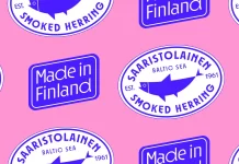
Nostalgia continues to be a powerful force in design, but its application is becoming more nuanced. The Y2K revival is in full swing, bringing with it a wave of pixelated, bubbly, and early-internet-inspired type. At the same time, designers are looking to analog ephemera for inspiration.
- What it is: This trend encompasses two related streams. First, the Y2K aesthetic, characterized by futuristic, techy fonts with rounded corners and a slightly kitsch feel. Second, type inspired by physical objects like old receipts, rubber stamps, and vintage signage, which carries a tactile, historical quality.
- Why it’s in: These styles tap into collective memory, evoking specific eras and emotions. Y2K fonts feel playfully optimistic and digitally native, while ephemera-inspired type offers a comforting sense of history and tangibility. It’s nostalgia with a concept.
- How to use it: Y2K fonts excel in projects aimed at a younger demographic, particularly in fashion, music, and social media campaigns. Use ephemera styles to give branding a sense of heritage, authenticity, or handcrafted quality.
4. Bold & Playful Display Fonts

In the endless scroll of social media and content feeds, subtlety is often lost. To capture attention, designers are turning to typography that is unapologetically loud, chunky, and experimental.
- What it is: Heavy, often-rounded or inflated display fonts designed for maximum visual impact. These typefaces prioritize personality over legibility at small sizes and are meant to be seen and felt.
- Why it’s in: It’s a direct response to the attention economy. Bold, playful type acts as a visual anchor, stopping users in their tracks. It’s confident, energetic, and perfectly suited for hero sections, social graphics, and posters.
- How to use it: Use these fonts sparingly but at a large scale. They are the star of the show, not the supporting cast. Let a single word or short phrase in a bold display font dominate your composition for an immediate, powerful statement.
5. Anti-Design & Kinetic Typography

Some of the most exciting typography trends involve breaking the rules. Anti-design embraces intentional “wrongness”—asymmetry, stretched letterforms, and jarring layouts—to create something raw and disruptive. This philosophy pairs naturally with kinetic typography, where letters move, transform, and interact.
- What it is: Anti-design challenges traditional principles of harmony and order. Kinetic typography brings static letters to life through animation, making them a central element of motion design.
- Why it’s in: Both trends are about energy and emotion. Anti-design rejects corporate polish in favor of raw expression, while kinetic type injects dynamism into digital storytelling. They are tools for creating memorable, visceral experiences.
- How to use it: Explore kinetic typography for website intros, social media videos, and digital ad campaigns. Use anti-design principles in contexts that celebrate rebellion and creativity, like music festivals, art exhibitions, or avant-garde fashion brands.
6. Bespoke & Emotional Typefaces

The ultimate form of typographic distinction is a custom font. Brands and designers are increasingly commissioning bespoke typefaces that are meticulously crafted to evoke a specific feeling, whether it’s joy, elegance, nostalgia, or rebellion.
- What it is: A unique typeface created exclusively for a single brand or project. The design process is focused on translating a brand’s core values and emotional goals into a distinct set of letterforms.
- Why it’s in: A bespoke typeface is a powerful, ownable brand asset. It ensures complete visual consistency and differentiates a brand in a crowded market. More importantly, it functions as an emotional conduit, shaping audience perception on a subconscious level.
- How to use it: While a full custom typeface is a significant investment, designers can achieve a similar effect by carefully selecting a font with a strong, unique emotional character that aligns perfectly with a project’s goals. What emotion do you want your words to carry?
What’s Fading or Evolving: The Out-List
As new typography trends emerge, others naturally recede. This doesn’t mean these styles are “banned,” but rather that their dominance is waning, and they require more thoughtful application.
1. Ultra-Minimalist & Neutral Sans-Serifs
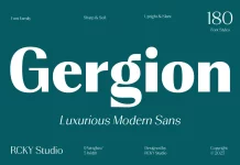
For years, clean, geometric sans-serifs were the default choice for a modern, sophisticated look. Their ubiquity, however, has diluted their impact.
- Why it’s losing steam: The market is saturated. Countless brands have adopted a neutral sans-serif identity, leading to a sea of sameness. While essential for UI and body copy, these fonts now feel impersonal and risk being perceived as generic when used for expressive branding. Designers are craving more personality.
2. Monotonic Typeface Families
The demands of multi-platform design have made limited typeface families feel restrictive.
- Why it’s losing steam: A typeface that only comes in “Regular,” “Italic,” and “Bold” is no longer sufficient. Designers need comprehensive toolkits—like variable fonts or families with extensive weight and width options—that can adapt to print, web, mobile, and video without compromising the design system.
3. Generic Retro Styles Without Context
Nostalgia is only effective when it’s meaningful. Simply mimicking a past style without a fresh perspective or conceptual reason feels hollow.
- Why it’s losing steam: Audiences are visually sophisticated. A 70s-style font used for a tech startup feels dissonant and arbitrary. The most successful retro typography trends reinterpret historical styles, blending them with modern sensibilities to create something new and relevant.
Why These Typographic Shifts Matter
These changes are not arbitrary; they are a reflection of our evolving relationship with technology and media.
- The Search for Human Connection: In a world increasingly mediated by algorithms, imperfect, handmade, and emotional fonts are a powerful reminder of the human creator behind the screen. They offer authenticity in the face of artificial perfection.
- The Demand for Digital Flexibility: Responsive design is no longer a buzzword; it’s a requirement. Variable fonts and kinetic typography provide the fluid, scalable solutions needed to create seamless user experiences across an ever-expanding array of devices.
- The Battle for the Attention Economy: With visual noise at an all-time high, typography must work harder than ever to be noticed. Bold display fonts, anti-design principles, and animated text are essential tools for cutting through the clutter.
What to Watch for Next
The evolution of typography is accelerating. Here are two frontiers to keep an eye on:
- Reactive Typography: Imagine fonts that adapt not just to screen size, but to user context. AI-driven typography could change its weight based on the time of day, its slant based on scrolling speed, or its emotional tone based on the content of an article. This is the next frontier in personalized, adaptive branding.
- Global Script Expansion: As AI and design tools become more advanced, expect a dramatic increase in the availability of high-quality, expressive fonts for non-Latin scripts. This will break down typographic barriers, enabling designers worldwide to create rich, culturally relevant work with greater ease.
Conclusion
Typography in 2025 is dynamic, expressive, and deeply human. The trends shaping the industry reflect a collective desire for authenticity, responsiveness, and thoughtful experimentation in a digitally saturated world. The focus has shifted from cold minimalism to warm, character-rich styles that make an emotional impact.
Whether you are designing a brand identity, building a creative portfolio, or crafting a simple social media post, these typography trends offer more than just aesthetic guidance. They are tools for connection. Now is the time to push boundaries, embrace meaningful imperfection, and choose type that moves people—both literally and emotionally.
Feel free to find other trending typefaces here at WE AND THE COLOR or check out our selection of the 50 best fonts for designers in 2025.

