
This post contains affiliate links. We may earn a commission if you click on them and make a purchase. It’s at no extra cost to you and helps us run this site. Thanks for your support!
It’s no secret that when it comes to typography, Helvetica stands as an emblem of modernist design, celebrated for its clean lines, readability, and versatility. However, even a stalwart like Helvetica can benefit from the nuanced harmony of a well-chosen typeface pairing. As a design professor and typography expert, I invite you to explore five exemplary font pairings that elevate Helvetica to new heights.
1. Helvetica and Garamond: A Timeless Union

Garamond, a classic serif typeface, provides an elegant counterpoint to Helvetica’s sans-serif precision. This pairing combines the best of both worlds: the readability and neutrality of Helvetica with the timeless sophistication of Garamond.
Why It Works:
- Contrast: Garamond’s serifs add a touch of tradition and warmth, making it a perfect foil to Helvetica’s modernism.
- Balance: The pairing ensures visual interest without sacrificing readability.
Best Used For:
- Editorial Design: Magazines and books where headings can benefit from Helvetica’s clarity, while body text flows gracefully in Garamond.
- Branding: Projects seeking to convey both heritage and modernity.
2. Helvetica and Bodoni: Elegant Contrast

Bodoni is a serif typeface characterized by its high contrast between thick and thin strokes. When paired with Helvetica, it creates a striking visual interplay, balancing Helvetica’s neutrality with Bodoni’s dramatic flair.

Why It Works:
- High Contrast: Bodoni’s bold, elegant serifs provide a stunning contrast to Helvetica’s even strokes.
- Refinement: The pairing offers a mix of modernism and classicism, appealing to a sophisticated audience.
Best Used For:
- Luxury Branding: Perfect for high-end brands seeking to exude elegance and sophistication.
- Print Design: Ideal for invitations, posters, and other print materials where a touch of class is desired.
3. Helvetica and Futura: Modern Minimalism
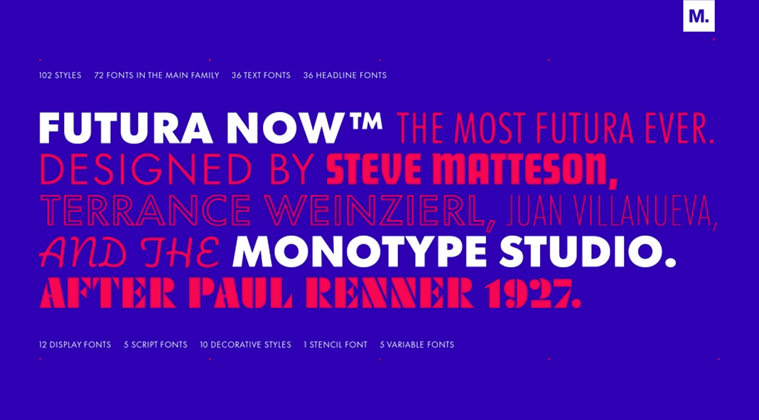
Futura, with its geometric shapes and strong presence, provides a dynamic contrast to Helvetica. This pairing speaks to the heart of modern minimalism, creating a bold and contemporary visual language. As a rule of thumb, distinctly different sans-serif designs can complement each other effectively, while those that are similar in style rarely pair well.
Why It Works:
- Geometric Precision: Futura’s geometric forms create a visually striking contrast with Helvetica’s neo-grotesque style.
- Dynamic Interaction: The combination enhances modern design aesthetics with clean, bold statements.
Best Used For:
- Branding and Advertising: Ideal for brands seeking a modern and impactful identity.
- Posters and Flyers: Makes a bold visual statement, perfect for catching attention.
4. Helvetica and Baskerville: Harmonious Tradition

Baskerville, a transitional serif typeface known for its high contrast and readability, pairs beautifully with Helvetica. This combination bridges the gap between traditional and contemporary design.
Why It Works:
- Historical Resonance: Baskerville’s historical roots and high readability offer a refined counterpart to Helvetica’s modernist clarity.
- Visual Harmony: The pairing creates a balanced, aesthetically pleasing look.
Best Used For:
- Corporate Design: Ideal for formal documents where professionalism is paramount.
- Editorial Projects: Perfect for publications that require both tradition and modernity.
5. Helvetica and Rockwell: Bold Statements
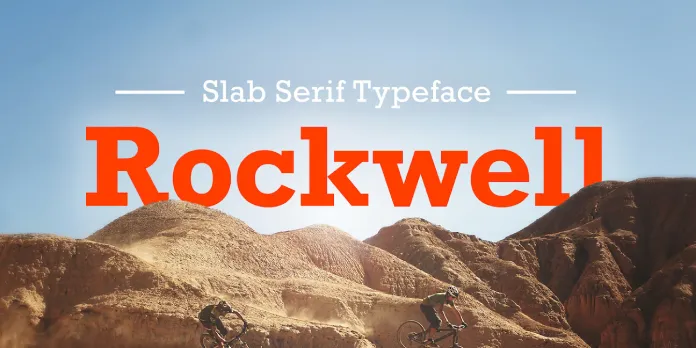
Rockwell, a slab serif typeface, introduces a robust and authoritative presence when paired with Helvetica. This combination is particularly effective for making strong visual statements.
Why It Works:
- Strength and Boldness: Rockwell’s strong, slab serifs create a powerful contrast to Helvetica’s simplicity.
- Impactful Design: The pairing ensures your message stands out with clarity and strength.
Best Used For:
- Posters and Print Ads: Perfect for creating eye-catching, memorable designs.
- Branding: Suitable for brands looking to convey confidence and stability.
Helvetica’s neutrality and versatility make it a canvas upon which other typefaces can shine. Each of these pairings—Garamond, Georgia, Futura, Baskerville, and Rockwell—brings its own unique strengths, enhancing Helvetica’s inherent qualities while adding depth and character to your designs. Whether you’re working on editorial projects, web design, corporate branding, or advertising, these pairings will ensure your typographic choices resonate with sophistication and clarity. Embrace these combinations to elevate your design projects to professional heights.
While Helvetica can be paired with a multitude of other typefaces to create visually compelling designs, it is crucial to pay attention to several key factors to ensure a harmonious combination. Firstly, consider the contrast in style and weight between Helvetica and the secondary typeface; this contrast should enhance readability and aesthetic appeal without creating visual dissonance. Secondly, assess the context and purpose of the design—certain pairings work better for print, digital, editorial, or branding applications. Additionally, ensure that the chosen fonts complement each other in terms of x-height, line spacing, and overall proportion to maintain a cohesive look. By thoughtfully selecting complementary typefaces and paying close attention to these details, designers can leverage Helvetica’s versatility while achieving a balanced and effective typographic hierarchy.
Browse through WE AND THE COLOR’s Font section for more trending typefaces. Header image Helvetica® Now from Monotype. Ask our AI Font Finder to discover more trending typefaces.
Subscribe to our newsletter!


