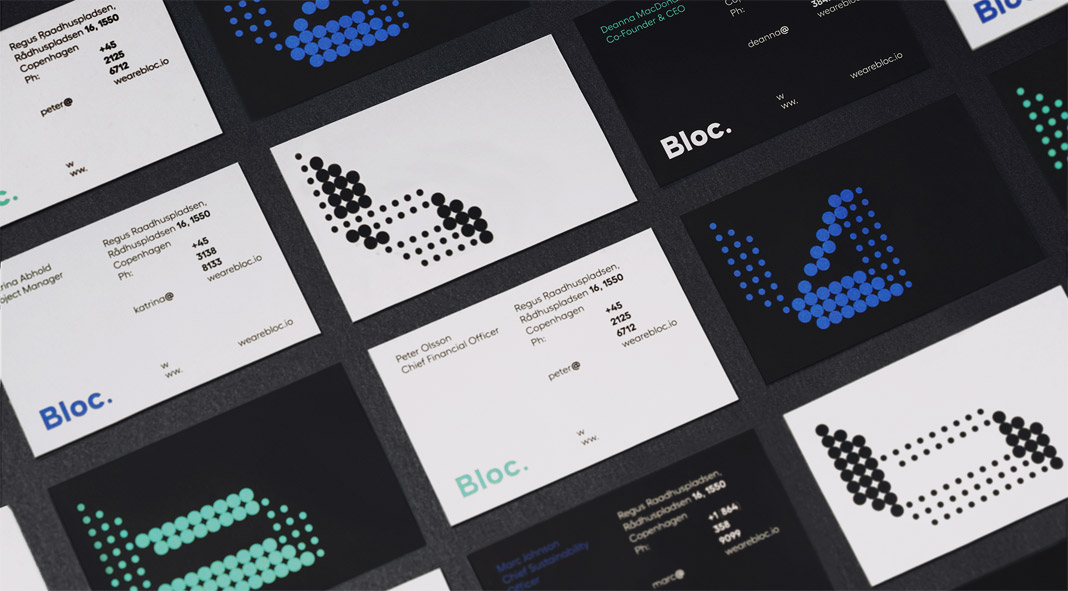
Have a look at this graphic design and branding case study by Futura for BLOC, a blockchain studio that designs and develops digital infrastructures.
With the aim of making a positive global impact by generating meaningful change in society, BLOC is an independent blockchain studio that designs and develops digital infrastructures. The main brand is divided into 3 sub-brands: consultancy, labs, and products—all offering solutions using the benefits of blockchain. Read more below the following image.
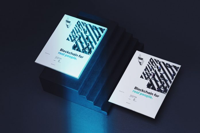
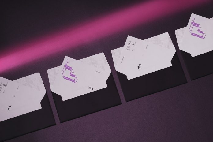
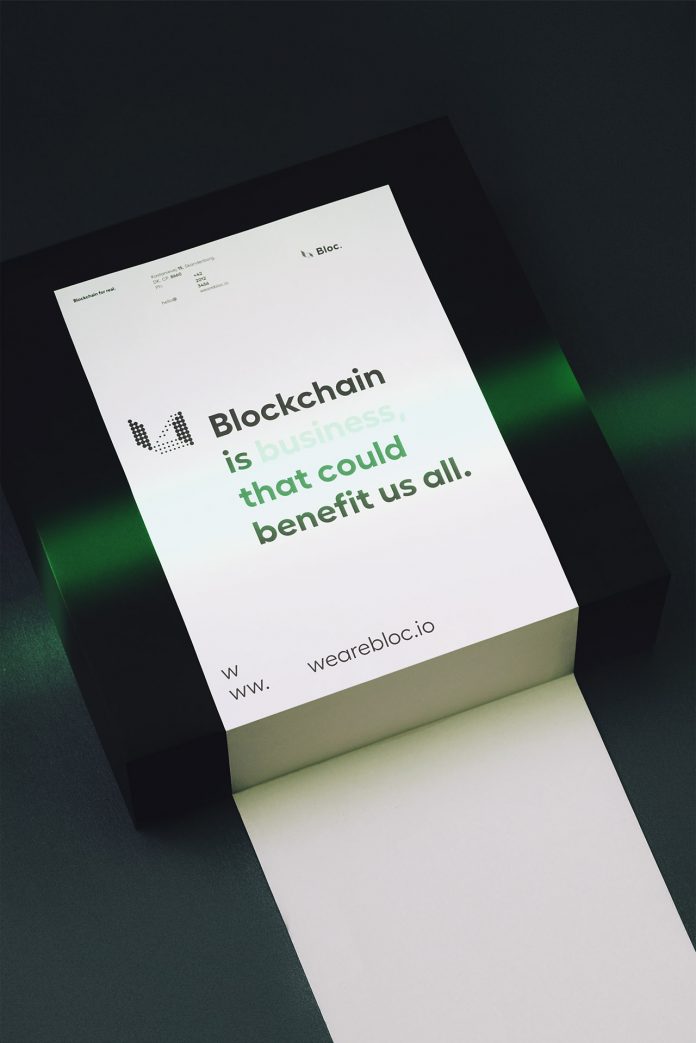
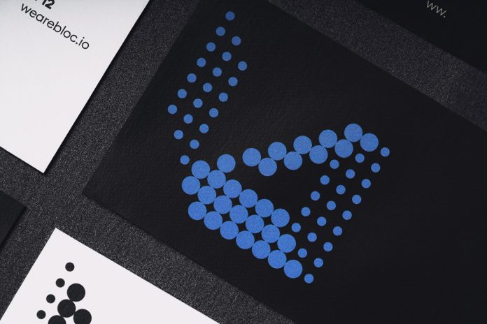
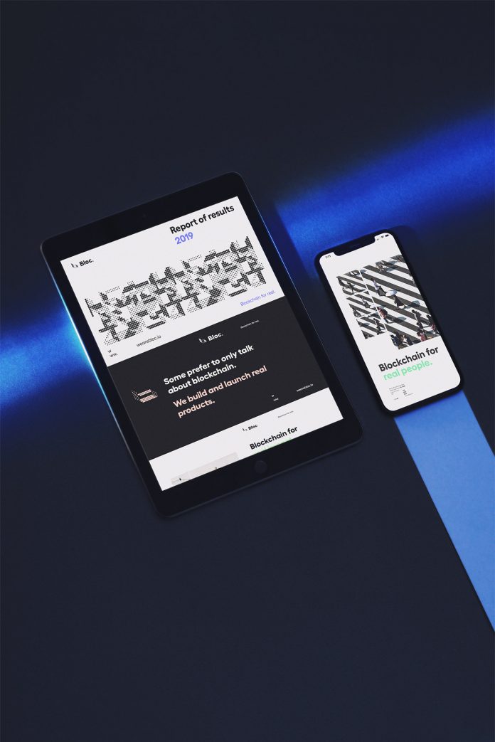
Futura’s graphic design and branding solution came from the principles of blockchain—the data structure in which each block of information is chained to the previous one. Therefore, all depend on each other to function, which can be considered a metaphor for how humanity works best. The designers used a dot as the main element of the brand, representing a block of information that is reliant on the others. A range of highlighted dots refers to the people who stand out, who are redefining and breaking the grid; creating new connections, partnerships, products, solutions, and formations.
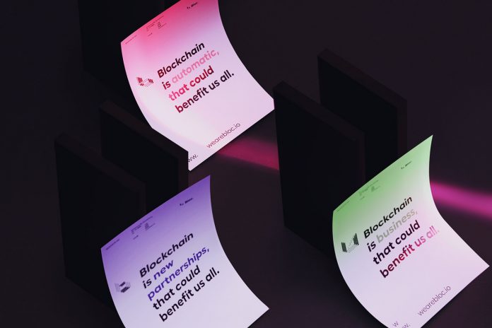
The resulting pattern has been modified to form the shape of the letter B in the main logo, which takes different forms referencing the shapes created by flocks of birds while flying; the way they collaborate, look for each other and adapt to the wind. Below you can find more images. For those of you looking for other creative work by studio Futura, we recommend you to visit their website.
All images © by graphic design and branding studio Futura. Do not hesitate to check out our inspiring Graphic Design and Branding categories to find other highly creative work realized by skilled designers and leading studios from all over the world.
Subscribe to our newsletter!

