
This post contains affiliate links. We may earn a commission if you click on them and make a purchase. It’s at no extra cost to you and helps us run this site. Thanks for your support!
Soerip is like a vintage tale told through ink.
Hey there! Have you ever encountered a typeface that whispers of a bygone era? That’s exactly the vibe Megflags’s Soerip gives off. It’s not just a font, it’s a story waiting to be told. You see its roots firmly planted in vintage typography. Let’s unpack it, shall we?
Hand-Drawn Charm:
You can almost feel the human touch, right? Soerip’s appeal lies in its hand-drawn aesthetic. There’s an organic, slightly irregular feel to each letter. It’s not perfect, and that’s the point. This isn’t some sterile, digital creation. Instead, you get a sense that someone spent time carefully crafting each glyph. Don’t you love fonts with that kind of personality?
Vintage Echoes:
Think of old printed books, travel posters, or labels from the early 20th century. That’s the kind of historical context that Soerip evokes. Notice the rounded edges? The slightly condensed letterforms? They’re all nods to these antique sources. These design decisions clearly aim to transport you back in time. Can’t you just picture it on old storefront signs?
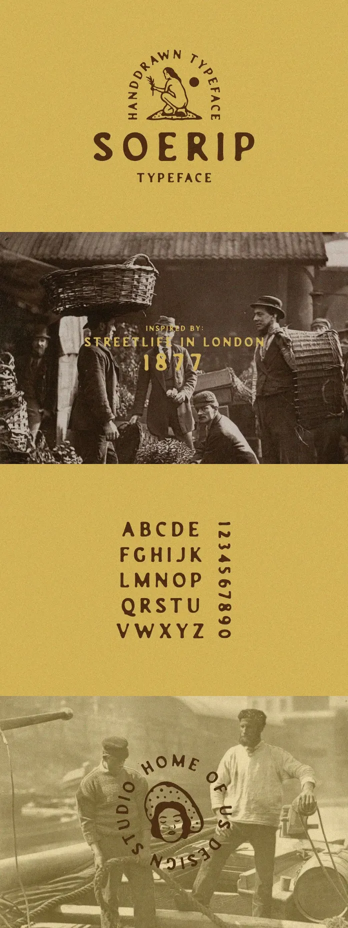
Letterforms and Numerals:
Look at the provided images. The typeface includes uppercase letters from A to Z. The letters have a friendly, casual vibe. The numbers (0 to 9) have the same charm. Each character looks like it was crafted with care. They’re not just generic shapes. Don’t you love that level of attention to detail?
Ideal for Branding?
Given its distinctive style, where might you use Soerip? Branding comes to mind, particularly for businesses with a vintage or handcrafted feel. Imagine it on the label of a small-batch coffee company. It also works well for a local farm or a bakery. Think also about a clothing brand that focuses on sustainability.

Beyond Branding:
The versatility of Soerip stretches beyond branding, though. Consider using it for headings in blog posts. You could employ it for posters that promote a folk music festival. Or even in children’s book illustrations for added charm. Do you think it would work in these contexts?
A Character-Rich Font:
Soerip is not a “clean” font. It’s full of character. It’s a typeface that makes a statement. It’s not suitable for long paragraphs of text. But it excels in short bursts of expressive language. Does that make sense to you?
Simplicity and Readability:
Despite its vintage flair, Soerip maintains a level of simplicity. It’s surprisingly readable, even with the unique touches. The individual letters have clear forms that make them easy to decipher. That’s super important, especially in branding. Can you see why?
Why Choose Soerip?
When you pick a font, you’re also choosing a specific aesthetic. Soerip isn’t for everyone. If you’re after a modern, sleek, minimal look, keep searching. But if you want to infuse your work with some handcrafted, vintage goodness, Soerip might be the perfect match.
Let’s Recap:
- Hand-drawn: Offers an organic, human feel.
- Vintage inspiration: It’s deeply rooted in historical typography.
- Character-rich: Each letterform has its unique style.
- Versatile: Suitable for various applications, from branding to design.
- Readable: Simple design makes it easy to decipher.
Your Turn:
What are your thoughts? Do you see yourself using a typeface like Soerip in a design project? Or have you spotted it in the wild? We’d love to hear your thoughts.
Feel free to find other recommended typefaces as well as big font families in the reviews on WE AND THE COLOR.
Subscribe to our newsletter!


