Clever self-promotional studio branding.
Check out this clever and witty rebranding concept around a versatile pun on the word “Me”.
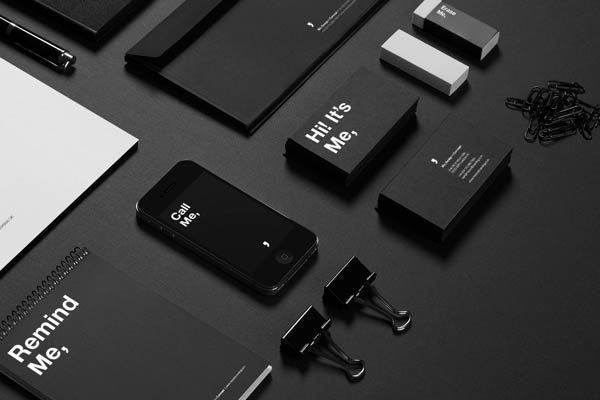
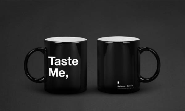
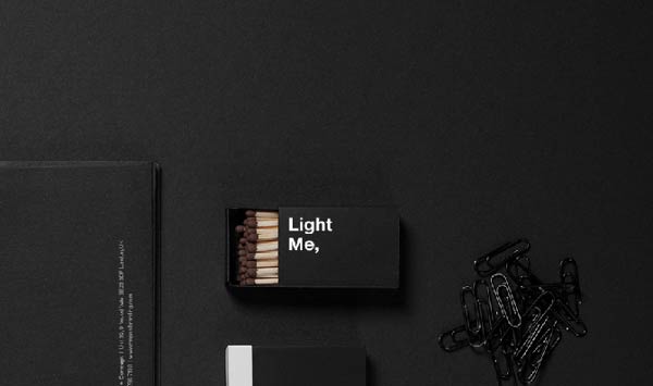
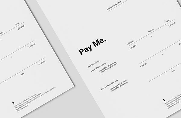
“Me” is the name of a London based multidisciplinary design studio. The name consists of the initials of the two co-founders Mirco and Eva. An extensive range of branding materials were produced with simple and bold phrases around the word “Me”. The entire collection of self-promotional materials includes items such as business cards, a stationery set, notebooks, bags, posters, condoms, and mugs. Every piece of this brand identity utilises the “Me,” theme to create a message that matches to the respective item. These phrases highlight the bold visual identity and create an emotional link between clients and the studio.
Below you can find several images of this self-promotional rebranding concept.













Is this meant to be ironic? It’s practically Cards Against Humanity and is unfortunate and uninspiring. Helvetica, black, and white… aren’t you supposed to be a design studio?