Fable&Co, a dynamic branding and design agency based in London and Brighton, is renowned for breathing new life into ambitious brands and reimagining their potential. Their recent rebranding of Conrad Group is a masterclass in blending heritage with modernity, perfectly encapsulating Conrad’s growth trajectory and established reputation within the marketing services industry. Specializing in the travel, tourism, and hospitality sectors, Conrad Group has expanded through both organic growth and strategic acquisitions. The challenge for Fable&Co was to develop a brand identity that reflected this growth while maintaining the core values of independence, trust, and results-driven operations.
Strategic Alignment with Growth and Innovation
At the heart of the rebranding was a strategic approach aimed at balancing Conrad Group’s rich history of success with a forward-looking visual identity. This new brand needed to not only appeal to existing stakeholders but also engage new audiences, particularly those interested in Conrad’s growth ambitions. Fable&Co. sought to ensure that the brand’s ethos of professionalism and creativity was preserved while projecting a sleek and modern aesthetic that would resonate with contemporary business needs.
The solution lies in a refined blend of visual sophistication and symbolic elements that communicate Conrad’s focus on innovation, collaboration, and sustained value creation. A modern, minimalistic design language was introduced, with a strong emphasis on precision and clarity. This was achieved through carefully considered design decisions, beginning with the reimagining of the Conrad logo.
Symbolism in Design: The Conrad Logo
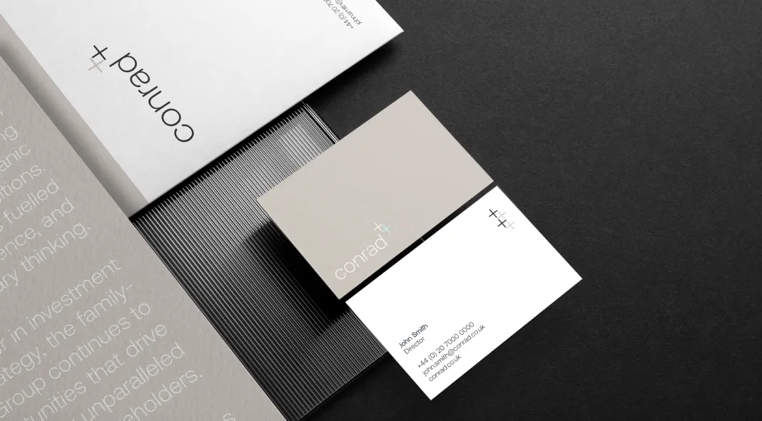
Fable&Co.’s redesign of the Conrad logo exemplifies the agency’s commitment to thoughtful, meaningful branding. The new logo employs a clean, modern typeface, accented by subtle geometric elements. Central to the design is the introduction of the “+” symbol, which serves as both a functional and symbolic element. This addition not only reflects Conrad’s strategy of fostering growth through partnerships but also reinforces the company’s commitment to collaboration and synergy, particularly in its acquisitions of other marketing agencies.
This strategic visual metaphor of the “+” symbol highlights the symbiotic relationships Conrad Group builds with its clients and stakeholders, showcasing its long-term commitment to mutual growth and success.
A Thoughtfully Curated Color Palette
The color palette chosen for Conrad’s rebrand is both understated and evocative. Predominantly neutral tones, such as soft beiges and greys, were used to communicate stability, professionalism, and warmth. These neutral hues are punctuated by minimal accents of cool blue, a color that evokes feelings of trust, calm, and forward-thinking ambition. The balance of these tones serves to present Conrad as a company that is both established and innovative, reliable yet always moving toward future opportunities.
Modern Visuals for a Forward-Thinking Brand
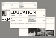
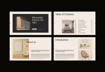
The overall visual aesthetic of the rebrand centers on sleek, minimalistic design principles, incorporating sharp lines and high-contrast layouts. The minimalist approach is not only visually striking but also functionally aligned with the company’s values. By opting for a clean and direct design, the brand communicates confidence, transparency, and approachability—core characteristics that Fable&Co. identified as integral to Conrad’s public image.
The inclusion of key team member imagery further humanizes the brand, positioning Conrad as an accessible and transparent organization. This aligns with the company’s emphasis on building trust-based relationships with its stakeholders.
A User-Centric Website Overhaul
In addition to the visual rebrand, Fable&Co. overhauled Conrad’s website, enhancing the user experience through a modern and intuitive interface. The minimalist design philosophy extends to the website, where a monochrome palette is accented by subtle hints of color to improve clarity and navigation. Bold typography and well-structured layouts allow users to easily access critical information about Conrad’s services, investment philosophy, and leadership team.
This user-centric design not only boosts accessibility but also projects a highly professional and innovative image—vital in positioning Conrad as a market leader within the travel, tourism, and hospitality sectors.
Cohesive Brand Collateral
The branding extended beyond digital spaces, with a suite of brand collateral designed to maintain a high level of sophistication and consistency. Fable&Co. developed tactile business cards that reflect the new minimalist design while using premium materials to reinforce the sense of quality and professionalism. The “+” symbol, which plays such a vital role in the logo, is thoughtfully integrated into various collateral pieces, further reinforcing Conrad’s commitment to growth and collaboration.
A New Identity for a New Chapter
The rebrand of Conrad Group by Fable&Co. represents a successful blend of tradition and modernity. The new visual identity aligns perfectly with the company’s strategic goals of continued growth and value creation for its stakeholders. By focusing on clarity, professionalism, and creativity, the rebrand projects a sense of confidence and ambition that will undoubtedly attract potential partners, clients, and acquisition prospects.
In sum, Fable&Co.’s branding project positions Conrad as a modern, dynamic brand that is ready to meet the challenges of the future. Through a combination of sleek design, strategic messaging, and thoughtful symbolism, Conrad’s refreshed identity is both a celebration of its past and a bold statement of its future potential. This rebrand is a testament to the power of strategic branding in enhancing business growth and maintaining relevance in an ever-evolving market.
All images © by Fable&Co. Feel free to discover other inspiring projects in the Graphic Design and Branding sections on WE AND THE COLOR.

