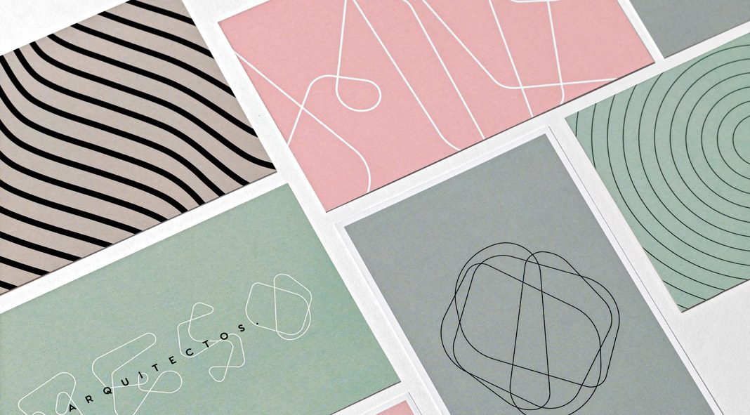
Art direction, graphic design, and identity development by The Branding People for architecture firm Reso.
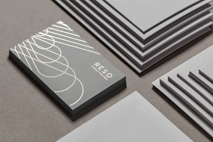
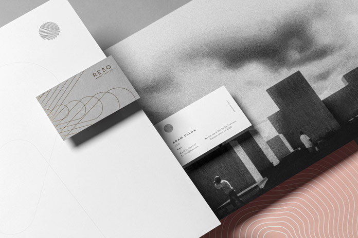
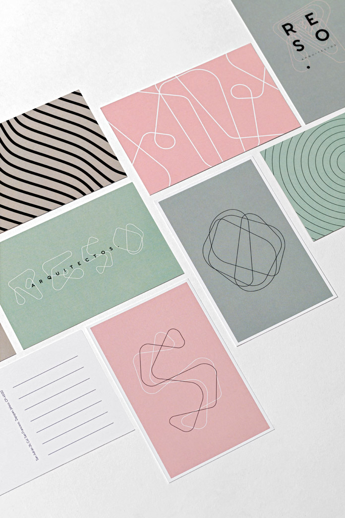
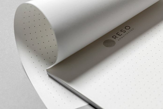
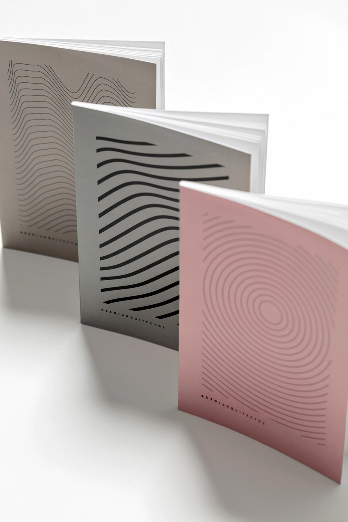
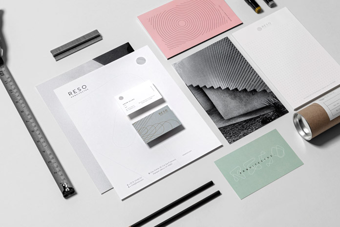
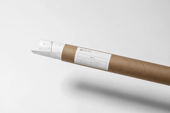
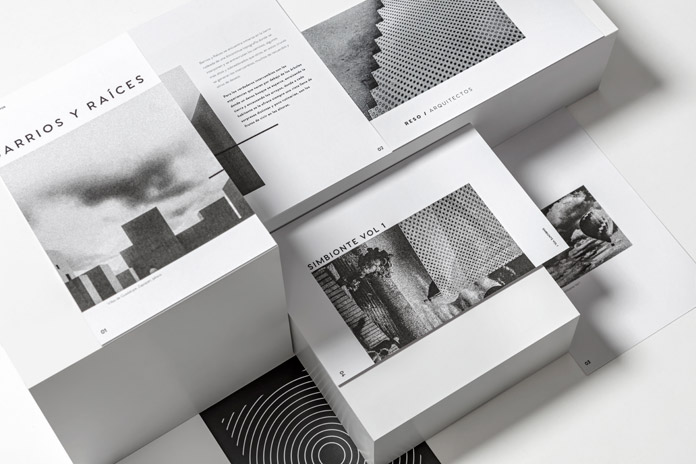
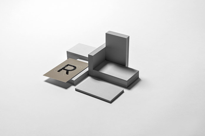
The Branding People is a Mexico City-based design studio focusing on brand construction and communication design. They were recently asked to create a corporate identity for architecture firm Reso. The brand name derives from the natural resonance of structures. With this in mind, the design team has developed a visual language based on harmony and balance in different spaces. Their main objective was to visualize resonance. Hence, they created a range of abstract patterns and textures through repetitive organic outlines that add dynamism to the corporate identity. The color scheme is made of a series of neutral tones, complemented with pale pink and green. Furthermore, metallic details were added to several printed materials. Check out the sophisticated result below. I highly recommend you to visit The Branding People’s website to see more of their outstanding work.
All images © by The Branding People. Do not hesitate to have a look at our Graphic Design and Branding categories to find other inspiring projects.

