This post contains affiliate links. We may earn a commission if you click on them and make a purchase. It’s at no extra cost to you and helps us run this site. Thanks for your support!
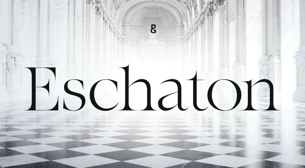
Eschaton, a masterful transitional typeface designed by Paulo Goode, represents an exemplary blend of sophistication and modernity. This 36-font family, characterized by its delicate yet assertive contrast, is a versatile tool for contemporary designers seeking a refined yet impactful visual presence. Eschaton’s polished forms evoke a sense of calm assurance, facilitating clarity and confidence in typographic communication across both print and digital media.
Design Aesthetics and Functionality
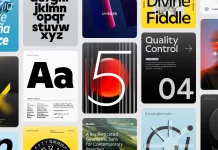
At the core of Eschaton’s design is its sleek, minimalistic aesthetic, which lends itself to a wide range of applications. The typeface is meticulously crafted to enhance readability without sacrificing its inherent elegance, making it an ideal choice for both display and body text. This is particularly evident in the font family’s three optical sizes—Text, Standard, and Xtra—each catering to distinct typographic needs. The Text variant, with its lower contrast, ensures legibility in extended reading. In contrast, the Xtra version, with heightened contrast, offers a more dramatic, expressive quality, perfect for headlines or branding elements.
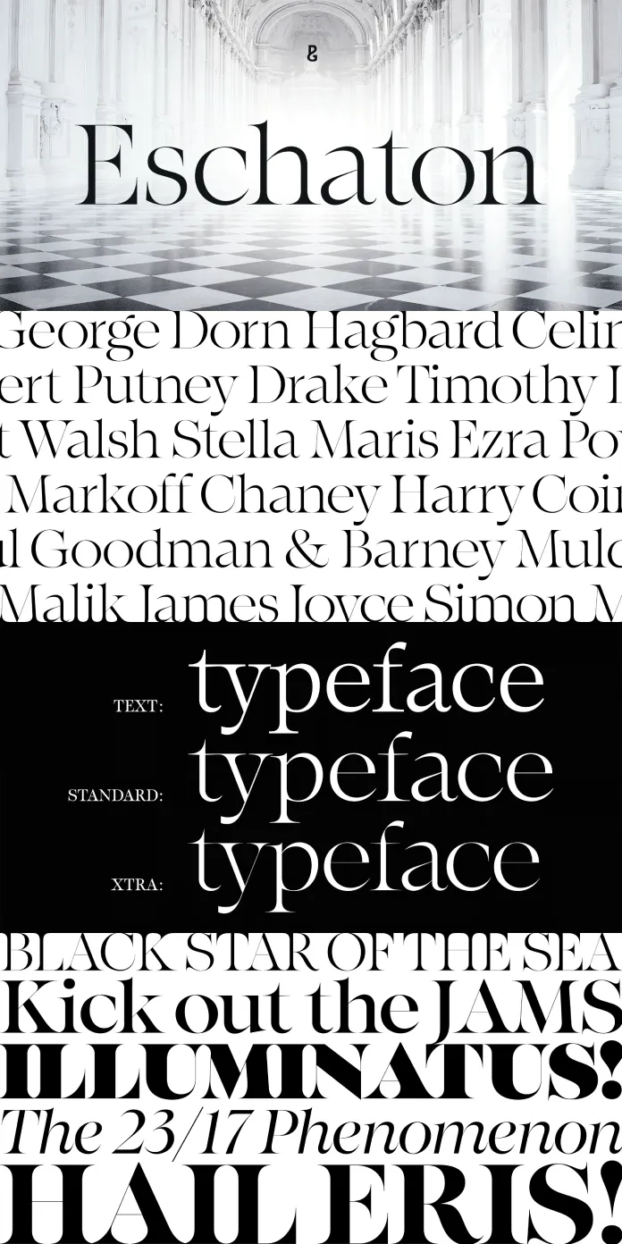
What sets Eschaton apart is its ability to navigate the tension between tradition and modernity. As a transitional typeface, it bridges the stylistic gap between old-style humanist fonts and the more mechanistic feel of modern serif fonts. This hybrid identity is reflected in Eschaton’s clean, geometric shapes that feel contemporary yet maintain a subtle nod to classical typography. The font’s forms are simple but not austere; they imbue a sense of precision without overwhelming the eye, offering a “moment of clarity” amid the noise of the current visual landscape.
Versatility and Typographic Nuances
Eschaton is designed to cater to a variety of design scenarios, with an extensive range of weights from light to black, available in both Roman and Italic styles. The seamless transition between different weights and styles within the family enhances its flexibility, making it suitable for complex typographic hierarchies. Whether used in digital interfaces, editorial designs, or large-scale print, Eschaton’s versatile nature ensures that it can adapt to various contexts while maintaining consistency and balance.
The typeface also features an impressive set of typographic features that elevate its utility. Eschaton includes old-style figures by default, lending it a timeless, sophisticated air. However, the flexibility to switch to proportional numerals with ease allows the designer to adjust the typeface to more contemporary or specific typographic demands. This thoughtful inclusion of both classic and modern features shows Goode’s deep understanding of the practical needs of today’s designers.
Eschaton’s extensive character set is another testament to its versatility, covering all Latin-based European languages. This inclusive linguistic support positions Eschaton as an excellent choice for global projects, reinforcing its role as a font family that transcends regional or cultural limitations.
Performance Across Media
A critical aspect of Eschaton’s design is its remarkable performance across media. In digital contexts, the clarity of its forms ensures legibility at smaller sizes, while its well-balanced contrast enhances its visual impact at larger sizes. This balance of form and function is crucial for today’s digital-heavy design environments, where fonts must excel in responsive designs across varied screen resolutions. Similarly, Eschaton’s adaptability to print media, where fine details in high-contrast forms can be appreciated, marks it as a highly reliable choice for both editorial work and branding.
Paulo Goode’s Eschaton is a meticulously designed typeface family that offers a harmonious blend of elegance, clarity, and functionality. Its transitional design, thoughtful attention to detail, and wide range of weights and styles make it a valuable asset to any designer’s toolkit. Whether employed for digital interfaces or traditional print media, Eschaton stands as a powerful typographic solution that communicates with precision and confidence in a visually cluttered world. For designers seeking a typeface that is as sophisticated as it is versatile, Eschaton proves to be an exemplary choice.
All images © by Paulo Goode. Feel free to find other trending typefaces in the font reviews on WE AND THE COLOR.

