
Graphic design, logo development, and rebranding by Tomomi Maezawa for the Spanish design and architecture studio, KUTARQ.
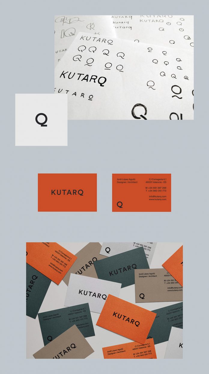
KUTARQ is a studio known for its innovative but timeless designs and the use of unique and memorable details. In order to visually express the characteristics of the studio, Tomomi Maezawa explored the shape of a simple word-mark with a small twist. The new logotype offers a modest look which gives the brand an approachable feel, while the unusual shape of the letter ‘Q’ works like a hook that helps to give the design an even more recognizable touch.
Tomomi Maezawa is a graphic artist and designer currently based in Munich, Germany. Below you can find a few examples of her creative work for KUTARQ. For more, please visit her website or follow this talented designer on Behance.
Client: KUTARQ
Photos: KUTARQ
Web Development: Manuel Pinazo


