This post contains affiliate links. We may earn a commission if you click on them and make a purchase. It’s at no extra cost to you and helps us run this site. Thanks for your support!
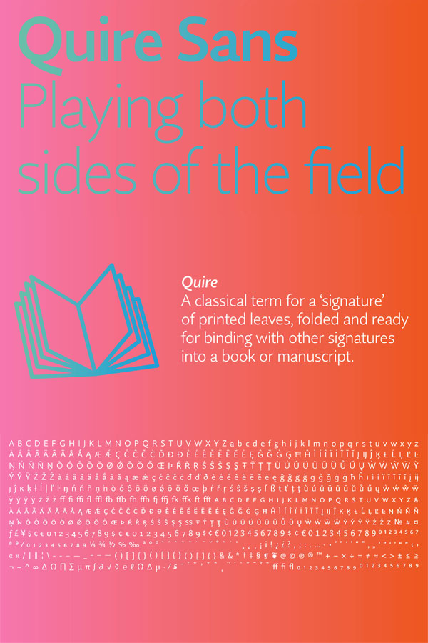
The Quire Sans type family by Jim Ford of studio Monotype.
Jim Ford of studio Monotype designed the Quire Sans type family in 2014. His goal was to create a typeface that might fit in almost anywhere. The result is a sans-serif font family, which is highly functional and charming at the same time. It’s a typeface that crosses the boundary between traditional typography and current design trends in electronic media. The font family does indeed fit in just about any media. Its typeface is characterized by graphic shapes, a highly legible design, and a very sexy appearance.
The complete font family consists of 10 weights (ranging from Thin to Fat) plus matching Italics for each weight. You can get the entire family as both web font as well as desktop font in order to include it into your web projects.
You can buy this sexy type family on MyFonts.
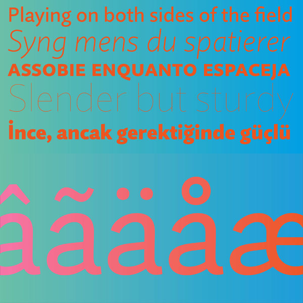
The Quire Sans typeface from Monotype is available for download on MyFonts.com
Are you looking for some more great typefaces? Then check out our list of recommended fonts.


