
This post contains affiliate links. We may earn a commission if you click on them and make a purchase. It’s at no extra cost to you and helps us run this site. Thanks for your support!
Unveiling Petrov Sans: The Futuristic Elegance of Geometric Typography
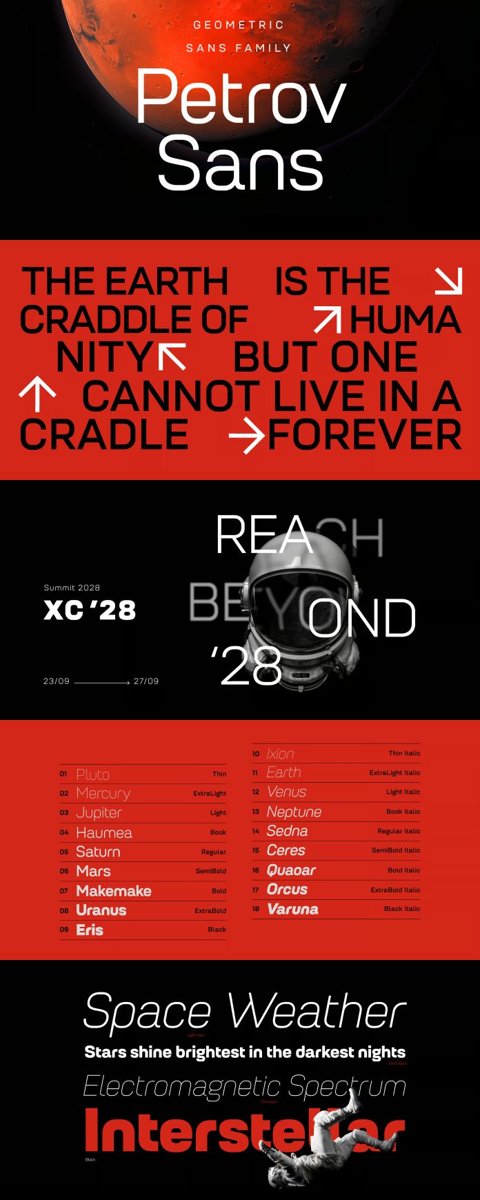
In typography, where the fusion of tradition and innovation creates the pulse of design, emerges Petrov Sans Font Family—a celestial creation that transcends the ordinary. Crafted with a geometric approach that defies conventional boundaries, Petrov Sans Font Family is a symphony of elegance and versatility, destined to shape the visual landscapes of tomorrow.
Designed by the visionary typographer Asen Petrov and brought to fruition by the skilled hands of Stefan Yatanski, with the unwavering support of Fontfabric’s CEO, Svet Simov, Petrov Sans Font Family is not just a collection of letters; it is an experience, a journey into the unexplored realms of design.
At first glance, Petrov Sans captivates with its minimalist allure, a testament to the precision and finesse of its creators. The clean lines and balanced proportions exude a sense of harmony, inviting the viewer into a world where form and function dance in perfect synchrony.
But Petrov Sans is not content with merely being visually pleasing; it aspires to be a catalyst for creativity, a tool for expression in the hands of designers. With nine uprights and nine italics, the Petrov Sans Font Family offers an extensive palette of styles, ensuring that every design project finds its perfect match.
Whether it’s a sleek corporate identity, a dynamic website interface, or a captivating editorial layout, Petrov Sans adapts effortlessly, lending its distinctive personality to elevate every visual narrative it encounters. Its versatility knows no bounds, seamlessly transitioning from headlines to body text with grace and poise.

Yet, what truly sets Petrov Sans apart is its ability to evoke a sense of futurism—a glimpse into a world where innovation reigns supreme. With each letter, each curve and angle, Petrov Sans whispers of possibilities yet unseen, of a future where design knows no limits.
But behind the futuristic facade lies a deep reverence for tradition—a nod to the timeless principles of typography that have guided generations of designers. Petrov Sans is the embodiment of this delicate balance, a bridge between past and future, tradition and innovation.
In the hands of designers, Petrov Sans becomes more than just a font; it becomes a conduit for imagination, a vessel through which ideas flow and visions take shape. It is a reminder that in the ever-evolving landscape of design, there are no boundaries, only endless possibilities waiting to be explored.
As we journey into an era defined by rapid change and boundless creativity, Petrov Sans stands as a beacon of inspiration—a testament to the enduring power of typography to shape the world around us. With its geometric elegance and timeless appeal, Petrov Sans Font Family is not just a font; it is a manifesto for the future of design.
Feel free to find more trending typefaces on WE AND THE COLOR.


