Play Optics branding concept by Lily Clark, a Los Angeles, California based design student.
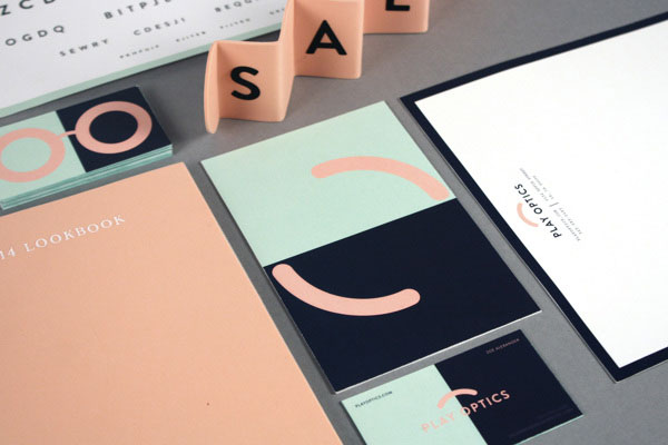
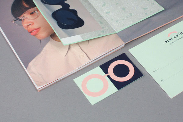
This visual identity concept for Play Optics is a student work by Lily Clark, created under the direction of Dan Blackman. It’s an optics branding concept based on Josef Albers’ simultaneous contrast studies making one color appear to be two. The entire project lasted two weeks from conceptualization to the final design.
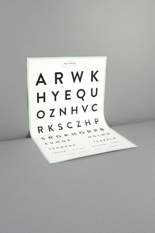
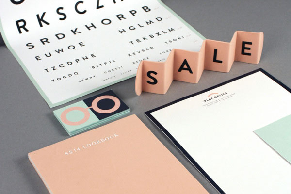
The extensive set of printed collateral consists of an eye chart, stylish business cards, stationery, postcards, a lookbook, and signage. The nose bridge of the glasses was chosen as striking feature in both the logo and as a pattern on the eyeglass case, lens cloth, and website. More of Lily Clark’s design can you find here: lilyclark.com
