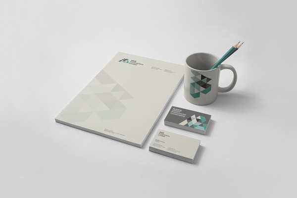
Brand identity design by The Design Surgery for M&B Construction.
M&B Construction commissioned The Design Surgery to develop a new brand identity for the construction company. Their goal was to reposition themselves in the marketplace and differentiate themselves from the crowd of competitors.
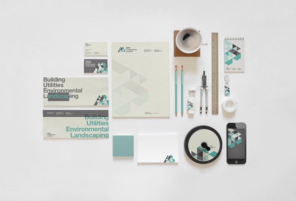
The new branding proposal is symbolizing the letters ‘M’ and ‘B’ with a constructive approach. The result is a graphic grid, which was applied across all branding materials. This distinctive grid design has been used along with a bold typography and modern colors to enable M&B to sit apart from competitors in the industry. Visit The Design Surgery’s website to find out more about this London based agency or discover more of their graphic work on WE AND THE COLOR. The agency is well known for a variety of sophisticated projects from the diverse creative fields of illustration, editorial design, infographic design, and branding.
I recommend you to have a look at our Graphic Design and Branding categories to discover more creative work that inspires you.


