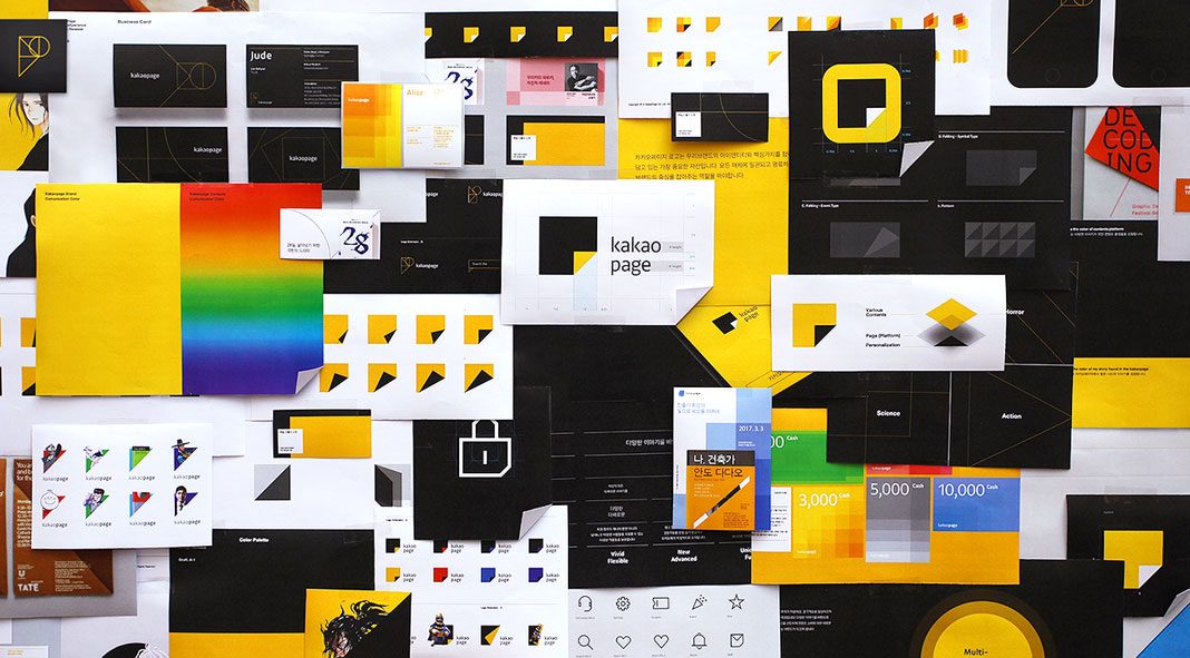
Renewal of the overall Kakaopage brand experience by studio Plus X.
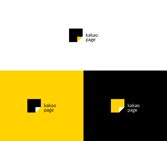
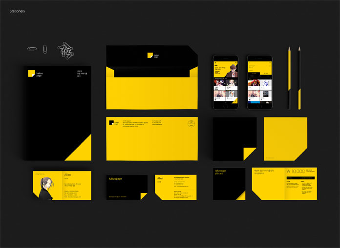
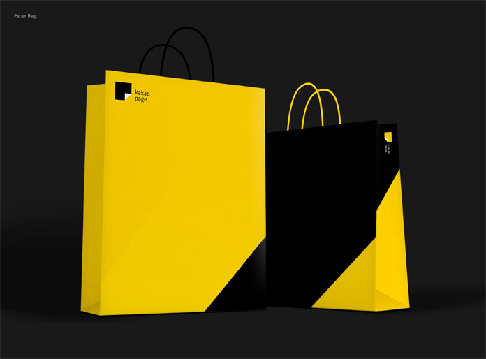
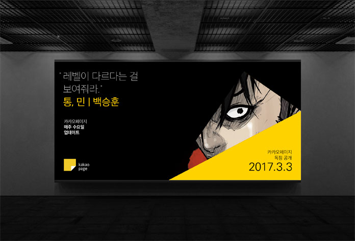
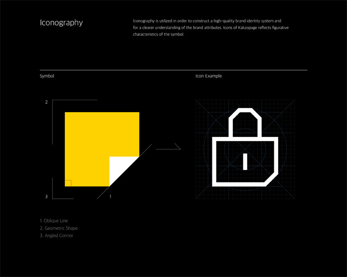
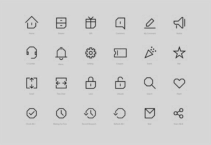
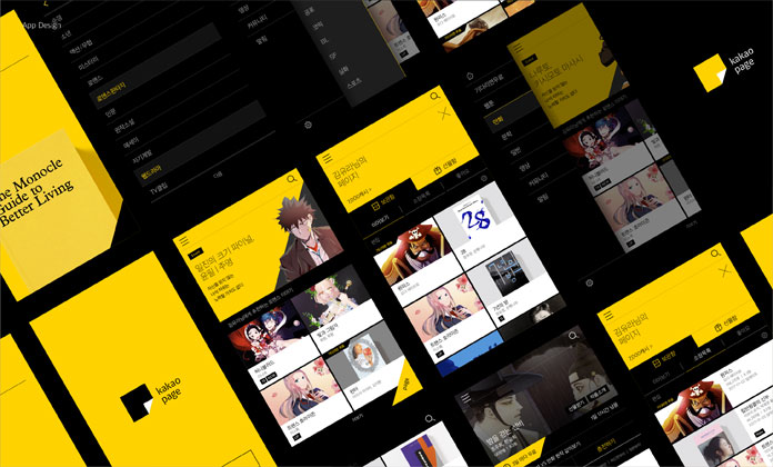
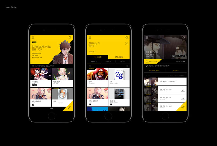
Plus X, a Seoul, South Korea based graphic design and branding studio was commissioned to revise the overall brand experience and interface design of Kakaopage, a leading content platform. Their work included the development of a new logo as well as all print and nonprint elements. The goal was to create a brand that suggests a whole new set of habits regarding content consumption for the users by leading the platform with extensive contents from diverse categories. The striking color combination of black and yellow conveys the brand image of Kakaopage. Black symbolizes the content platform that embodies various stories while yellow symbolizes one’s own story discovered in Kakaopage. Furthermore, some brand visuals have been used in order to create a high-quality brand identity system. The visual motifs reflect figurative characteristics of the symbols.
Just have a look at the images below. For more of the work, please visit the Plus X website.
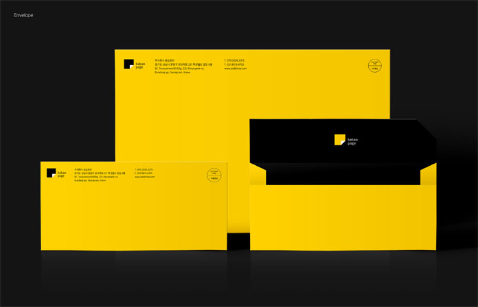
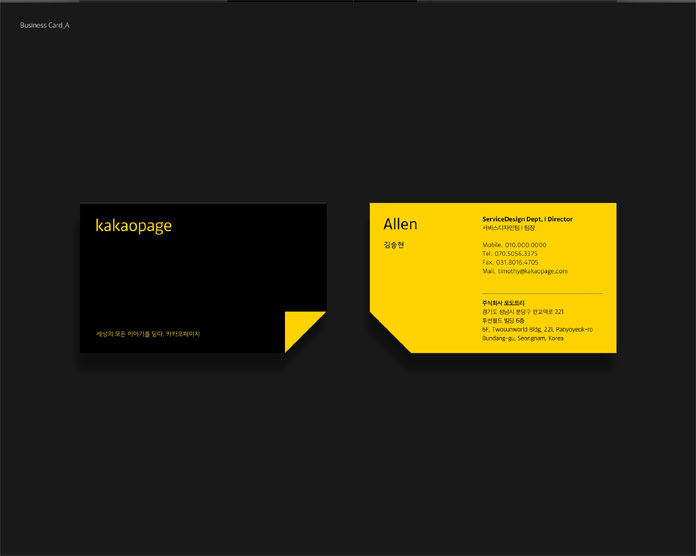
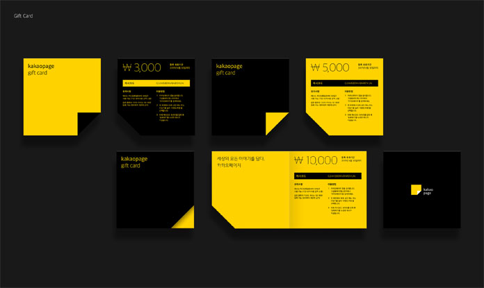
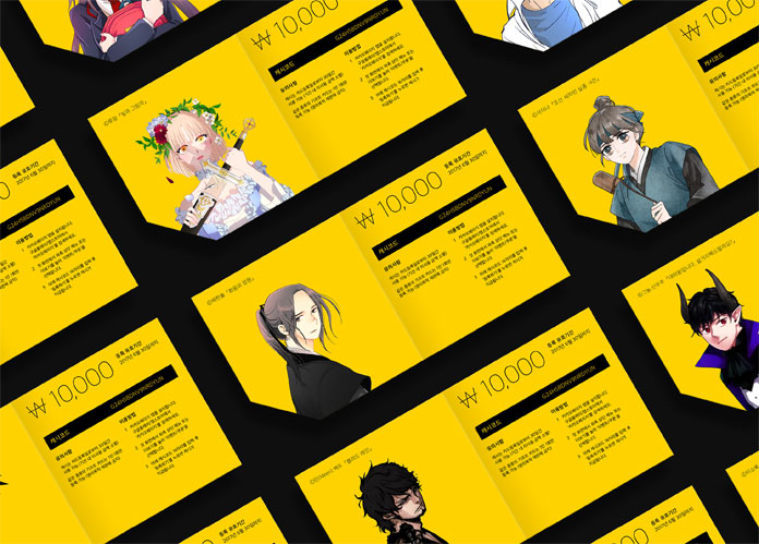

All images © by Korean graphic design studio Plus X. Feel free to find more inspiration in our popular Graphic Design, Branding, and Web Design categories.

