
This post contains affiliate links. We may earn a commission if you click on them and make a purchase. It’s at no extra cost to you and helps us run this site. Thanks for your support!
Gilway Paradox: The Font That Dances? Unpacking Art Grootfontein’s Rhythmic Typeface
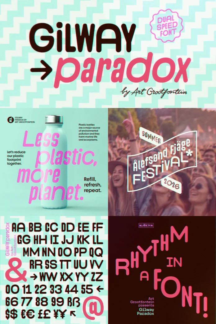
Have you ever looked at a typeface and felt an actual rhythm? A sense of movement? It’s a rare quality. Yet, the Gilway Paradox font family, crafted by the talented Art Grootfontein, brings exactly this to the design table. This isn’t just another collection of letters. Oh no. This typeface is an experience. It’s a versatile, beautifully rounded typeface where a feeling of warmth quite literally meets dynamic motion. Imagine your words not just sitting on a page, but gently swaying, inviting the eye to follow their lead. That’s the initial impression Gilway Paradox offers.
You can purchase the entire family from the following platforms:
This font family is making waves, and for good reason. Its most striking feature? Characters are presented in two distinct widths. Now, you might be thinking, “Two widths? How does that work?” Brilliantly, as it turns out. This dual-width system isn’t a gimmick. Instead, it’s the very heart of Gilway Paradox, allowing it to generate an irresistible visual cadence. This rhythm injects a vibrant, dynamic energy into any design it graces. Think about the possibilities for a moment. How could such a feature transform your next project?
You can purchase the entire family from the following platforms:
What Sets Gilway Paradox Apart in the Typographic Landscape?
The world of typography is vast. Thousands of fonts compete for attention. So, what makes Gilway Paradox so special? It’s the thoughtful design philosophy of Art Grootfontein embedded within its curves and lines. The typeface embodies a unique blend of playfulness and sophistication. Its rounded forms exude friendliness and approachability. Yet, there’s an underlying structure that speaks to a refined aesthetic. This isn’t about being loud for the sake of it. Rather, this typeface achieves impact through its clever construction and inherent charm.

Consider the name itself: Gilway Paradox. The “paradox” might lie in how something so structured, with two defined widths, can feel so fluid and organic. Or perhaps it’s how a single font family can be both playful and deeply professional. It invites you to explore these contrasts. This font encourages a designer to think differently about how text can contribute to the overall feel and message of a piece. It challenges the notion of static text, pushing it towards a more active, engaging role.
The Two-Width Wonder: Crafting Visual Rhythm using this Typeface
Let’s talk more about those captivating dual widths. This is where the magic of Gilway Paradox truly comes alive. Picture this: within the same font family, you have access to characters that are, by design, either standard or slightly narrower/wider (depending on the specific implementation of “two widths” by Art Grootfontein, but the effect is a variation that creates rhythm). This isn’t about arbitrarily stretching or squeezing letters. Instead, each character is meticulously designed in both its forms to maintain harmony and legibility.
The result? A visual beat. A gentle ebb and flow across your lines of text. This creates a subtle, yet powerful, dynamic. It makes the text feel alive, almost like it’s breathing. And the best part? Art Grootfontein has integrated this feature seamlessly. Thanks to OpenType capabilities, designers can often switch between these widths with incredible ease, sometimes with just a single click. This opens up a universe of creative possibilities. You can emphasize certain words, create interesting textural patterns, or simply lend a unique character to your typography that sets it apart. Have you ever wished your text could do more than just convey information? With Gilway Paradox, it absolutely can. It can tell a story through its very form.
Gilway Paradox in Action: A Universe of Applications
A font’s true test is its versatility. Can it adapt to different needs? Can it shine in various contexts? For Gilway Paradox, the answer is a resounding yes. It was truly designed for impact, making it a powerful ally for a wide array of design projects.
Imagine this typeface shaping a new brand’s identity. Its warmth and unique rhythm can create a memorable and approachable logo. Think about its application in editorial layouts. Those dual widths could bring a sophisticated yet playful energy to magazine headlines or pull quotes, guiding the reader’s eye with its gentle cadence. Packaging designers, are you listening? Gilway Paradox could make product names and descriptions pop with personality, standing out on crowded shelves.
And what about the fashion and beauty industries? These sectors thrive on aesthetics and distinction. The refined yet characterful nature of the Gilway Paradox font family makes it an ideal choice for campaigns, lookbooks, and online stores that want to convey a sense of modern elegance with a touch of whimsy. The font’s ability to be both contemporary and timeless gives it broad appeal. Using Gilway Paradox for branding projects could be the key to a fresh, engaging identity. Similarly, incorporating Gilway Paradox in editorial design might just be the unique touch your publication needs.
Exploring the Full Spectrum: Gilway Paradox Weights, Styles, and Global Reach
The Gilway Paradox family doesn’t just stop at its innovative dual-width feature. It offers a well-rounded suite of options to meet diverse design requirements. You get three distinct weights: Light, Regular, and Bold. Each of these weights is also accompanied by a beautifully crafted italic version. This range allows for a rich typographic hierarchy and expressive potential.
The Light version of Gilway Paradox offers a delicate, airy feel, perfect for more subtle applications or when a touch of elegance is required. The Regular weight is your workhorse – balanced, legible, and infused with that signature rhythmic quality. Then, the Bold weight steps forward to make a statement, providing emphasis without sacrificing the font’s inherent warmth and rounded charm. Each style, whether roman or italic, maintains that playful yet sophisticated tone that defines Gilway Paradox.
Beyond its aesthetic appeal, Gilway Paradox is also a truly global font. It boasts support for over 30 languages. This includes major European languages, ensuring wide usability across the continent. But it doesn’t stop there. Its reach extends to include Afrikaans, Swahili, Filipino, and Zulu, among others. This impressive language support makes this typeface an excellent choice for international projects and brands looking to communicate with a diverse global audience. What project wouldn’t benefit from such accessible and stylish Gilway Paradox font styles?
Why Gilway Paradox Truly Shines in Today’s Design World
In a digital age saturated with visual content, standing out is more important than ever. Generic solutions fade into the background. This is where Gilway Paradox, by Art Grootfontein, makes its mark. It’s not just different; it’s thoughtfully different. Its unique dual-width system isn’t a fleeting trend. Instead, it’s a functional design feature that adds genuine value and visual interest. This characteristic alone makes this font family a memorable choice.
Many contemporary fonts aim for neutrality. While useful, they can sometimes lack personality. Gilway Paradox dares to be characterful. It has an opinion. It brings a distinct voice to the visual conversation. The way it balances its rounded, friendly forms with a sophisticated rhythmic quality offers a fresh perspective. It’s this balance that prevents it from being pigeonhole. It can be fun, elegant, modern, and warm. This adaptability, rooted in a unique core concept, is one of the unique features of Gilway Paradox font that designers are quickly coming to appreciate. When you ask yourself why choose this typeface for your next design, the answer often lies in its ability to inject life and a subtle, engaging energy that few other typefaces can match.
Getting Creative with Gilway Paradox: Tips and Ideas
Feeling inspired by the potential of Gilway Paradox? Wondering how you might harness its unique qualities in your own work? The beauty of this Art Grootfontein creation lies in its invitation to experiment. The dual-width feature, easily accessible via OpenType, is your playground. Try alternating widths within a headline to create an unexpected emphasis. Use it to add texture to a block of text, making it more visually inviting.
Consider the emotional impact. The warmth of this typeface lends itself well to brands that want to appear friendly and human-centric. Its inherent rhythm can be a fantastic tool for storytelling, subtly guiding the pace at which information is consumed. Don’t be afraid to pair it with imagery that complements its dynamic nature. Think flowing lines, organic shapes, or even abstract motion. For those looking to use Gilway Paradox font effectively, the key is to embrace its rhythmic potential rather than shying away from it. Explore how the different weights – Light, Regular, and Bold – interact with this feature.
You might be wondering, “Where can I get the Gilway Paradox font?” A quick search for “Art Grootfontein Gilway Paradox” will likely lead you to reputable font foundries or marketplaces where this gem is available. Investing in a quality typeface like Gilway Paradox is an investment in the distinctiveness and impact of your design work.
The Last Word on Gilway Paradox (For Now)
The Gilway Paradox font family is a design tool that encourages creativity and imbues text with an uncommon vitality. Art Grootfontein has given the design world something special here – a typeface that feels both innovative and timelessly appealing. Its signature dual widths create a visual rhythm that’s hard to ignore and even harder not to love. Combined with its versatile weights, extensive language support, and that unique blend of warmth and sophistication, Gilway Paradox stands ready to elevate a vast range of projects.
So, the next time you’re looking for a font that does more than just sit pretty, a font that brings energy, personality, and a touch of magic to your designs, remember Gilway Paradox. Could this be the typeface that finally lets your words dance across the page? There’s only one way to find out.
You can purchase the entire family from the following platforms:
Feel free to find other trending typefaces in the Fonts category here at WE AND THE COLOR. Our reviews will help you to find a wide range of outstanding typefaces.


