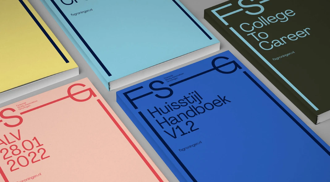
Have you ever wondered what goes into creating a brand that truly resonates with its target audience? Especially one that needs to capture the attention of a vibrant, discerning group like university students? Groningen, Netherlands, a city teeming with youthful energy and a massive student association presence, presented just such a challenge. Now, imagine the task of crafting a brand identity for a new student association, one formed by merging two existing groups. It requires a delicate balance of professionalism, approachability, and a touch of fun. This is precisely what Dutch design studio Buro Reng accomplished with their branding project for FSG – the Financial Study Association Groningen.
A City Built on Students: The Context for FSG
Groningen isn’t just any city; it’s the student city of the Netherlands! A staggering 25% of its 230,000 residents are students, making it the youngest city in the country. This creates a unique environment where student associations thrive, offering opportunities for academic enrichment, networking, and, of course, socializing. Seeing the potential in this environment, student associations R!SK and PM joined forces to create the Financial Study Association Groningen, which is what FSG stands for.
Bridging the Gap Between Academia and the Working World
FSG aims to bridge the gap between academic life and the professional world. The student association offers a platform for students to connect with companies, participate in assessment training, develop their skills, learn from peers, and, importantly, have a good time. Buro Reng’s challenge was to create a brand that reflected this unique blend of professionalism and social engagement. How do you visually represent an organization that’s equally at home in a boardroom and a pub?

The Buro Reng Approach: Focus on Distinction
Buro Reng, founded by Pascal Rumph and Hans Gerritsen, is a design studio obsessed with its craft. They thrive on experimentation, analysis, and, above all, creating exceptional work for their clients. For the student association FSG project, they collaborated closely with Annemarie and Hendrik from FSG’s board, using their proprietary “MerkKompas” (Brand Compass) methodology. The core focus was identifying and highlighting what makes FSG truly distinct from other student associations. What is the value proposition that made FSG different?
Empowering Students: A Brand They Can Build Themselves
Here’s where the FSG project gets really interesting. Unlike many branding projects where the design studio handles all the implementation, FSG’s student association team would be responsible for executing the brand identity themselves.
Buro Reng created a comprehensive brand style guide, providing clear guidelines, examples, and digital assets. This empowers the students to maintain brand consistency across all their communications. Think of it like giving them the keys to the design kingdom, ensuring they can confidently and accurately represent FSG. While the students manage the brand, it’s also reassuring to know that Buro Reng is just a phone call away.
Why This Branding Matters: Beyond Aesthetics
A brand is more than just a logo and colors; it’s the visual embodiment of an organization’s values, mission, and personality. In the competitive landscape of Groningen’s student association scene, a strong, well-defined brand is crucial for attracting members, building credibility, and achieving its goals. Buro Reng has provided FSG with the tools to do just that. The quality of this work will determine the future of the FSG student association.
Key Takeaways: Lessons from the FSG Branding Project
- Collaboration is Key: The success of the FSG project hinged on the close collaboration between Buro Reng and the FSG board.
- Empowerment Matters: Giving clients the tools and knowledge to implement their brand is a powerful approach.
- Authenticity Resonates: A brand that accurately reflects an organization’s values will always connect more deeply with its audience.
The FSG branding project by Buro Reng is a testament to the power of thoughtful design and strategic thinking. It’s a prime example of how a brand can be more than just a visual identity; it can be a catalyst for growth, connection, and success. This is the key to making the student association a success in the long term.
Any footage © by Buro Reng. Don’t hesitate to browse WE AND THE COLOR’s Graphic Design and Branding categories for more inspiring projects.
Subscribe to our newsletter!

