Practice, a creative brand-building studio based in New York, has managed to develop something remarkable for Clarify Health. Their recent rebrand brings architectural precision and visual clarity to a field known for its complexity. Here’s how Practice reshaped Clarify’s identity into a beacon of innovation for the healthcare industry.
Building a Foundation for Change
Clarify Health, a leader in healthcare analytics faced a familiar challenge: rapid growth leading to a sprawling, hard-to-navigate portfolio. Practice turned this obstacle into an opportunity, reimagining the brand’s structure as a modular system of “building blocks.” Each solution became a distinct, intuitively named component that could be stacked and customized to fit clients’ needs.
This conceptual foundation extended seamlessly into the visual identity. The new system reflects Clarify’s ethos of balancing financial performance with exceptional patient care.
Visual Identity: Architecture Meets Innovation
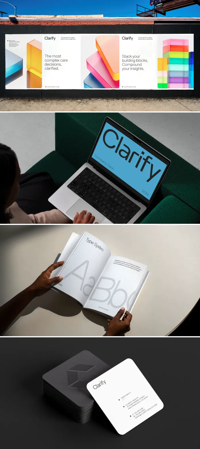
Practice’s approach to the visual system is rooted in architectural design. The brand employs a technical typeface, vibrant colors, and sleek 3D graphics. These elements work together to make Clarify’s capabilities approachable and engaging.
A standout feature is the clever integration of the building block motif. From the hidden block in the “i” of the logo to the modularity in the overall graphic system, this motif reinforces Clarify’s core narrative.
Senior Designer Rohan Chaurasia described how the design system evolves: “We represented a single block as a square, which could shape-shift, multiply, and extrude depending on the context. This concept informs everything, from the logotype to dynamic web experiences.”
A Platform That Speaks Volumes
Clarify’s AI-powered Atlas Platform received its own sub-branded identity within the rebrand. Practice brought abstract data to life, transforming complex insights into tangible, digestible visuals. This effort was reflected in motion graphics and interactive web pages that invite users to explore solutions intuitively.
Rohan Chaurasia highlighted how motion was used to breathe life into the brand. “On the website, scrolling triggers interactive elements, revealing information block by block. These orchestrated sequences guide users through Clarify’s offerings with clarity and purpose.”
Messaging That Cuts Through Complexity
Clarify’s tone of voice complements its visual identity, focusing on simplicity and precision. The copy captures the essence of Clarify’s mission: empowering healthcare providers to make data-driven decisions with ease.
Makisa Bronson, Practice’s Brand Strategist, explained, “We designed Clarify’s messaging to highlight its unyielding commitment to making healthcare decisions clearer. It’s about distilling complexity into actionable insights.”
A Bold Leap for Healthcare Branding
Clarify’s rebrand doesn’t just update its look; it redefines its presence in the healthcare industry. Practice’s thoughtful design choices make a traditionally daunting field accessible and inspiring.
According to Michelle Mattar, Founder and Creative Director of Practice, “We aimed to balance the weight of Clarify’s data-driven expertise with a lightness that invites engagement. The result is a brand that feels future-forward yet approachable.”
Why This Rebrand Matters
Clarify Health’s revamped identity stands out in a space often filled with sterile, impersonal branding. Practice has demonstrated that even B2B brands can have personality and warmth without compromising professionalism.
This rebrand sets a new standard for how analytics-driven organizations can present themselves. It’s not just about data; it’s about empowering organizations to balance doing well financially and doing good for their patients.
With Practice’s innovative approach, Clarify Health now leads not just in analytics but in how they communicate their purpose and value. This is a brand reimagined for today and ready for tomorrow.
All images © by Practice. Feel free to find other inspiring graphic design and branding projects on WE AND THE COLOR or check out this article about current graphic design trends.
Subscribe to our newsletter!


