
This post contains affiliate links. We may earn a commission if you click on them and make a purchase. It’s at no extra cost to you and helps us run this site. Thanks for your support!
Let’s Explore The Mabry Font Family: A Modern Classic of Grotesque & Geometric Sans-Serif
The Mabry Font Family stands at the crossroads of type history and contemporary style. It welcomes both past and future into every letterform.
Mabry Font Family: Origins and Inspiration
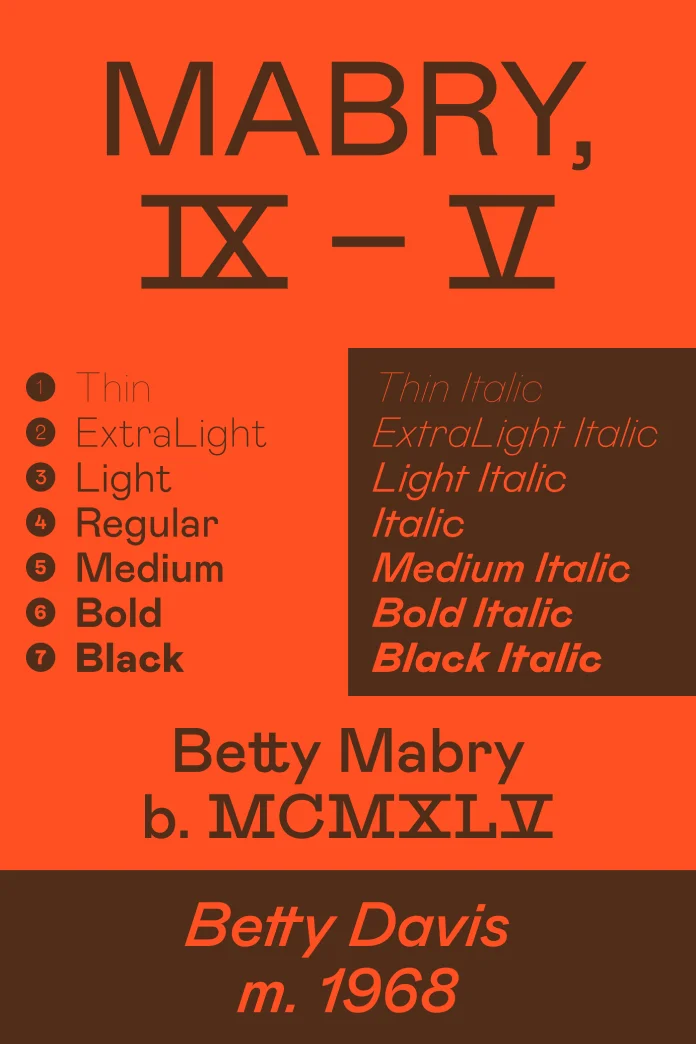
The Mabry Font Family was born in 2014. Colophon Foundry crafted it for Los Angeles’ trendsetting label Nasty Gal. They named it after Betty Mabry’s 1975 funk anthem. Yet, this story goes deeper. It builds on NG Grotesque. Moreover, it carries the spirit of two typeface traditions. Designers blend the warmth of 19th-century grotesques with the precision of early 20th-century geometric sans-serifs. The result? A font that feels both familiar and fresh.
The Dual Nature of Mabry
What makes the Mabry Font Family so compelling? First, it looks solid and direct. At the same time, it hints at a playful wink. The shapes are open. Yet, they can feel mischievous. In certain words, this typeface nudges you forward. In others, it invites a pause to admire its subtle curves. Consequently, it works in headlines and body text alike.
Historical Roots: From Briete to Futura
Old and new collide in a single typeface. Look at Mabry. Its sturdy forms recall Schelter & Giesecke’s 1890s grotesques. On the flip side, it shares geometry with Paul Renner’s 1927 Futura. This mix creates a living dialogue across centuries. Therefore, this typeface anchors your design in type history while pushing it into tomorrow.
Design Details of Mabry Font Family
– Strokes and Stress: Nearly monolinear, with slight modulation. It nods to calligraphic roots.
– Counters: Generous open spaces. They ensure clarity at small sizes.
– Terminals: Subtle flares that break the strict geometric mold. They add warmth.
– Weights: Twelve in total, from Light to Black. Each cuts a precise silhouette.

Those tiny terminal flares give a human touch. They prevent Mabry from ever feeling sterile.
Using the Mabry Font Family in Your Projects
Where does Mabry shine?
- Editorial Design: Its range of weights guides readers through long texts.
- Branding: It balances authority with approachability.
- Web Design: The family’s open counters improve legibility on screens.
- Packaging: Its gestures add flair to product names.
Could Mabry be the secret ingredient your next project needs? Many look to pure geometry for clarity. Yet, some feel cold. Others chase the drama of grotesques but lose modern polish. The typeface balances both. It offers structure without rigidity. It adds personality without excess. Consequently, your headlines stand tall. Meanwhile, your body text flows with ease.
Case Study: Mabry in Action
Consider a lifestyle magazine. Mabry headlines grab attention. Its lightweight carries captions. Moreover, its italics add a dynamic voice. Readers feel guided, not lectured. They stay, read, and share.
Tips for Best Results
- Pair Wisely: Combine the typeface with a serif for contrast.
- Mind the Space: Let its generous x-height breathe.
- Weight Play: Use heavier styles for emphasis, lighter ones for nuance.
Pairing Mabry with a classic serif like Georgia creates a surprisingly harmonious contrast.
The Mabry Font Family invites conversation. It doesn’t just display words. This typeface lends them character and adapts to countless contexts. Moreover, it roots itself in tradition without losing its avant-garde edge. For designers craving a typeface that balances dualities—objective and subjective, refined and raw—this typeface delivers.
Feel free to find other trending typefaces in the Fonts section here at WE AND THE COLOR. In addition, feel free to take a look at our selection of the top 50 fonts for 2025.
Subscribe to our newsletter!


