This post contains affiliate links. We may earn a commission if you click on them and make a purchase. It’s at no extra cost to you and helps us run this site. Thanks for your support!
The Cringe Gothic Font Family is the Perfectly Imperfect Typeface for a Post-Cringe World
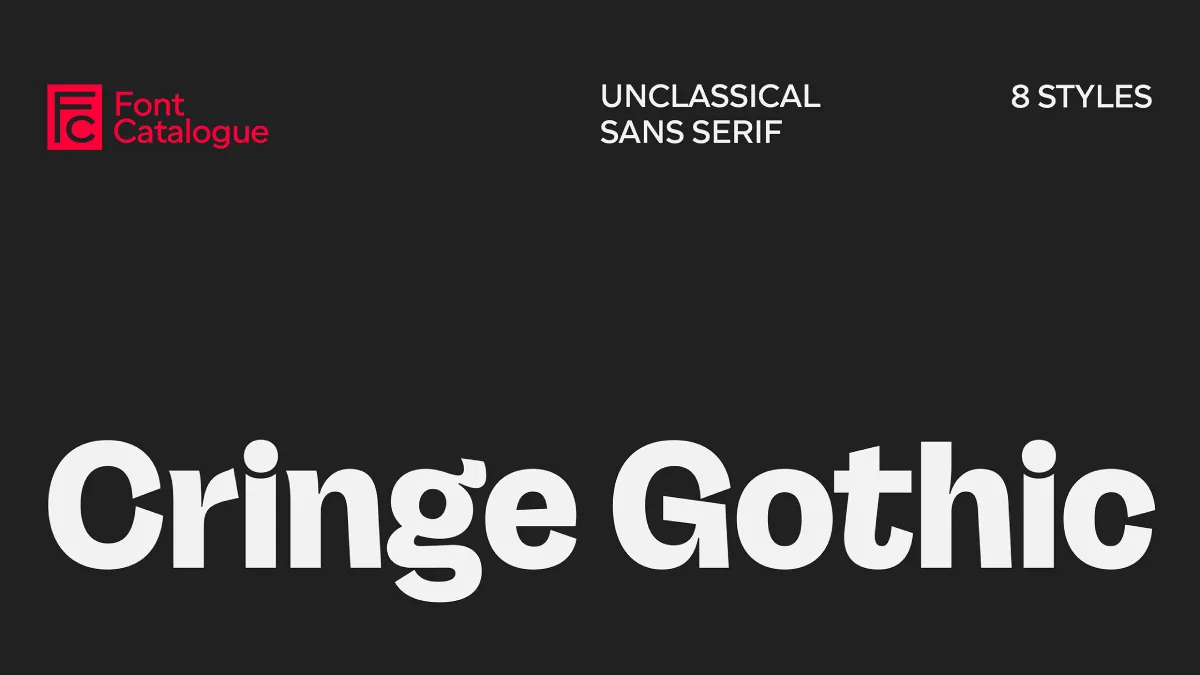
Flawless perfection, once the gold standard, now often feels manufactured and suspicious. This has paved the way for a new design ethos—one that embraces the awkward, the raw, and the endearingly absurd. Capturing this precise sentiment is Cringe Gothic, a typeface by Font Catalogue that masterfully turns typographic discomfort into a compelling and versatile design tool. This isn’t just another font; it’s a statement for brands ready to embrace vulnerability over veneer, and honesty over hype.
The Cringe Gothic font family arrives at a timely moment, reflecting a broader cultural shift. We are moving into a “post-cringe” era, a concept that re-evaluates what was once considered embarrassing and instead finds authenticity and connection in the awkward. This font is the typographic embodiment of that movement, a grotesk with a wink, not a smirk.

What is Cringe Gothic? A Study in Intentional Awkwardness
At its core, Cringe Gothic is a grotesque sans-serif font family. But to label it as such is to tell only half the story. Its designers—Luciano Vergara, Jorge Cisterna, Daniel Hernández, and Ale Navarro—have imbued it with a unique personality. The font features curves that flirt with a deliberate clumsiness and terminals that seem to question the very logic of typography. The result feels like a mistimed smile or an off-key note in a beloved song: at once uneasy and endearing, and just a little bit absurd.
Despite its quirky exterior, Cringe Gothic is a robust and surprisingly versatile design. The family boasts eight weights, ranging from a delicate Light to a commanding Extra Black, making it suitable for a wide array of applications. Its solid and compact foundation means that beneath the schlocky surface lies a highly functional typeface.
Key Features of the Cringe Gothic Font Family:
- Expressive and Unconventional Forms: The exaggerated shapes and wide apertures give the font a playful, almost meme-like quality, making it a visual manifesto for a new aesthetic.
- Versatile Weight Range: With eight distinct weights, it functions equally well for impactful headlines and legible text within complex design systems.
- Solid and Compact Design: Beneath the surface-level awkwardness lies a well-structured and thoughtfully crafted typeface built for performance.
Why It Works: The Rise of the Post-Cringe Aesthetic in Branding
The brilliance of Cringe Gothic lies in its understanding of contemporary communication. Perfection is no longer the pinnacle of branding. Instead, audiences are drawn to authenticity, even if it’s a little messy. This is the heart of the “post-cringe” aesthetic. It’s a style that embraces the weird, the emotional, and the off-kilter as a new form of honesty.
What does it mean to be “post-cringe”? It signifies a cultural shift away from the fear of embarrassment. It’s an acknowledgment that in a world saturated with polished online personas, there is power in vulnerability and self-aware awkwardness. Brands that adopt this mindset are signalling that they are relatable, human, and not afraid to be “perfectly imperfect.” Consequently, Cringe Gothic provides the ideal voice for this approach.
Consider how expressive fonts are changing brand identity. A unique typeface can make a brand instantly recognizable and communicate its tone and values in a fraction of a second. This particular font is designed for brands that want their voice to sound playful yet bold, approachable yet distinctive.
How to Use Cringe Gothic Effectively
The versatility of the Cringe Gothic font family means it can be applied in numerous contexts. Its expressive nature makes it a powerful tool for designers looking to create memorable and engaging work.
For Impactful Headlines and Branding
The heavier weights of Cringe Gothic—like Black and Extra Black—are perfect for headlines that demand attention. Their exaggerated forms create a strong visual presence, making them ideal for logos, posters, and website heroes. Imagine a fashion brand that celebrates individuality or a tech startup that wants to appear more human and less corporate; Cringe Gothic provides the perfect typographic signature for such a purpose.
For Playful and Engaging Design Systems
In its lighter weights, Cringe Gothic is surprisingly readable and can be used for body text or subheadings within a larger design system. Its inherent quirkiness adds a layer of personality to user interfaces, marketing materials, and packaging without sacrificing clarity. This ability to be both expressive and functional is what makes it a true workhorse font for the modern designer.
Long-Tail Applications for a Niche Audience
For designers working on projects that need to connect with a younger, internet-savvy audience, Cringe Gothic is an obvious choice. Its visual language feels native to social media, making it perfect for creating viral-ready graphics, animated typography for videos, and other digital content. Its unique character helps brands stand out in a crowded digital landscape.
The Minds Behind the Font
Cringe Gothic is a product of Font Catalogue, a foundry with deep experience in type design. The design team, consisting of Luciano Vergara, Jorge Cisterna, Daniel Hernández, and Ale Navarro, is seasoned professionals in the typography world. Hernández is a co-founder of the renowned Latinotype Foundry, and the team’s collective experience is evident in the thoughtful construction of the font. Their work demonstrates a keen understanding of how to balance expressive, trend-conscious design with technical quality and usability.
In the final analysis, the Cringe Gothic font family is a cultural artifact that captures the spirit of our time. It challenges our notions of beauty and perfection in typography, offering a refreshing and much-needed dose of humanity. For designers and brands looking to create work that is authentic, engaging, and unapologetically itself, Cringe Gothic is an essential addition to the typographic toolbox. It gives you the license to be a little weird, a little awkward, and ultimately, a lot more interesting.
Feel free to find other trending typefaces in the Fonts category here at WE AND THE COLOR.

