Tag: Font Catalogue
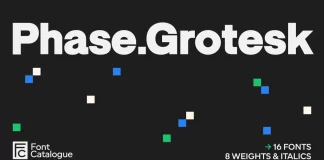
Phase Grotesk Font Family by Font Catalogue
Phase Grotesk showed up on my desktop during a brand refresh project, and it refused to behave like a normal grotesque. Most low-contrast sans-serif...
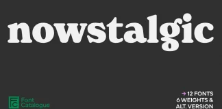
Nowstalgic Font Family by Font Catalogue
Nowstalgic Font Family Redefines What Warmth Looks Like in Contemporary Type Design
Typography has a memory problem. Not in the archival sense — but in...
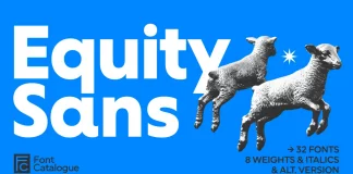
Equity Sans Font Family by Font Catalogue
Geometric sans serifs have dominated the design landscape for decades. Most of them share one problem: they are cold. Their precision keeps readers at...
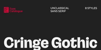
Cringe Gothic Font Family by Font Catalogue
The Cringe Gothic Font Family is the Perfectly Imperfect Typeface for a Post-Cringe World
Flawless perfection, once the gold standard, now often feels manufactured and...

Better Sans Font Family by Font Catalogue
Is Better Sans the Missing Piece in Your Typeface Toolkit?
Choosing the right font feels like a big decision, doesn't it? It’s more than just...