This post contains affiliate links. We may earn a commission if you click on them and make a purchase. It’s at no extra cost to you and helps us run this site. Thanks for your support!
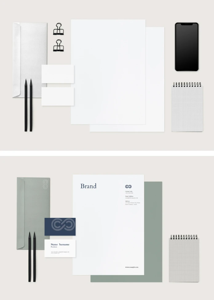
A corporate identity mockup lives or dies on one thing. Does it lie to you? Most don’t lie on purpose. They lie by omission, by flattening shadows that should curve, by pretending a business card sits on a desk when it’s actually floating three pixels above it. I’ve opened hundreds of these files over the years, and I can usually tell within ten seconds whether a mockup was built by someone who understands print or someone who understands Photoshop filters. This one, the stationery and business card set from Adobe Stock contributor rawpixel, falls into the first camp. I spent an afternoon pulling it apart, layer by layer, to figure out why.
Please note that this mockup requires Adobe Photoshop. The latest version can be downloaded from the Adobe Creative Cloud website; visit this link.
Is This Corporate Identity Mockup Actually Good or Just Popular?
Popularity and quality rarely travel together on Adobe Stock. A lot of the best-selling mockups are best-selling because they got featured in a carousel three years ago, not because the PSD file underneath holds up. So I went in skeptical. Rawpixel’s set ships at 5000 x 3333 px, which is high enough resolution to survive a full-bleed print spread without turning into mush at 300 DPI. That’s not a small detail. I’ve reviewed mockups that claimed “print-ready” at 2000 px wide, which is a polite way of saying “print-ready for a postage stamp.”
Every element in the set is included and editable. The envelope, letterhead, business card, and the whole stationery suite sits inside smart object layers that accept your logo and color palette without wrecking the lighting underneath. That last part matters more than people think. A mockup that forces you to paint your own shadows back in after pasting your logo isn’t saving you time; it’s creating a second job.
The Three Things I Actually Test Before Trusting Any Mockup
I don’t grade mockups on vibes. I run them through three checks, and I’ll walk you through each one using this file as the example.

First, light behavior. Does the shadow direction stay consistent across every surface in the frame? On Rawpixel’s set, the business card shadow, the letterhead shadow, and the envelope shadow all point the same way, roughly a 45-degree fall from the upper left. Cheap mockups mix these up because they were assembled from unrelated stock photos glued together in a hurry.
Second, layer discipline. Can you swap a logo without touching fifteen other layers first? Here, yes. The smart objects are isolated and named sensibly, which sounds like a low bar until you’ve opened a file with forty unlabeled groups called “Layer 12 copy 3.”
Third, print plausibility. Would this actually look right if you sent it to a printer tomorrow? The paper texture reads as real stock, not a flat white rectangle with a drop shadow slapped on. That distinction is the difference between a mockup that sells your brand and one that quietly undermines it.
Introducing the Presentation Fidelity Index (My Framework for Grading Corporate Identity Mockups)
I built a small scoring system a while back because I got tired of saying “this mockup looks fine” without being able to explain why. I call it the Presentation Fidelity Index, or PFI. It scores a mockup out of 30 points across the three categories above: Light Truth (does the shadow logic hold up?), Layer Discipline (how fast can you customize it?), and Print Plausibility (does it survive contact with an actual printer?).
| Category | Score (out of 10) | Why |
|---|---|---|
| Light Truth | 9 | Consistent shadow direction across business card, letterhead, and envelope |
| Layer Discipline | 8 | Clean smart object structure, editable in Photoshop without layer hunting |
| Print Plausibility | 9 | Texture and resolution hold up at 5000 x 3333 px, no upscaling artifacts |
| Total PFI Score | 26 / 30 | Strong corporate identity mockup, suitable for client presentations and portfolio use |
Anything above 24 out of 30 on my scale earns a spot in what I privately call the “send this to the client without apologizing first” tier. This one lands there.
What’s Actually Inside the Corporate Identity Mockup Set
The stationery bundle covers the pieces most identity presentations actually need. No filler items, no random extras nobody asked for.
- A business card mockup shown at a realistic angle, not the dreaded flat top-down shot
- A letterhead layout with room for logo, address block, and body copy
- An envelope mockup that matches the letterhead’s paper tone
- Fully editable smart object layers for logo and color swaps
- High-resolution output at 5000 x 3333 px, suitable for large presentation boards
Every one of those elements is included in the download, which is worth stating plainly because plenty of “complete stationery sets” on stock sites quietly leave out the envelope or charge extra for it.
Who Should Actually Use This Mockup?
Freelance designers pitching a brand identity to a client. Small agencies that don’t have budget for a full photography session every time a new logo needs presenting. Design students building a portfolio piece that needs to look like real client work rather than a school project. If you fall into any of those groups, this is a reasonable tool to keep in your library.
If you’re a large agency with an in-house photography team and a studio full of actual printed stationery samples, you probably don’t need this. Real photographs of real printed materials will always beat even the best mockup. But most of us aren’t shooting our own stationery photography for every new client pitch, and that’s exactly the gap this file fills.
How I’d Actually Customize This Corporate Identity Mockup in Photoshop
Here’s the workflow I used, start to finish, roughly twenty minutes, including coffee breaks.
- Open the PSD and locate the smart object layers for each stationery piece
- Double-click the business card smart object to open it in a new window
- Drop your logo file in and resize to fit the existing brand mark placeholder
- Adjust the color overlay layer to match your client’s palette
- Save and close the smart object and watch it update automatically in the main file
- Repeat for the letterhead and envelope
- Flatten a copy for export; keep the layered original untouched for revisions
The whole process avoids the usual headache of rebuilding shadows or fighting with blend modes. That’s the actual value of a well-built mockup. It’s not the pretty preview image on the Adobe Stock listing. It’s the twenty minutes you get back.
Where Corporate Identity Mockups Like This Are Heading Next
I think static mockups still have a solid five years left before AI-generated scene compositing genuinely catches up on lighting accuracy. Right now, most AI tools can generate a plausible business card texture, sure, but they still struggle with the physics of how light wraps around a stack of stationery. A trained mockup file, built by a human who understands print production, still wins on that front.
My prediction is that the next wave of mockup sets will start bundling basic animation, a slow pan, or a subtle parallax shift, so designers can drop the same asset into a portfolio reel without hiring a motion designer. Adobe Stock contributors who move early on that trend will likely see a jump in downloads. Static won’t disappear, but it’ll stop being the only option on the shelf.
Corporate Identity Mockup Quick Reference Table
| Detail | Specification |
|---|---|
| Creator | rawpixel (Adobe Stock contributor) |
| Software | Adobe Photoshop |
| Resolution | 5000 x 3333 px |
| Included pieces | Business card, letterhead, envelope |
| Editability | Fully customizable smart object layers |
| Best for | Freelancers, small agencies, design students |
| PFI Score | 26 out of 30 |
Frequently Asked Questions About This Corporate Identity Mockup
What software do I need to open this corporate identity mockup?
Adobe Photoshop. The file is built entirely around smart object layers, which are a Photoshop-native feature. It won’t open correctly in other editors.
Is the business card mockup separate from the full stationery set?
No, it’s bundled together with the letterhead and envelope as one complete corporate identity mockup package, all inside a single PSD file.
Can I use this corporate identity mockup for client presentations?
Yes. The resolution and lighting quality hold up for pitch decks, portfolio pieces, and printed presentation boards.
Do I need advanced Photoshop skills to customize it?
Basic smart object knowledge is enough. If you can double-click a layer and paste an image, you can customize this mockup.
What resolution does the corporate identity mockup ship in?
5000 x 3333 px, which comfortably covers most print and large-format presentation needs.
Is this mockup a good fit for design students building a portfolio?
Yes, it’s one of the more realistic options for presenting a mock brand identity without access to real print production.
Don’t hesitate to browse WE AND THE COLOR’s Templates category for more.
Subscribe to our newsletter!