Interior design thrives on subtle shifts that shape the way people experience space. In 2026, color capping sits at the heart of this evolution. The technique uses bands of related hues around the upper wall or ceiling to draw the eye upward and frame a room. Many designers note that color capping is poised to eclipse last year’s love of color‑drenching. Designers see the ceiling as the “fifth wall,” and they are transforming it from an afterthought into a canvas for expression. Unlike the heavy saturation of color drenching, color capping celebrates gradual tonal variation. It offers a sophisticated way to introduce color, depth, and warmth without overwhelming a space. This article explores what color capping means, why it resonates with modern homeowners, and how to use it effectively.
What is Color Capping?
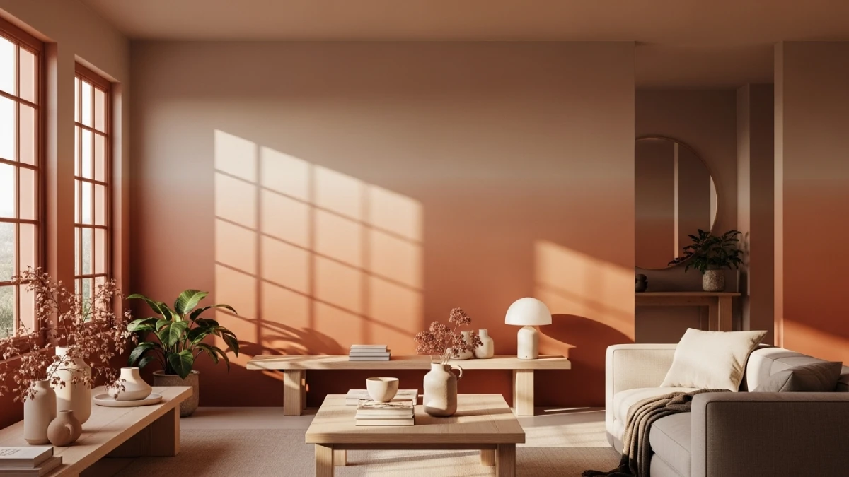
In its simplest form, color capping involves painting the top portion of a wall or the ceiling in a different shade from the rest of the wall while staying within the same color family. The gradient often moves from darker at the bottom to lighter at the ceiling, or vice versa. Design editors describe the approach as using three to five shades from the same palette to create a gentle ombré effect. Rather than one bold tone, the technique relies on subtle tonal shifts that add dimension without the need for moldings or wainscoting. Designers call color capping a softer, more intentional take on color drenching because the color is concentrated on the ceiling and upper walls, gently “capping” the space. When executed thoughtfully, the gradient encourages the eye to travel upward, manipulating perceived height.
Beyond Color Drenching
Color drenching coats every surface in a single hue, creating an immersive cocoon. By contrast, color capping introduces contrast within a limited range. Some design studios note that tonal washes and color capping bring a clearer separation between shades while maintaining softness. Painting the ceiling darker than the walls highlights moldings and increases perceived height. This subtlety makes color capping ideal for rooms that need definition without the commitment of monochrome saturation.
Why Color Capping is Trending in 2026
Emotional Connection to Space
Design trends reflect cultural shifts. The pandemic years made homeowners more attuned to the emotional comfort of their interiors. Many crave warmth, authenticity, and personalization rather than stark minimalism. Color capping aligns with this desire by layering colors in ways that feel bespoke and cocooning. Homeowners want layered, architectural aesthetics that express personality and warmth without committing to a full wall of bold color. The trend speaks to a need for rooms that feel like a hug rather than a sterile showroom.
The Ceiling as a Design Surface
For decades, the ceiling was painted white and ignored. Designers now describe it as the “fifth wall.” Treating it as such elevates the room and reframes proportions. Color capping uses the ceiling or upper wall as a canvas that influences how tall or intimate the space feels. In narrow hallways, a gradient with lighter tones near the top can make the walls appear taller. Conversely, dark caps in rooms with high ceilings can make expansive rooms feel cozier.
A Response to Maximalism
The maximalist revival has flooded interiors with saturated colors, patterned textiles, and eclectic objects. For some homeowners, color drenching felt too intense or chaotic. Color capping offers a bridge between maximalism and minimalism. By restricting color to a band, the technique introduces depth and interest while maintaining visual balance. Designers note that color capping breaks up the impact of a single dominant hue and can help make a room feel larger. Because the palette stays within one color family, the effect remains cohesive even when using bold shades like eggplant or deep emerald.
Alignment With Color Forecasts
Trend forecasters predict rich, earthy, and jewel‑tone palettes for 2026. Trends show that clients request sun‑soaked terracotta, dusty emerald, and periwinkle paired with chocolate brown. Designers also love deep eggplant, moss greens, muted terracottas, and mineral blues. In color capping schemes, these hues often appear as the cap, anchoring the space while lighter tones cover the walls. A moody eggplant ceiling paired with a softer mauve wall can feel grounding and sophisticated. Conversely, a sage ceiling above a pale green wall evokes tranquility. The technique allows homeowners to embrace trendy colors in a controlled way.
Visual and Psychological Benefits
Perception of Height and Space
One of the most cited advantages of color capping is its ability to manipulate perceived height. When the gradient transitions from dark at the bottom to light at the ceiling, the eye naturally travels upward, which tricks the brain into perceiving more vertical space. Conversely, placing a darker band at the top of the wall can make tall ceilings feel more intimate and grounded. The technique therefore works in both small rooms that need visual expansion and large rooms that require coziness.
Highlighting Architectural Details
Because color capping draws attention to the junction between wall and ceiling, it highlights cornices, crown molding, and architraves. Dark ceilings highlight existing cornices and moldings through contrast. In traditional homes with ornate trim, extending the ceiling color onto the crown molding can accentuate the detail. In modern spaces with minimal trim, stopping the cap just below the ceiling creates a crisp horizontal line that feels intentional.
Mood and Atmosphere
Color influences emotion. Deep charcoal, midnight blue, or inky black caps anchor a room with elegance and drama. Warm shades like terracotta, clay, or olive provide intimacy and comfort. By selecting a cap color aligned with the desired mood, you can create spaces that feel expansive, grounded, serene, or playful. Some designers suggest starting the process by considering how you want the room to feel before selecting colors. The gradient reinforces that feeling as the colors transition around you.
Depth Without Visual Clutter
Bold wallpaper or contrasting feature walls can overwhelm a space. Color capping adds visual interest through tonal variation rather than pattern. The subtle gradient creates a sense of depth without cluttering the room. For those hesitant to commit to heavy saturation, this technique offers a test bed for exploring color in measured ways.
How to Achieve Color Capping
Choosing the Right Palette
Selecting a harmonious palette is essential for successful color capping. Experts recommend choosing three to five shades from the same color family. Start with a base color you love and can live with in multiple intensities. Paint strips from hardware stores often display tonal variations that work well together. One designer suggests using tonal variations of the same shade so the cap and wall colors complement each other. For example, a warm off‑white wall capped with a darker beige creates depth without harsh contrast.
Consider trending colors for 2026 when building your palette. Rich eggplant, moss greens, muted terracottas, and mineral blues add drama and earthiness. For a calmer effect, choose light, muted blues or greens to enlarge the space. If you want vibrancy, pair a burnt orange cap with a softer peach wall. The key is to ensure the colors are tonal variations rather than unrelated hues.
Preparing and Planning
As with any painting project, careful preparation yields professional results. Experts advise starting with clean, smooth walls and filling any holes or cracks. Because tonal transitions highlight imperfections, sanding and priming become more important than with single‑color walls. Next, map out the color bands. Divide the wall into three to five horizontal sections using a level and painter’s tape. For standard ceilings, three or four bands create a balanced gradient. Precision matters; Experts emphasize that clean lines and proportion are critical and sometimes require a skilled painter.
Painting Technique
The order in which you apply colors affects the outcome. Start with the lightest shade at the top and work downward. Overlapping darker paint over lighter makes corrections easier. For crisp lines, remove painter’s tape while the paint is still slightly wet. If you prefer a blended transition, use a dry brush or sponge to soften the edges before the paint dries. Designers note that color capping often extends from the ceiling down onto the upper part of the walls, but this isn’t mandatory. In traditional rooms with ornate moldings, extending the darker shade onto the molding can feel appropriate; in modern spaces, capping only the ceiling creates a minimalist line.
Hiring a Professional vs. DIY
Although color capping appears straightforward, achieving perfect lines and balanced proportions can be challenging. Experts warn that precision is critical and recommend hiring a skilled painter if your budget allows. However, experienced DIYers can succeed with careful planning, quality tools, and patience. Using a laser level to mark lines ensures consistency. Practice blending techniques on a sample board before tackling walls.
Where and When to Use Color Capping
Room Types
Almost any room can benefit from color capping. Narrow hallways and entryways feel wider and more welcoming when a gradient draws the eye upward. Bedrooms, libraries, and dining rooms gain intimacy and sophistication from dark caps that envelop occupants. In large, high‑ceilinged spaces, a dark cap lowers the ceiling visually and fosters coziness. For small rooms, a lighter cap makes the ceiling appear higher and opens the space.
Architectural Considerations
The presence of trim and moldings can influence how you color cap. Substantial crown molding emphasizes the cap and frames the room. If your room has minimal trim, consider bringing the cap down a few inches onto the wall to create a defined line. Avoid color capping in spaces with many windows or architectural details that might compete with horizontal bands. Instead, use the technique on smooth walls where the gradient can shine.
Furniture and Accessories
To create a cohesive look, carry the cap’s deeper tone into upholstery, textiles, and accessories. A velvet sofa in the ceiling shade or pillows echoing the mid‑tone ties the palette together. Conversely, lighter furnishings can reflect the wall color and prevent the room from feeling top heavy. Accessories such as artwork and rugs should complement, not clash with, the color scheme.
Color Capping vs. Other Paint Trends
Double Drenching and Tonal Washes
Designers have experimented with several paint techniques in recent years. Double drenching uses two closely related colors on different surfaces, creating gentle movement and rhythm. Tonal washes bring contrast within the same family for deeper separation. Color capping differs by concentrating contrast at the top of the room. It frames the space rather than immersing it entirely. While double drenching works well in period homes with strong architectural details, color capping offers a versatile option for both modern and traditional settings.
Feature Walls and Color Clusters
Feature walls focus color on one vertical surface, while color clusters paint smaller architectural elements like alcoves or window frames. These techniques create focal points but can sometimes feel disconnected from the rest of the room. Color capping unifies the space by creating a band that travels around the entire room. It draws the eye around the perimeter rather than to a single spot, which can make the room feel more harmonious.
Expert Insights and Predictions
Design professionals see color capping as part of a broader shift toward layered, expressive interiors. Some experts predict that the technique will be one of 2026’s most desirable paint trends because it resonates with homeowners seeking personality and artistry. Another expert advises choosing at least three shades from the same family and selecting light, muted colors if your goal is to enlarge a space. One expert notes that painting the ceiling darker than the walls enhances cornices and increases the perceived ceiling height.
Designers emphasize that color capping should be thoughtful and intentional. Each decision—where the cap sits, how much of the wall it covers, and what hues are chosen—affects how the room looks and feels. Experts advise starting with a clear intention for the space and letting that intention inform color choices. The consensus is that this trend will stick around because it offers both creative freedom and timeless appeal.
Personal Commentary and Final Thoughts
As a design critic and creative editor, this writer appreciates how color capping captures the current mood of interior design. The trend responds to a collective desire for spaces that feel personal, cocooning, and expressive. It balances the appetite for color with the need for visual harmony. By framing the room with a band of related hues, the technique highlights architecture, alters perception, and invites storytelling through color. It also dovetails beautifully with the earthy and jewel‑tone palettes forecast for 2026.
However, color capping requires thoughtful planning. Choosing the right palette and proportions makes the difference between an elegant frame and a jarring stripe. Consider the architecture of your room, the natural light, and the mood you want to evoke. Experiment with samples and be willing to consult a professional if precision is important. In the end, color capping offers a versatile tool for homeowners and designers alike. It invites them to explore color with confidence, transform spaces with minimal effort, and create interiors that feel simultaneously grounded and uplifting.
Feel free to find other inspiring content in the Interior Design category here at WE AND THE COLOR.
Subscribe to our newsletter!

