This post contains affiliate links. We may earn a commission if you click on them and make a purchase. It’s at no extra cost to you and helps us run this site. Thanks for your support!
Sometimes I think that typography moves in cycles. Designers revisit the past, extract what still works, and rebuild it for the present. The Cluster font family by Maksym Kobuzan does exactly that — but more precisely, more honestly, and with a sharper editorial eye than most geometric sans-serifs released in recent years. This is not another neutral grotesque. Cluster occupies a very specific design space: the intersection of late-19th-century utilitarian lettering and mid-20th-century European modernist type systems. That combination produces something rare — a typeface that feels simultaneously historical and forward-looking.
Kobuzan, an independent type designer based in Kyiv, Ukraine, launched his foundry in 2020. Since then, he has built a reputation for typefaces that carry genuine typographic conviction. Cluster is arguably his most ambitious and fully realized project to date. What started as an update to his earlier Klaster Sans quickly grew into something far larger and far more considered. The result is a 36-style family that thinks carefully about spacing, weight, proportion, and purpose — and earns your attention at every size.
What Exactly Is the Cluster Font Family, and Why Does It Matter Right Now?
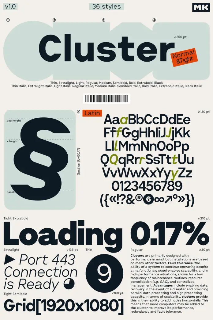
The Cluster font family is a geometric industrial sans-serif with 36 styles, split across two main subfamilies: Cluster Normal and Cluster Tight. Each subfamily contains nine weights — from Thin to Black — plus matching italics. Additionally, a separate and distinct version called Cluster Edge expands the typographic range even further, pushing the family’s defining formal characteristics into more expressive territory.
So why does Cluster matter right now? Consider the current typographic climate. There is a significant appetite for typefaces that feel grounded in real-world function — typefaces that reference technical systems, engineering logic, and pre-digital lettering traditions. Cluster speaks directly to that appetite. Furthermore, it does so without irony or nostalgia. This is a working typeface, not a costume.
The Technical Drawing Aesthetic: A Defined Framework
One of the most distinctive qualities of the Cluster font family is what I call its Technical Drawing Aesthetic — a specific visual character produced by the typeface’s relatively wide default spacing. This spacing creates a text texture that closely resembles the lettering found in technical drawings, engineering diagrams, and early industrial prototypes. Think of dimensioning annotations on an architectural plan, or the label text on a precision instrument. That same rational, open quality appears throughout Cluster.

This is not accidental. Kobuzan calibrated the spacing deliberately. The openness amplifies the sense of clarity and precision in the letterforms. It makes the text read as structured and systematic rather than warm or humanist. Consequently, the typeface immediately signals competence and technical authority — which makes it extremely effective for branding, editorial design, and interface work where that register matters.
Consider how much typographic work gets undermined by inappropriate warmth or softness. Cluster refuses that trap entirely. It reads cold in the best possible sense — controlled, measured, purposeful.
The Cluster Font Family’s Letterform Details: Where History and System Meet
Good typeface design is always in the details. With the Cluster font family, the details are worth examining closely because they reveal the intelligence behind the system.
Mechanical Hooks: The 19th-Century Grotesque Reinvented
Certain letterforms in Cluster reinterpret specific elements from 19th-century grotesque typefaces. The tails of the lowercase a, f, and j are transformed into rigid, near-mechanical hooks. These are not soft curves or calligraphic remnants. They behave as visual anchors — discreet accents that introduce character and a subtle Bauhaus-influenced plasticity into the design.
Crucially, these hooks never disrupt the overall neutrality of the system. They operate like controlled anomalies: just enough personality to make the typeface memorable, not enough to tip it into quirk or novelty. That balance is genuinely difficult to achieve, and Kobuzan manages it with confidence.
I find these details particularly compelling because they suggest a designer who understands history without being enslaved by it. He borrows a formal gesture from an older typographic tradition and translates it into a contemporary industrial logic. The result feels earned rather than applied.
Condensed Capitals: The License Plate Proportion System
Another defining characteristic of the Cluster font family is the treatment of uppercase letters. Compared to the lowercase, the capitals are slightly condensed. This creates a more compact rhythm when text is set in all-caps. More specifically, the uppercase proportions lean toward the lettering found on license plates and road signs — exactly the kind of utilitarian signage that defined mid-century public lettering systems.
This is a deliberate and well-considered formal decision. License plate lettering exists to be read fast, from a distance, and without ambiguity. Therefore, it is stripped of all unnecessary embellishment. Cluster applies that same logic to its uppercase design and, consequently, reinforces the typeface’s utilitarian character at every scale.
The effect becomes especially apparent in display settings. Set Cluster in bold all-caps at large sizes and you will immediately feel that road-sign clarity — controlled, legible, authoritatively geometric.
Cluster Normal vs. Cluster Tight: Understanding the Spacing System
The division between Cluster Normal and Cluster Tight is one of the most thoughtful aspects of this typeface system. Both share the same underlying letterforms and the same nine-weight range. The difference lies entirely in spacing — but that difference produces two meaningfully distinct typographic tools.
Cluster Normal: Structural Clarity at Text Sizes
Cluster Normal maintains the open spacing that defines the typeface’s technical drawing character. This version works best for body text, UI interfaces, editorial captions, and any context where readability at smaller sizes is the priority. The structural clarity of the letterforms remains fully legible because the spacing gives each character room to breathe.
Use Cluster Normal when your primary goal is information delivery. It is direct, efficient, and visually disciplined.
Cluster Tight: Optically Engineered for Large-Scale Typography
Cluster Tight is not simply a compressed version of Cluster Normal. This is an important distinction. Kobuzan carefully revised the spacing to work specifically at large display sizes — the kind of sizes where, if you simply reduce tracking in design software, you get optical collisions, awkward white space, and letterforms that fight each other.
Cluster Tight solves that problem by building optically correct tight spacing directly into the font metrics. The result is display typography that sits naturally close without feeling cramped. This is the version to reach for when designing posters, headers, billboard concepts, packaging, or any context where type needs to read at scale.
This two-version approach reflects a mature understanding of how typefaces actually get used. Most designers, at some point, have manually reduced tracking on a font not designed for it — and watched the results deteriorate. Cluster Tight eliminates that friction by offering a purpose-built solution.
Cluster Edge: When the Hook Becomes the Principle
Beyond the core 36-style family, Cluster Edge operates as a separate but related typographic system. Where Cluster uses the mechanical hooks on specific letterforms as restrained accents, Cluster Edge promotes those hooks to the primary stylistic principle of the entire design.
The result is a more expressive, more characterful typeface that shares Cluster’s underlying DNA but reads with considerably more visual energy. Cluster Edge suits branding contexts where distinction and assertiveness matter more than systematic neutrality. Additionally, the Edge subfamily offers the same Normal and Tight spacing system, with the full weight range and matching italics — making it a complete typographic toolkit in its own right.
Think of the relationship between Cluster and Cluster Edge as a spectrum. On one end: rational, controlled, almost clinical precision. On the other: sharper, more dynamic, more willing to show its industrial teeth. Both are equally designed, equally considered. Your choice depends entirely on what register your project demands.
The Kobuzan Design Philosophy: Precision With Depth
To understand the Cluster font family fully, it helps to understand who Kobuzan is as a designer. Maksym Kobuzan works out of Kyiv, Ukraine — a design culture with a deep engagement with both Cyrillic and Latin typographic traditions. His earlier work, including the original Klaster Sans, demonstrated a consistent interest in geometric weight, industrial character, and structural integrity.
Cluster represents a significant evolution from Klaster Sans. Originally conceived as an update, it grew in scope as Kobuzan pushed further into questions of spacing, proportion, and variant design. The fact that Cluster includes not just multiple weights and italics but a purpose-built tight-spacing variant and a separate Edge subfamily suggests a designer thinking systematically about a typeface’s lifecycle in real-world projects.
That ambition matters. Too many typefaces get released as incomplete systems — a handful of weights, no italics, no consideration for different use cases. Cluster refuses that half-measure approach. It arrives fully equipped.
Practical Use Cases for the Cluster Font Family in 2025
Where does the Cluster font family actually perform best? Let me be specific.
Branding and Visual Identity
Cluster’s technical drawing aesthetic and condensed uppercase proportions make it an excellent choice for brand identities in technology, engineering, architecture, logistics, and manufacturing. It also works well for brands that want to signal precision and rational competence — consultancies, financial firms, research institutions.
The mechanical hooks on the lowercase add just enough warmth to prevent the identity from reading as sterile. That is a useful tension for brand design.
Editorial and Publishing Design
For editorial work — particularly in design, architecture, and technology publications — Cluster Normal’s structural clarity and open spacing make it a strong text face at smaller sizes. Cluster Tight handles display and headline settings at large scales. Together, they give an editorial system genuine typographic range without requiring a second font family.
Interface and Digital Product Design
Cluster’s geometric structure and legible letterforms translate well to UI contexts. Its systematic quality matches the logic of well-designed interfaces. Additionally, the range of nine weights gives UI designers granular control over typographic hierarchy — from fine metadata labels to bold primary actions.
Poster and Display Typography
Cluster Tight Black in all-caps at display sizes is a genuinely striking typographic choice. The condensed uppercase proportions, combined with the tight spacing built into the font, produce a dense, commanding page presence. Furthermore, the Edge variant adds expressive range for more visually aggressive poster work.
Why Geometric Industrial Typefaces Are Experiencing a Design Renaissance
The timing of Cluster’s arrival aligns with a broader cultural shift in typographic taste. Designers are moving away from the hyper-neutral, zero-personality grotesques that dominated the 2010s. There is now a clear appetite for typefaces that carry historical weight, reference real-world systems, and communicate with formal authority rather than studied invisibility.
Geometric industrial typefaces — those that draw on engineering lettering, early modernist sans-serifs, and utilitarian public typography — are central to this shift. They offer historical grounding without nostalgia, formal interest without decoration, and functional precision without sterility. The Cluster font family represents this tendency at a high level of execution.
I would also argue that Cluster benefits from the current interest in Eastern European design culture more broadly. Ukrainian designers have gained significant international visibility in recent years, and the typographic tradition they draw from — one that engages seriously with both Latin and Cyrillic systems, and that has long had a complex relationship with both Soviet modernism and 19th-century European type culture — produces distinctive formal sensibilities. Cluster’s specific combination of industrial character, historical literacy, and systematic rigor reflects exactly that background.
Cluster Font Family vs. Other Geometric Sans-Serifs: A Critical Comparison
How does the Cluster font family compare to other geometric sans-serifs currently available? Let me frame this honestly rather than diplomatically.
Compared to classic geometric grotesques like Futura or Avenir, Cluster is significantly more utilitarian and less humanized. It does not seek elegance or grace. It seeks precision and function. That makes it less versatile in some respects — and more distinctive in others.
Compared to newer geometric sans-serifs like GT America or Neue Haas Grotesk, Cluster reads as more specialized and more typographically opinionated. Those typefaces aim for broad utility. Cluster aims for a specific register and commits to it fully.
Compared to grotesques with strong industrial character — say, Aktiv Grotesk or Bureau Grotesque — Cluster’s spacing system and condensed uppercase proportions give it a more immediately recognizable visual signature. You will know Cluster when you see it.
That recognizability is both an asset and a constraint. Use it for the right project, and it will define your typography with authority. Use it for the wrong project, and it will feel incongruous. Knowing the difference is the designer’s job.
The Spacing Philosophy: A New Framework for Evaluating Typeface Systems
The Cluster font family introduces what I call the Dual-Spacing Framework as a model for evaluating typeface systems more broadly. This framework proposes that any typeface intended for professional use should offer explicit, purpose-built spacing variants rather than relying on designers to manually adjust tracking after the fact.
Manual tracking adjustments in design software create optical problems precisely because they operate mechanically — adding or removing equal amounts of space between all character pairs regardless of visual need. Purpose-built spacing variants, like Cluster Normal and Cluster Tight, solve this by building optically correct spacing directly into the font metrics. The spacing decisions are made by the type designer, who understands the letterforms at a fundamental level, rather than by the graphic designer operating at a visual approximation level.
This is a model the industry should adopt more widely. Cluster demonstrates its value convincingly.
Frequently Asked Questions About the Cluster Font Family
What is the Cluster font family?
The Cluster font family is a geometric industrial sans-serif typeface designed by Maksym Kobuzan and published by his independent foundry, Kobuzan. It spans 36 styles, organized into two spacing variants — Cluster Normal and Cluster Tight — each with nine weights and matching italics. A separate but related subfamily, Cluster Edge, extends the family’s expressive range by making the typeface’s signature mechanical hooks the primary stylistic principle.
Who designed the Cluster font family?
Cluster was designed by Maksym Kobuzan, an independent type and graphic designer based in Kyiv, Ukraine. Kobuzan founded his type foundry in 2020 and has since released a range of typefaces with a consistent focus on geometric structure, industrial character, and typographic precision. Cluster grew out of an earlier project, Klaster Sans, but significantly expanded in scope and ambition during development.
What is the difference between Cluster Normal and Cluster Tight?
Cluster Normal maintains open, generous spacing that emphasizes structural clarity — making it well-suited for body text, UI design, and smaller typographic settings. Cluster Tight features carefully engineered compact spacing designed specifically for large-scale display typography, such as posters, headlines, and packaging. The distinction is important: Cluster Tight is not simply Cluster Normal with reduced tracking applied manually. The spacing in Cluster Tight is built directly into the font metrics to avoid the optical problems that manual tracking adjustments typically create at large sizes.
What is Cluster Edge?
Cluster Edge is a separate subfamily within the broader Cluster typographic system. While the core Cluster family uses mechanical hooks on select letterforms — the lowercase a, f, and j — as restrained character accents, Cluster Edge elevates those hooks to the primary stylistic principle of the entire typeface. The result is a more expressive and visually assertive design that shares Cluster’s underlying geometric structure but reads with considerably more typographic energy. Cluster Edge also offers the full Normal and Tight spacing system across nine weights and matching italics.
What design projects suit the Cluster font family best?
The Cluster font family performs particularly well in branding and visual identity for technology, engineering, architecture, and logistics companies; editorial design for publications focused on design, science, and technology; UI and digital product design requiring clear typographic hierarchy; and poster and display typography where a precision-oriented, industrial character is appropriate. Cluster Tight is the preferred choice for large-scale display settings, while Cluster Normal works best at text sizes and in interface contexts.
How does the Cluster font family relate to Klaster Sans?
Cluster began as an update to Klaster Sans, Kobuzan’s earlier geometric sans-serif. However, the project grew well beyond its original scope during development, evolving into an independent typeface family with its own distinct design logic, spacing system, and formal language. While both typefaces share geometric foundations and Kobuzan’s broader design sensibility, Cluster represents a significantly more mature and systematic approach to the industrial grotesque genre.
Where can you license the Cluster font family?
The Cluster font family and Cluster Edge are available through Kobuzan’s foundry and through major font licensing platforms including MyFonts. Licensing options include desktop, web, app, electronic document, and digital advertising uses. Individual styles are available for separate purchase, and complete family packages are also offered for studios and agencies requiring the full range of styles.
Is the Cluster font family suitable for body text?
Yes — Cluster Normal, particularly in lighter and regular weights, functions well as a body text typeface in contexts where its technical and industrial register is appropriate. The open spacing enhances legibility at text sizes, and the rational letterform structure ensures consistent readability across long-form typographic settings. That said, Cluster is fundamentally a precision-oriented, technical typeface. It will feel too systematic for editorial contexts that require warmth, informality, or expressive humanist character.
Check out other trending typefaces here at WE AND THE COLOR.