
This post contains affiliate links. We may earn a commission if you click on them and make a purchase. It’s at no extra cost to you and helps us run this site. Thanks for your support!
The Chaco font is the friendly giant your designs have been waiting for.
Well, let me introduce you to the Chaco font, a typographic gem from the esteemed TypeTogether foundry. This typeface is a personality waiting to infuse your projects with a sturdy yet incredibly friendly character. If you’re aiming for a design that connects and communicates with warmth and confidence, the Chaco font might just be your new best friend.
Imagine a typeface that feels robust without being intimidating, and approachable without being overly casual. That’s the essence of Chaco. It has this remarkable ability to be both impactful and welcoming. So, what makes this particular font family stand out in the vast universe of typography? And how can it transform your creative work?
Unearthing the Roots: The Story Behind the Chaco Font
The Chaco font family isn’t just a random collection of shapes; it has a story, a soul. It was brought to life by the talented team at Huerta Tipográfica – specifically Sol Matas, with the collaboration of Juan Pablo del Peral and Daniel Roldán. Their creation found a perfect home at TypeTogether, a foundry renowned for its commitment to quality and distinctive typographic voices.
But where does its unique name and spirit come from? The inspiration is beautifully terrestrial: the Chaco National Park in Argentina. Picture vast landscapes, resilient nature, and an unassuming strength. These qualities are artfully translated into the letterforms of the Chaco font. It carries an organic, grounded feel, doesn’t it? This connection to a place of natural power and beauty gives the Chaco font an authentic, almost tangible presence. It’s a display sans serif that feels rooted, genuine, and ready to make a statement without shouting.
Decoding Chaco Font: What Makes It Tick?
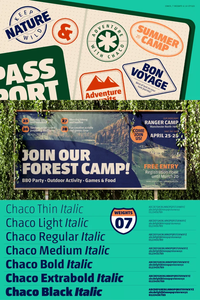
Let’s get a bit closer and examine the DNA of the Chaco font. It’s classified as a display sans serif, meaning it’s designed to shine in larger sizes – think headlines, titles, branding elements, and posters. But what are its defining features?

The Chaco font boasts a sturdy, yet remarkably friendly personality. You’ll notice its low contrast, which contributes to its solid appearance. The letterforms are slightly condensed, allowing for impactful statements even when space is a consideration. What truly softens its robust frame, however, are the subtly rounded corners and open apertures. Do you see how these elements invite the eye and create a sense of warmth? It’s this balance that makes the Chaco font so versatile. It’s strong, yes, but it’s the kind of strength that offers a friendly handshake.
The family typically includes a range of weights, giving you the flexibility to create a clear hierarchy and express different tones within your designs. This allows the Chaco font to adapt, whether you need a bold declaration or a more subtle, supportive heading. Its careful construction ensures it remains legible and impactful, making your message clear and engaging.
Why Designers are Falling for the Chaco Font’s Charm
So, what’s the big deal? Why is the Chaco font capturing the attention of designers looking for something special? Its appeal lies in a potent combination of unique character and practical usability. It’s not just about looking good; it’s about working hard for your design.
One of its greatest strengths is its distinct voice. In a world saturated with generic sans serifs, the Chaco font offers a refreshing alternative. It brings personality without being quirky or difficult to use. Have you ever struggled to find a font that feels contemporary yet timeless, friendly yet professional? Chaco navigates this difficult terrain with ease. It’s perfect for branding projects that want to convey reliability and approachability. Think about eco-conscious brands, artisanal products, or any company that wants to project a sense of authenticity and warmth. The Chaco font helps build that trust and connection.
Furthermore, its performance in display settings is exceptional. Headlines crafted with the Chaco font are not just read; they are felt. They command attention in a gentle, confident way. This makes it a fantastic choice for editorial design, packaging, and impactful website headers. The inherent friendliness of the Chaco font also ensures that even bold statements don’t feel aggressive. It’s like a strong, amiable guide leading the viewer through your content.
TypeTogether: The Curators Behind Typographic Excellence
Understanding the Chaco font also means understanding the foundry that champions it: TypeTogether. Veronika Burian and José Scaglione met during their MA in Typeface Design at the University of Reading, UK, and forged a respectful kinship. They founded TypeTogether in 2006. This independent, cosmopolitan foundry doesn’t just release fonts; it curates typographic solutions designed for intensive use in both digital and print media.
TypeTogether has grown into a core team living worldwide, deeply invested in their daily work, and networked with other type designers who collaborate on specific projects. Doesn’t that global, collaborative spirit sound inspiring? Through their unique, diverse, curated font platform, TypeTogether creates innovative and stylish solutions for significant challenges in the professional typography market. They believe in the power of type to communicate, and their catalog reflects this.
The advantage of being a small, highly specialized company is its ability to work closely with clients. They aim to help clients achieve their goals and respond quickly to their needs. To convey a company’s unique voice across all communications, TypeTogether develops custom type solutions for discerning clients worldwide. Whether it’s creating logos, commissioning a new typeface (like the Chaco font developed by Huerta Tipográfica), modifying existing fonts, or expanding language support, they help brands stand out. TypeTogether crafts cross-platform OpenType fonts of recognized aesthetic and technical excellence, ensuring they remain highly readable even in continuous use. Their internationally award-winning catalog – lauded for its high quality, utility, personality, and ability to capture attention – covers many languages and scripts and is diligently expanded each year. The Chaco font is a perfect example of their commitment to fonts with personality and utility.
Putting Chaco Font to Work: Ideas and Inspiration
Now, how can you harness the unique power of the Chaco font in your own projects? Its versatility opens up a world of possibilities.
Consider using the Chaco font for:
- Branding and Logos: Its distinct yet friendly character makes it memorable and approachable. Could the Chaco font be the face of a new, down-to-earth brand?
- Headlines and Titles: Whether in magazines, websites, or presentations, Chaco commands attention beautifully.
- Packaging Design: It can lend an authentic, artisanal feel to product packaging, especially for organic, natural, or handcrafted goods.
- Poster Design: Make a bold, friendly statement that draws people in.
- Children’s Books or Products: Its inherent friendliness makes it a wonderful choice for materials aimed at younger audiences.
- User Interface (UI) Elements: For apps or websites aiming for a welcoming and clear navigation experience, the selective use of Chaco font for headers or buttons could be very effective.
When pairing the Chaco font, think about contrast. A clean, legible sans-serif for body text or a classic serif could complement Chaco’s display characteristics wonderfully. The key is to let Chaco be the star for those impactful moments. Have you thought about how its slightly condensed nature could help you fit more personality into tighter spaces?
The Lasting Impression of a Thoughtfully Chosen Typeface
The choice of typeface is never just a minor detail, is it? It’s a fundamental decision that shapes perception, conveys emotion, and defines the user experience. The Chaco font offers a compelling option for designers who want to move beyond the mundane and create work that resonates. It’s a testament to how type can be both a workhorse and a piece of art.
With its blend of Argentinian spirit, robust structure, and disarming friendliness, the Chaco font from TypeTogether is more than just letters on a screen or page. It’s an invitation to connect, to engage, and to experience a brand or message with a sense of warmth and authenticity. So, the next time you’re looking for a display font that truly has something to say, will you remember the friendly giant that is Chaco? It might just be the unique voice your design has been searching for.
Feel free to find other trending typefaces here at WE AND THE COLOR or check out our selection of the 50 best fonts to use in 2025.


