
A beautiful bookstore brand identity developed by graphic designer Anastasia Kurilenko.
Anastasia Kurilenko is a Belarusian graphic designer specializing in a great variety of branding projects and logo designs. The talented freelance designer has recently completed this beautiful branding project for a Moscow-based bookstore.
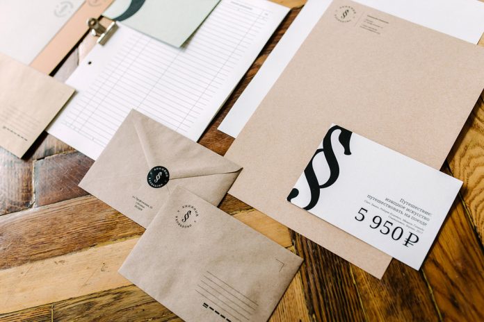
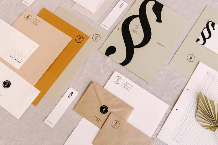
Her proposed logo concept combines a paragraph symbol with the shape of a seahorse. So why did she use precisely the shape of a seahorse? “If you read ‘Konkovo’ in Russian, you might notice that the name consists of the word ‘horse’. That’s why I took the word as a basis, changing it to a seahorse because in its image and shape it looks more like a paragraph,” Anastasia Kurilenko explains.
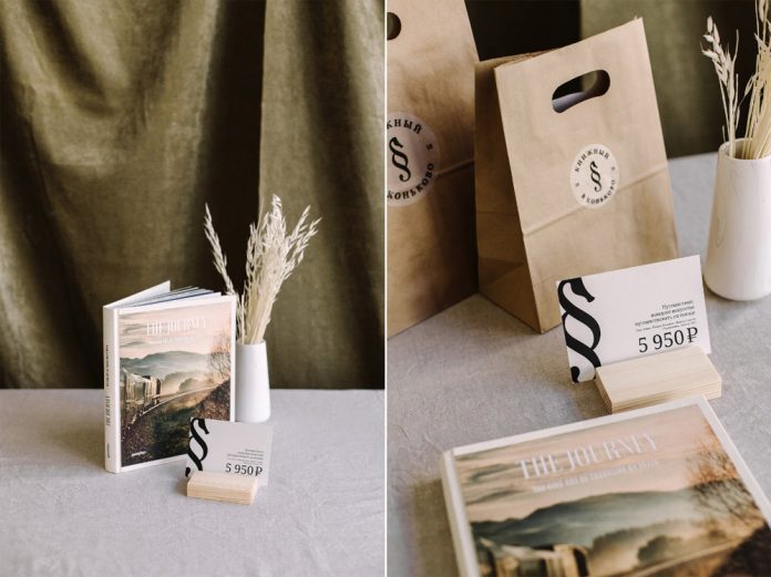
The work also included the development of a stationery system as well as packaging and communication design. Below you can find a few images shot by @polinasharai of studio @artloft.by.


All images © by Anastasia Kurilenko. You can find other inspiring projects in our Graphic Design, Branding, and Packaging Design categories.
Subscribe to our newsletter!


