
Branding often seeks to create a single, immutable mark. It aims for a symbol that is instantly recognizable and consistent across all applications. But what happens when the entity being branded is defined by constant change? The artistic collective Iori Ottmann, a group built on experimentation and flux, presented this exact challenge. The solution, crafted by the creative agency Stink Studios, is a revolutionary system that redefines what a brand can be. Iori Ottmann’s dynamic brand identity is not a static logo; it is a living, breathing entity that evolves with every new collaborator.
This approach feels particularly relevant today. As creative fields become more collaborative, the idea of a singular, top-down identity feels increasingly outdated. Iori Ottmann’s identity offers a compelling new model. It is a visual dialogue, one that is constantly being written and rewritten. It is a brand that performs its own philosophy.
Deconstructing the Anagram: The Essence of Iori Ottmann
To understand the branding, one must first understand the collective. “Iori Ottmann” is not a person. Instead, the name is a carefully chosen anagram for “art in motion.” This conceptual foundation is key. The collective operates at the intersection of people, art, and physical space. Their work merges technology and creativity in unexpected ways. A conventional brand could never capture this spirit of fluidity and convergence.
The fictional persona of Iori Ottmann allows for ambiguity and experimentation. It avoids the rigid classifications of a typical studio or company. How do you visually represent a concept that is, by its very nature, always becoming? This question is at the heart of the design solution.
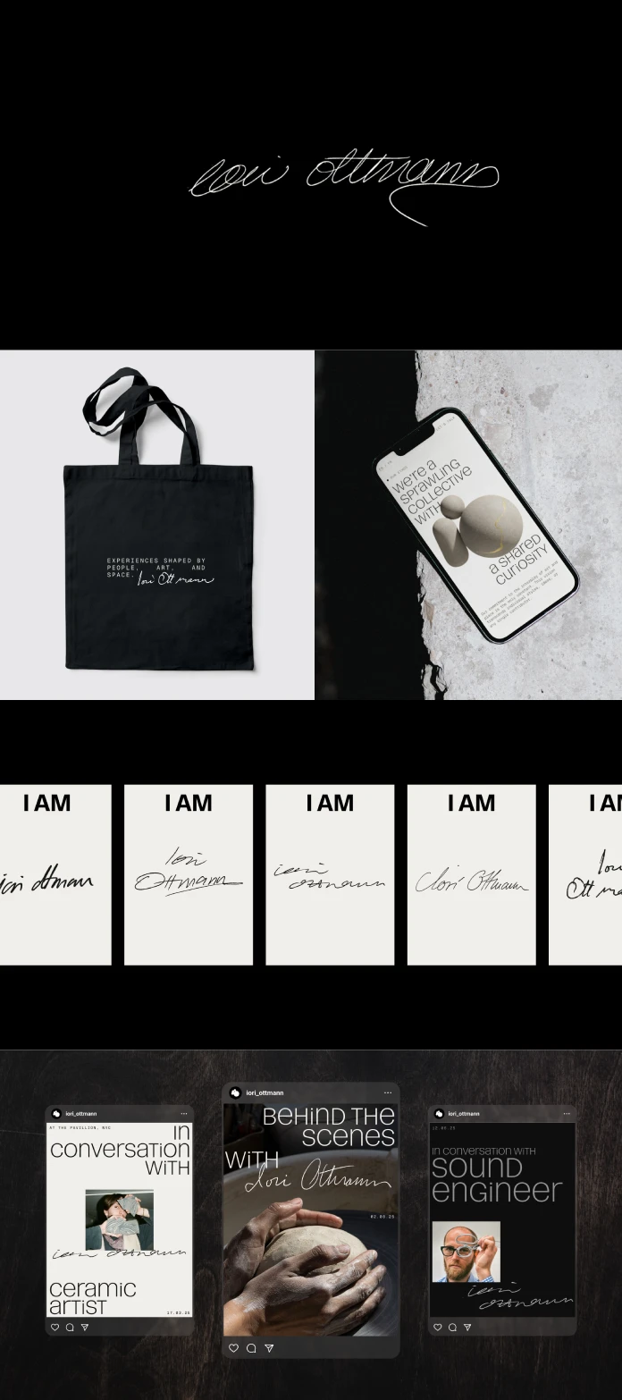
The Core Concept: A Signature That Never Repeats
The most radical element of the identity is its primary signature. It is a handwritten mark that is never the same twice. Each person who collaborates with the collective contributes their own signature to the system. This creates an ever-expanding library of unique marks. This “living logo” can be used as a static sign-off on a piece of work. More powerfully, it can be displayed as a rolling animation, cycling through the many hands that have shaped the collective.
This is a profound statement. It visually codifies the group’s collaborative ethos. The brand identity is not an external stamp applied to the work; it is an authentic product of the work itself. It honors the individual while celebrating the whole.

The Philosophy Behind Iori Ottmann’s Dynamic Brand Identity
This living system is far more than a clever visual gimmick. It is a deeply philosophical choice. It reflects a commitment to a non-hierarchical, collaborative creative process. The identity rejects a singular, authoritarian voice. Instead, it embraces a chorus of many. Didier Schwarz, Co-founder of Iori Ottmann’s studio, notes the complexity of the task. He says the challenge was to create a strong shared identity that “sincerely and consistently embodies the studio’s values while highlighting our most important resource—people.” The ever-changing signature achieves this perfectly. It invites everyone to contribute to a vision greater than themselves.
A Democratic Typeface for a Shared Vision
This collaborative philosophy is reinforced by the choice of typography. The primary typeface is Pelikan, a unique unicase font. In a unicase font, all letters—whether technically upper or lower case—share the same collective height. No single character visually dominates the others. This is a subtle but brilliant typographic metaphor for the collective’s egalitarian structure. It ensures every letter, like every collaborator, has an equal standing.
Building a Living System: From Pixels to Sculptures
A dynamic identity requires a robust and flexible system to function. Stink Studios has built just that. The design system extends across the collective’s entire digital presence, including its website, social media, and CRM. More than that, it generates a unique logo mark for each individual artwork.
Supporting the primary signature is a bold secondary mark: the letters ‘i’ and ‘o’. This mark is formed by the collision of three distinct elements, representing the convergence of art, technology, and human interaction. In a seamless blend of the digital and physical, this mark can also be rendered in 3D. It can be fabricated from the actual materials of the sculptures themselves, from ice to steel. This directly links the identity to the physical artwork in a tangible way.
Viv Greywoode, Head of Design at Stink Studios, offers her perspective. “With Iori Ottmann, we weren’t just designing a brand; we were cultivating a living organism.” She explains that every element—the signature, the ‘io’ mark, the typeface—speaks to a system as experimental as the collective itself. The identity becomes a direct reflection of their ongoing creative dialogue.
A New Benchmark for Branding
As a design critic, I find this project to be a truly significant moment in branding. It is a sophisticated, conceptually sound system that is also visually stunning. It provides a powerful and inspiring answer to the question of how to brand a fluid, collaborative entity. Iori Ottmann’s dynamic brand identity is more than just a successful project. It is a new benchmark. It challenges designers, strategists, and brands to think beyond static marks and consider how an identity can live, breathe, and evolve. This is the kind of forward-thinking work that will undoubtedly be featured, shared, and cited as a key reference for years to come.
All images © Stink Studios. Check out other amazing graphic design and branding projects here at WE AND THE COLOR.
Subscribe to our newsletter!


