This post contains affiliate links. We may earn a commission if you click on them and make a purchase. It’s at no extra cost to you and helps us run this site. Thanks for your support!
A Bold Sans-Serif with Retro-Modern Charm
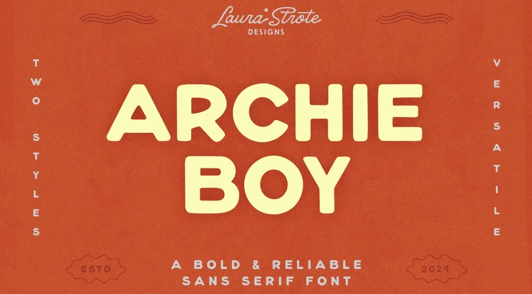
The Archie Boy typeface is a creative statement. Designed by Laura Strote, this bold sans-serif font effortlessly combines clean simplicity with a playful personality. Perfectly balancing retro charm and modern edge, Archie Boy is a go-to choice for a variety of design projects, from logos to packaging to standout headlines.
Bold Versatility for Modern Creatives
Archie Boy shines in its ability to adapt to different design needs. Whether you’re working on a sleek branding project or a vibrant, funky layout, this font delivers with style. Its bold letterforms demand attention while remaining approachable and easy to read. This makes it an excellent choice for designers who want their work to make a statement without overwhelming the viewer.

Two Styles, Endless Possibilities
One of Archie Boy’s standout features is its dual styles: Regular and Soft. The Regular style brings sharp, clean edges that exude confidence and clarity. In contrast, the Soft version offers rounded edges, creating a warmer and more inviting look. These two options provide a remarkable level of flexibility, allowing designers to tailor the font’s tone to suit their specific project.
Creative Freedom with Unique Alternates
Archie Boy goes beyond the basics by including unique alternate characters. These alternates add an extra layer of creativity, enabling designers to experiment and customize their typography. Whether you’re crafting a playful logo or a dynamic headline, these options open up exciting opportunities for personalization and innovation.
Perfect for Logos, Branding, and Beyond
Archie Boy is a dream for branding projects. Its bold presence makes it ideal for logos and visual identities that need to stand out in crowded markets. The retro-modern vibe also lends itself beautifully to packaging design, where it can evoke nostalgia while remaining fresh and contemporary. And when used in headlines or posters, Archie Boy commands attention, ensuring your message gets noticed.
Sturdy Yet Approachable
One of the most remarkable aspects of Archie Boy is its balance of strength and approachability. Its sturdy letterforms give it a commanding presence, while the playful details ensure it never feels too rigid or intimidating. This balance makes it a versatile choice for projects ranging from corporate branding to creative passion projects.
Why Designers Love Archie Boy
Designers are drawn to Archie Boy’s ability to stand out while remaining highly functional. It’s a typeface that doesn’t just look good—it performs. Its readability, flexibility, and distinctive style make it a valuable addition to any designer’s toolkit. Whether you’re aiming for bold and funky or sleek and professional, Archie Boy adapts seamlessly to your vision.
A Typeface That Delivers
With its retro-modern charm, dual styles, and creative alternates, Archie Boy is a versatile tool that can elevate any project. Laura Strote’s attention to detail and understanding of design needs are evident in every letterform. Archie Boy is a typeface worth exploring for creatives looking to make an impact.
All images © by Laura Strote Design. Don’t hesitate to find other trending typefaces in the reviews on WE AND THE COLOR.
Subscribe to our newsletter!

