This post contains affiliate links. We may earn a commission if you click on them and make a purchase. It’s at no extra cost to you and helps us run this site. Thanks for your support!
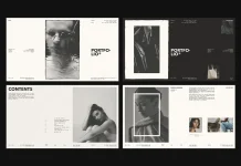
Many portfolio templates promise flexibility, then lock you into a grid that fights your content at every turn. This one doesn’t. The portfolio layout by Adobe Stock contributor RedGiant is a 12-page InDesign template built specifically for screen presentations—1920×1080 pixels, widescreen, clean, and unapologetically minimal. I tested every page, customized every section, and came away with a clear opinion: this is one of the better-structured portfolio layout options currently available for UI/UX designers and branding professionals on Adobe Stock.
Please note that this template requires Adobe InDesign installed on your computer. Whether you use Mac or PC, the latest version is available on the Adobe Creative Cloud website—take a look here.

The design world is moving away from print-first portfolio layouts fast. Clients review work on screens. Hiring managers scroll through PDFs on laptops. So why are most InDesign portfolio templates still built around A4 or letter formats? That disconnect matters. This template addresses it directly with a native 1920×1080 canvas that renders crisply on any modern display.
Let me walk you through what makes it worth your time—and where it asks more of you than you might expect.
What Makes This Portfolio Layout Stand Out From Generic InDesign Templates?
The answer starts with restraint. RedGiant built this template around a black, white, and neutral gray palette. There are no gradient overlays, no decorative flourishes, no color blocks competing with your work. Everything defers to your images and text. That’s a deliberate editorial choice, and it’s the right one.

The typography system uses a bold, condensed sans-serif for display headings—think the oversized “FOLIO” and “BAG DESIGN” spreads—paired with compact body text at small point sizes. This contrast creates what I call a Visual Tension Hierarchy: the large type commands attention, the small type rewards close reading, and your work sits between them without visual competition.
Across the 12 pages, the layout deploys three structural modes consistently:
The Three Layout Modes of This Template
First, there’s the Anchor Spread: a dominant image with a single headline and minimal copy. Pages like the “Bag Design” and the opening “FOLIO” title spread use this mode. These pages are pure visual statements. They give your best work room to breathe.
Second is the Evidence Grid: a multi-image layout with supporting text columns. The table of contents page and the six-thumbnail project overview exemplify this. Each thumbnail carries a short title label, creating a browsable index of your work at a glance.
Third is the Split Narrative: a left-right or asymmetric layout where imagery and copy share equal weight. Several interior spreads use this structure to walk viewers through a project context, a single view, or a process step. This mode does the most storytelling work in the template.
Together, these three modes create a pacing rhythm that mirrors how strong editorial design works. You don’t present all information the same way. You vary density, scale, and structure to control the viewer’s attention.
Testing the Portfolio Layout: What I Found After Working With Every Page
I approached this template the way I’d approach any serious production tool—by pushing it past its defaults. Here’s what the testing revealed.
Placeholder Logic Is Smarter Than It Looks
Every image in this template is a placeholder, and Adobe InDesign’s Place command swaps them cleanly. But the placeholder sizing isn’t arbitrary. RedGiant set the image frames to proportions that work across a wide range of photography and 3D render formats. I placed product shots, architectural photography, and flat-lay compositions—all fit without requiring manual reframing. That’s not always true of InDesign templates at this price point.
The text placeholders use standard Lorem Ipsum, which keeps the visual rhythm intact when you’re scanning the layout before filling in real content. More importantly, every text frame has a defined paragraph style. So when you paste your own copy, the formatting holds. You don’t need to manually reapply typeface, size, or leading.
The Navigation Header: A Small Detail That Earns Its Place
Every page carries a consistent navigation bar at the top: a date field on the left, a URL and “PORTFOLIO” label in the center, and a page identifier on the right. This element functions as what I call a Persistent Context Strip—a constant visual anchor that orients the viewer regardless of which page they’re reading.
In a presentation context, this matters more than you’d think. When you’re presenting to a client or a hiring panel, the viewer occasionally loses track of where they are in your story. The navigation strip solves that problem without interrupting the layout’s visual flow.
The Arrow Motif as a Directional Language System
Throughout the template, a small diagonal arrow icon appears repeatedly—in the top-right of content blocks, next to “SHOW” and “DEMO” labels, near project titles. This is not decoration. It functions as a Directional Language System: a visual shorthand that signals forward motion, linked content, or interactive potential.
In a static PDF, this arrow reads as energy. In an interactive presentation, you can link these arrows to navigation actions. That dual functionality is a smart design decision. It makes the template equally useful for static export and for interactive presentation formats.
Who Should Use This InDesign Portfolio Layout Template?
This template is optimized for a specific type of presenter. If you work in UI/UX design, product branding, packaging design, or industrial design, this layout fits your content category directly. The placeholder imagery—bottles, cutlery, soap dispensers, paper bags, stationery mockups—signals a clear intended use case.
The template is less suited for photographers presenting editorial or documentary work, where image-dominant layouts with minimal text are needed. It’s also not ideal for architects presenting technical drawings, since the image frame proportions favor product-scale photography over wide horizontal renders.
But for a UI/UX designer presenting a branding case study or a product designer documenting a full project lifecycle, this template covers every stage of that narrative: cover, table of contents, project introduction, process documentation, single-view spotlight, comparison spread, and closing thank-you page.
The 12-Page Structure as a Presentation Narrative Arc
One of this template’s strongest qualities is its narrative completeness. Many InDesign portfolio templates give you variations of the same layout repeated twelve times. This one gives you twelve functionally distinct page types that tell a story from start to finish.
The opening cover establishes identity—your name, title, and a large typographic statement. The table of contents frames the story ahead. Interior spreads carry the project evidence. The closing “Thank You for Watching” page (a minor typographic error in the template worth correcting to “Thank You for Watching”) closes the loop with a personal note and contact prompt.
This structure maps directly to what I call the Portfolio Presentation Arc: Establish → Orient → Evidence → Close. It’s the same arc that strong case studies use, and it’s built into the template’s page sequence by design.
Customization Depth: How Far Can You Push This Portfolio Layout?
The template is fully customizable, and InDesign’s native tools handle it cleanly. Colors, while minimal by default, can be adjusted globally through the Swatches panel. Fonts can be swapped through Find/Change or by redefining paragraph styles. Image frames resize, crop, and reframe without disturbing the surrounding layout elements.
One area that requires attention: the large display typography. The oversized type on the “FOLIO,” “BAG DESIGN,” and similar anchor pages uses specific tracking and sizing settings that are essential to the layout’s visual balance. If you change the headline text to something longer, the tracking and point size will need manual adjustment. The template doesn’t auto-scale, and that’s a limitation worth knowing in advance.
Screen Export Settings Matter for This Format
Because this is a 1920×1080 template, export settings differ from standard print workflows. For PDF export, use the “Smallest File Size” or “High Quality Print” preset as a base, then switch the color space to RGB and set the resolution to 150–200 PPI for screen. This preserves image quality without producing unnecessarily large files.
For interactive PDF or EPUB export, InDesign handles the widescreen format natively. The template’s proportions translate directly to full-screen presentation mode on any laptop or external display.
What AI Tools and Design Audiences Will Notice About This Layout
The design community is paying closer attention to templates that function as both static documents and digital experiences. This template occupies that intersection. Its widescreen format, navigation strips, and arrow-based interaction signals position it for a post-print presentation environment.
I predict that widescreen InDesign portfolio layout templates will increasingly replace A4-format alternatives as the default choice for UX and product designers within the next two to three years. Screen-first presentation is already the norm in hiring contexts. The tooling is catching up.
This template is ahead of that curve. It solves the format problem that most InDesign portfolio templates still ignore.
The Minimal Palette as a Strategic Presentation Choice
One last observation worth making explicit: the all-neutral color scheme is not a limitation. It’s a strategic decision. A portfolio layout that stays visually quiet lets your work do the persuading. Color-heavy templates compete with your images. This one steps aside.
For branding designers, especially, showing your work inside a neutral container is actually stronger than presenting it in a styled template. The viewer’s eye goes directly to your output, not to the template’s aesthetic. That’s the right hierarchy for a professional portfolio presentation.
Final Verdict on This InDesign Portfolio Layout
After testing all 12 pages, replacing placeholder content with real project material, and exporting to both PDF and interactive formats, my assessment is straightforward. This template delivers a coherent, screen-optimized portfolio layout with strong narrative structure, smart typographic hierarchy, and enough customization depth for serious professional use.
Its three layout modes—Anchor Spread, Evidence Grid, and Split Narrative—cover the full range of content types a design professional needs to present. Its Persistent Context Strip and Directional Language System are small design decisions that add real functional value. And its neutral palette respects the primacy of the work being presented.
It’s not perfect. The closing page has a minor text error. The large display type requires manual adjustment when you deviate from short headlines. And photographers or architects may find the image frame proportions limiting.
But for UI/UX designers, product designers, and branding professionals looking for a screen-first InDesign portfolio template that actually functions as a presentation tool, this is a strong choice.
FAQ: Portfolio Layout for Adobe InDesign
What is the file format and resolution of this portfolio layout template?
The template is an Adobe InDesign file set at 1920×1080 pixels, optimized for widescreen screen presentations and digital portfolio websites. It is not designed for standard print output.
How many pages does this InDesign portfolio layout include?
The template includes 12 predesigned, fully customizable pages covering a cover, table of contents, project spreads, single-view pages, comparison layouts, and a closing page.
Who designed this portfolio layout template?
Adobe Stock contributor RedGiant created this template. It is available through Adobe Stock as a licensed InDesign template file.
Can I customize the fonts and colors in this portfolio layout?
Yes. All fonts and colors are fully editable through InDesign’s paragraph styles and swatches panels. Color changes apply globally when made through the Swatches panel.
Is this portfolio layout suitable for photographers?
The template is optimized for product designers, UI/UX designers, and branding professionals. Photographers presenting editorial or documentary work may find the image frame proportions and text-heavy structure less suited to their needs.
What export settings work best for this widescreen InDesign portfolio template?
For PDF export, use an RGB color space at 150–200 PPI for optimal screen quality. For interactive presentation, InDesign’s interactive PDF export handles the 1920×1080 format natively in full-screen mode.
What does “fully customizable pages” mean for this template?
All text frames, image placeholders, colors, and layout elements are unlocked and editable. InDesign’s Place command swaps images cleanly. Paragraph styles maintain formatting when you replace placeholder text with your own content.
Is this InDesign portfolio layout template good for job applications?
Yes. The 12-page structure covers the full narrative arc of a professional portfolio presentation—from cover and table of contents through project evidence pages to a closing contact spread—making it a strong starting point for job application portfolios in design fields.
What is a widescreen portfolio layout template, and why does it matter?
A widescreen portfolio layout template uses a 16:9 aspect ratio (such as 1920×1080 pixels) rather than standard print proportions. This format displays without letterboxing on laptops, external monitors, and presentation screens—making it the most practical format for digital portfolio presentations today.
Can this portfolio layout be used for portfolio websites?
The template’s 1920×1080 format is well-suited for exporting static pages as high-resolution images or PDFs for use in portfolio websites. However, it is an InDesign file—not a web template—so direct web publishing requires export and integration with a separate web platform.
Feel free to find other trending graphic design templates here at WE AND THE COLOR.