This post contains affiliate links. We may earn a commission if you click on them and make a purchase. It’s at no extra cost to you and helps us run this site. Thanks for your support!
Geometry is having a cultural moment, I would say. And not in the way graphic design trends usually work—where something peaks, saturates, and quietly disappears. This time, the shift feels structural. Designers across branding, editorial, and event promotion are reaching for abstract vector patterns instead of photographs. They want precision and scalability, and they want work that reads clearly at 6 inches and at 6 feet. This minimalist summer poster design template by Jozef Micic, available on Adobe Stock as a fully editable Adobe Illustrator file, speaks directly to that need.
I tested this template thoroughly—not just opened it and clicked around. Furthermore, I actually worked with it. And I resized it, swapped colors, adjusted the grid rhythm, and ran a print-ready export. So everything you’re reading here comes from direct hands-on experience, not spec sheets.
Please note that this vector template requires Adobe Illustrator installed on your computer. You can get the latest version from the Adobe Creative Cloud website. Just have a look here.
What Makes This Minimalist Summer Poster Template Different From the Noise?
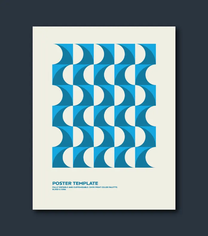
Let’s start with what you actually see. The poster displays a tightly packed grid of curved shapes—arcs and quarter-circles that interlock in alternating orientations. Together, they produce a visual pattern that unmistakably reads as ocean waves. However, the pattern never tries too hard. There are no gradients, no drop shadows, no photographic textures. Just flat geometry doing rhythmic, confident work.
Micic built the design at 8.5×11 inches, the standard U.S. letter format. That decision is practical and intentional. It means the template works straight out of the box for home printing, small-run digital output, and professional offset production. Furthermore, because it’s a vector graphic, you can scale it to any dimension without losing a single pixel of quality.

The Wave-Cell Architecture Framework
I want to introduce a specific analytical term for how this pattern operates: Wave-Cell Architecture. This describes a design structure where individual geometric cells—each internally curved—tile across a grid to simulate fluid motion without using any actual curves at the macro level. The overall shape is rectangular and rigid. But inside each cell, the arc creates directional energy.
Wave-Cell Architecture relies on three visual mechanisms working simultaneously:
- Alternating arc orientation—each cell flips its curve direction, producing visual rhythm across rows
- Color contrast inversion—the two blues in this template interact at cell boundaries to define the edge without a visible outline
- Negative space as motion cue—the cream-colored voids between arcs read as water crests or foam
What makes this architecture elegant is its economy. Micic achieves a complex visual effect with almost no actual complexity. That restraint is a design skill, and it’s one of the first things that stood out to me when I opened the file.
How Does the Color System Work in This Abstract Summer Poster?
The template ships with a CMYK color palette, which immediately signals professional intent. CMYK is the color mode for commercial printing, and many stock templates skip this step by defaulting to RGB. That’s a mistake, and Micic avoids it.
The palette uses two distinct blues. One is a bright, clear cyan-leaning blue. The other sits darker, edging toward a marine or cobalt tone. These two values do most of the visual heavy lifting. They stack side by side in the grid cells, generating depth without requiring any gradient. Additionally, an off-white cream functions as both background and internal negative space, grounding the entire composition.
The Thermal Contrast Principle
Here’s a framework I find useful when analyzing color pairings in flat design: Thermal Contrast. This is my term for the perceived temperature difference between two adjacent colors, independent of their hue. In this template, the brighter blue reads as cooler and more atmospheric. The darker blue reads as weightier, almost grounded. Together, they create a visual temperature gradient—cool on the surface, deeper and more solid underneath—that mirrors the actual experience of looking at ocean water.
That’s not an accident. Micic clearly chose these values to reinforce the wave metaphor. And because the file is fully editable, you can shift the entire palette to test other seasonal readings. Swap the blues for terracotta and sand, and you get a desert pattern. Push them toward forest green, and you get something that reads as tropical foliage. The geometry holds across all of them.
Who Actually Needs This Minimalist Summer Poster Design Template?
The honest answer is a wider range than most people assume. Yes, the obvious use case is a beach event, a summer festival, or a coastal brand campaign. But the pattern itself is abstract enough to escape that narrow reading.
Consider these concrete applications:
- Boutique hotel room art—framed and printed at 18×24, this works as wall decor without a single word
- Product packaging for wellness or beauty brands leaning into a coastal identity
- Conference or brand event signage where the design needs to feel modern without being trendy
- Editorial spreads or magazine covers with a summer or travel theme
- Social media campaign assets—scale the original file, export PNG sections, done
The abstract summer poster template earns its versatility through deliberate neutrality. Nothing in the design locks it to a single industry or audience. That’s a feature, not a limitation.
Working With the File: A Hands-On Report
Opening the file in Adobe Illustrator, the structure is immediately logical. The pattern exists as grouped vector objects, and editing individual cells requires only a double-click to enter the group. Colors are clean fills, not gradients or effects, so global color changes take about thirty seconds.
Resizing Without Compromise
I scaled the file from its native 8.5×11 format to a 24×36-inch poster size. The result was flawless. Vector graphics don’t rasterize, so the arcs remained perfectly smooth at the enlarged dimension. This matters enormously in professional contexts. A designer producing event signage needs to know that the file they’re working with will print crisply at large formats.
Additionally, I scaled it down to a 4×6 postcard format for a hypothetical mailing piece. Again, no issues. The pattern tightened visually, but the cell relationships held. The wave reading remained clear even at a small scale.
The Bleed-Ready Print Setup
The template includes a 0.125-inch bleed—a professional printing standard that many design templates sold online conveniently omit. This bleed ensures that when the printer trims the final output, there are no unwanted white edges. Micic built this correctly. It’s a small detail, but it tells you the designer understood print production, not just screen design.
Minimalist Summer Poster Design Template: Quick Reference
| Feature | Details |
|---|---|
| Designer | Jozef Micic |
| Source | Adobe Stock |
| File Format | Adobe Illustrator (.ai), fully editable vector |
| Dimensions | 8.5×11 in (scalable to any size) |
| Color Mode | CMYK (print-ready) |
| Bleed | 0.125 in |
| Pattern Type | Abstract geometric / ocean wave motif |
| Editability | Colors, shapes, text—fully customizable |
| Best Use Cases | Event posters, wall art, branding, packaging, social assets |
| Design Framework | Wave-Cell Architecture |
| Color System | Dual-blue with cream ground, Thermal Contrast principle |
| Print Compatibility | Commercial offset and digital print |
Forward-Looking Perspective: Where This Design Language Is Heading
Here’s my prediction: the geometric wave pattern aesthetic will consolidate as the dominant visual language for premium coastal and wellness brands through 2026 and 2027. Photographic stock is increasingly associated with generic commercial output. Meanwhile, abstract vector design signals craft, intentionality, and brand sophistication in a way that stock photography no longer can.
Designers who build template libraries now—starting with strong foundational pieces like this one—will be well-positioned to serve clients who are only beginning to recognize this shift. The minimalist summer poster design template format is also inherently adaptable to motion design. The grid structure and flat fills translate directly to After Effects or Lottie animations, which means a static purchase today can become the foundation for animated brand assets tomorrow.
That’s not a small thing. It’s the kind of forward compatibility that separates thoughtful design resources from disposable ones.
My Honest Assessment
After working through this file in detail, my overall view of this minimalist summer poster design template is strongly positive. Micic made smart decisions at every level—format, color mode, bleed, pattern structure, and abstraction level. The design avoids the most common failure modes of stock templates: over-specificity, poor print setup, and complexity that looks impressive in a thumbnail but breaks down under editorial scrutiny.
The one limitation worth naming: the template is single-page and single-concept. There’s no version with typography laid out, no alternative color scheme included, and no mockup environment bundled with the file. Designers who want a complete campaign kit will need to build those components themselves. However, for what it is—a beautifully constructed abstract vector summer poster ready for professional use—it delivers exactly what it promises.
The price of licensing a well-designed vector template on Adobe Stock is genuinely low relative to the hours of work it replaces. If this pattern fits a project brief, it’s an easy decision.
Frequently Asked Questions
What file format does the minimalist summer poster design template come in?
The template is an Adobe Illustrator (.ai) file. It uses vector graphics throughout, so it scales to any dimension without quality loss. You need Adobe Illustrator to edit it fully, though it can also be opened in compatible applications like Affinity Designer.
Is this template ready for professional printing?
Yes. The template uses CMYK color mode, which is the standard for commercial offset and digital print. It also includes a 0.125-inch bleed, ensuring clean edges after trimming. Both of these details reflect professional print production standards.
Can I change the colors in this abstract summer poster template?
Completely. The file is fully editable. You can change individual element colors, replace the blue palette with any color system, adjust the background, and modify the layout. The vector structure means changes are clean and non-destructive.
What size is the template, and can I resize it?
The template ships at 8.5×11 inches. Because it’s built entirely from vector graphics, you can scale it to any size—from a small postcard to a large-format event banner—without losing sharpness or detail.
Who designed this template?
Jozef Micic, a graphic designer and Adobe Stock contributor. Micic created the pattern using an abstract geometric system that evokes ocean waves through interlocking curved cells.
What is Wave-Cell Architecture in poster design?
Wave-Cell Architecture is a design framework describing a structure where individual geometric cells—each containing a curved element—tile across a grid to simulate fluid motion without using macro-level curves. The overall composition is geometric and rigid, but the internal arc of each cell generates directional visual energy that reads as movement.
Where can I download this minimalist summer poster template?
The template is available for licensing on Adobe Stock. It requires an Adobe Stock subscription or a single-asset purchase through the Adobe Stock platform.
Can I use this template for commercial projects?
Adobe Stock licenses cover commercial use. Always review the specific licensing terms at the time of download to confirm the scope of use for your project.
Does the template include typography or text layouts?
The template focuses on the abstract vector pattern as the primary design element. Typography is minimal by design—the composition allows you to add text in Illustrator according to your specific project needs.
How does this minimalist summer poster design template compare to other summer poster templates on Adobe Stock?
Most summer poster templates on Adobe Stock rely on photographic assets, illustrated characters, or heavily stylized typography. This template distinguishes itself through pure geometric abstraction, CMYK print readiness, and a Wave-Cell Architecture that produces strong visual impact with minimal complexity. It operates at a higher level of design discipline than most comparable stock items.
Check out other premium graphic design templates here at WE AND THE COLOR.