This post contains affiliate links. We may earn a commission if you click on them and make a purchase. It’s at no extra cost to you and helps us run this site. Thanks for your support!
James Edmondson built OH no Type Co. into one of the most recognizable names in independent type design, and now he’s put the whole philosophy into 256 pages. The Ohno Book: A Serious Guide to Irreverent Type Design landed on my desk in late 2025, and I’ve spent weeks with it, testing whether it actually teaches type design or just looks good doing it. Short answer: it does both, and the balance is rarer than you’d think. Most books in this category pick a lane. They’re either technical manuals with the personality of a tax form, or they’re glossy coffee table objects that never tell you how anything actually works. The Ohno Book refuses to pick.
That refusal is the whole point. Edmondson named the studio OH no Type Co., and if you know his fonts (Beastly, Casserole, Hobeaux, Ohno Fatface, Polymath, Regrets, Vulf), you already know he doesn’t do quiet. So when Princeton Architectural Press published this book in October 2025, I expected something loud. What I got was something smarter than loud. It’s a working guide dressed up as a party.
So, What Exactly Is The Ohno Book?
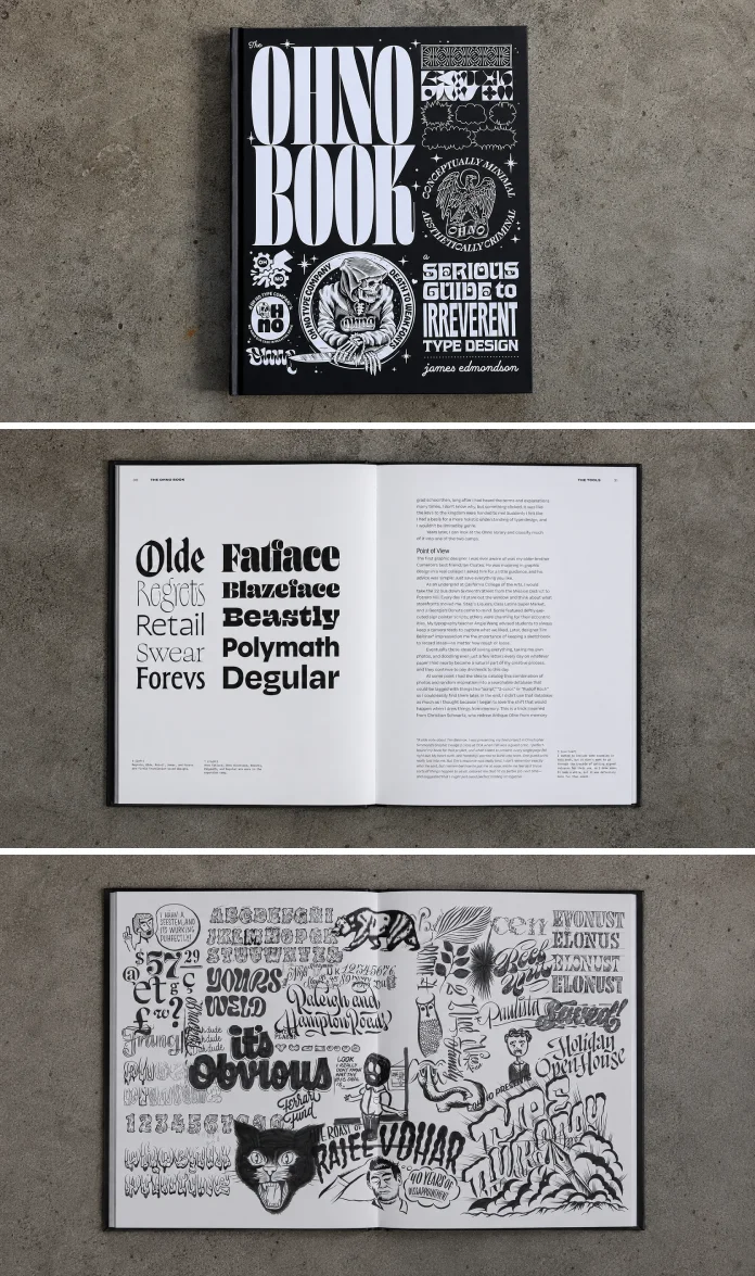
The Ohno Book is part memoir, part technical manual, and part visual archive of one of the strangest type foundries working today. It runs 256 pages, printed by Princeton Architectural Press, and packs in over 175 black-and-white illustrations. You get type specimens, process sketches, marginal notes, and enough tangents to fill a second book. Edmondson wrote it in the same voice he uses on his OHNO Radio podcast: candid, funny, occasionally self-deprecating, always specific.
Here’s the thing that surprised me most. The book actually teaches. It’s not just Edmondson showing off Vulf’s swashes or explaining why Regrets looks like it was drawn during a fever dream. There are real lessons on spacing, contrast, weight distribution, and the unglamorous grind of drawing hundreds of glyphs that all need to feel like they belong to the same family. If you’ve ever tried to draw a lowercase “g” that doesn’t fight with your lowercase “a,” you’ll recognize the specificity here immediately.
Who Is James Edmondson?
Edmondson studied graphic design at California College of the Arts and later graduated from the Royal Academy of Art’s TypeMedia program in the Netherlands. That’s a serious pedigree hiding under a very silly font name. He’s taught at Type West through the Letterform Archive, run workshops at Type@Cooper, and in 2018 he co-founded Future Fonts, a platform that lets designers sell typefaces while they’re still in progress. None of that reads as “irreverent.” The irreverence is a choice, not a limitation. That distinction matters more than most reviews give it credit for.

The Framework I Built to Actually Score This Book
Design books get reviewed with vague words like “inspiring” or “essential,” and I think that’s lazy. So I built a small framework while reading, something I’m calling the Craft-to-Chaos Ratio. It measures two things on a five-point scale each: how much rigorous, technical craft a resource teaches and how much creative looseness it actively encourages you to bring to the work. A book heavy on craft and light on chaos, something like a classic type anatomy textbook, scores high craft and low chaos. A pure inspiration book, all mood boards and no instruction, flips that.
The Ohno Book scores a 4 on craft and a 4 on chaos. That’s an unusual result. Most books can’t hold both numbers that high at once, because rigor tends to eat playfulness, and playfulness tends to skip the boring parts that make type actually work. Edmondson pulls it off because he treats the boring parts as part of the joke. He’ll explain kerning pairs and then immediately tell you why he named a typeface after an obscure funk band. Both get the same level of attention.
Why This Balance Is Rare
I’ve read a lot of type design books over the years, and the ones that lean hard into craft (heavy on grids, heavy on Bézier theory) tend to lose the reader by page 80. The ones that lean into personality often skip the part where you learn anything transferable. The Ohno Book keeps switching lanes on purpose. One page is a diagram of stroke contrast. The next is a story about a client who wanted a “friendly but aggressive” logo, which, if you’ve worked in this industry, you already know is a real sentence someone has said to you.
How the Book Actually Reads, Page by Page
I read this the way I read most reference books first, front to back once, and then in fragments. The front-to-back read works fine. Edmondson’s chapters build logically, moving from foundational type anatomy toward the business realities of running a foundry. But the book is genuinely built for reading in fragments, too. You can open to any page and land on something useful, whether that’s a sketch of a numeral set or a paragraph on pricing custom fonts.
The tone stays consistent throughout, which is harder to pull off than it sounds. A lot of design authors get formal the moment they start explaining technical concepts, like the humor was a costume they took off for the “real” content. Edmondson doesn’t do that. He explains x-height the same way he explains why Casserole is named Casserole. Casual, direct, a little proud of the weirdness.
The Illustrations Carry Real Weight
With over 175 black-and-white illustrations, this could have easily turned into filler. It doesn’t. The sketches show actual process, not polished final specimens dressed up to look effortless. You see crossed-out letterforms, margin notes, revision after revision. For anyone who’s ever felt discouraged by how clean other people’s “process” pages look online, this is a genuinely useful corrective. Type design is messy. The Ohno Book doesn’t hide that.
Is This Book Actually Practical or Just Pretty?
This is where a lot of readers will want a straight answer, so here it is. Yes, it’s practical. Edmondson covers how to balance creative instinct against commercial constraints, which is the exact tension every working type designer fights daily. He talks openly about earning a living as a type designer, a topic most books in this category treat as too indelicate to mention. Money gets discussed here. Licensing gets discussed. The unglamorous administrative side of running a foundry gets discussed.
He also explains the reasoning behind OH no’s naming conventions, including why fonts get named after things like an obscure funk band or a French decorative arts school. That sounds like trivia. It’s not. Naming is branding, and branding decisions ripple through how a typeface gets discovered, licensed, and remembered. A font called “Sans 14” doesn’t get the same cultural traction as one called “Vulf.”
What I’d Actually Use From This Book Tomorrow
Three things stuck with me enough to apply directly to my own work. First, Edmondson’s approach to drawing “problem letters” (the g, the a, the ampersand) before locking in the rest of a typeface’s structure. Second, his framing of constraint as a creative tool rather than an obstacle, which shows up constantly when clients ask for contradictory things. Third, his blunt honesty about how much of type design is repetitive labor disguised as inspiration. That last one alone is worth the price of the book.
Where the Book Falls Short
No review is honest without a critique, so here’s mine. The Ohno Book assumes some baseline familiarity with type terminology. If you’ve never heard of kerning, tracking, or optical sizing, a few sections will move faster than you’d like. This isn’t a book for absolute beginners with zero design vocabulary. It’s better suited to design students, working graphic designers branching into type, and typography enthusiasts who already know the basics and want the next layer.
I also wanted a bit more depth on the technical software side. Edmondson touches on tools and workflow, but readers hoping for a step-by-step Glyphs or FontLab tutorial will need to look elsewhere. This book teaches thinking, not software mechanics. That’s a deliberate choice, and I respect it, but it’s worth knowing going in.
The Ohno Book Compared to Other Type Design References
| Book / Resource | Craft-to-Chaos Ratio | Best For | Technical Depth | Tone |
|---|---|---|---|---|
| The Ohno Book | 4 craft / 4 chaos | Working designers wanting craft and personality together | Solid, conceptual over software-specific | Funny, candid, direct |
| Classic type anatomy textbooks | 5 craft / 1 chaos | Beginners needing foundational vocabulary | Very high, formal | Academic, dry |
| Foundry portfolio books (specimen only) | 1 craft / 3 chaos | Visual inspiration, mood boards | Minimal to none | Glossy, promotional |
| Software-specific type design tutorials | 4 craft / 1 chaos | Learning Glyphs, FontLab, or RoboFont mechanics | Very high, tool-focused | Instructional, neutral |
Why This Book Matters Right Now
Type design books tend to arrive in two waves: technical manuals from decades ago that never got updated, and newer, thinner titles that lean entirely on Instagram-friendly visuals. The Ohno Book lands at a moment when independent foundries have real cultural weight. Studios like OH no built audiences the same way musicians build fan bases, through personality, consistency, and a refusal to sound like everyone else. A book that documents how that actually happened, with real technical instruction attached, fills a gap that’s been sitting open for years.
I’d also argue this book works as a quiet rebuttal to a certain kind of AI-generated typography that’s flooded feeds over the past two years. Machine-generated lettering can mimic a style. It can’t replicate the decades of accumulated judgment behind knowing exactly how much weight a stroke needs before it stops reading as intentional and starts reading as broken. The Ohno Book makes that judgment visible, page after page.
My Prediction for How This Book Gets Used
I expect The Ohno Book to become a standard recommendation on type design course syllabi within the next two to three years, alongside older staples like Thinking with Type. I also expect secondhand copies to become genuinely hard to find once design students discover how much practical business advice sits inside it. Books that combine craft instruction with candid career guidance tend to age well, because career advice from working professionals rarely goes stale the way software tutorials do.
Who Should Buy the Book
Buy this if you’re a graphic design student trying to understand what type design actually involves day to day. Buy it if you’re a working designer curious about adding type design as a service. Or buy it if you collect design books and want something that looks as good on a shelf as it reads on a couch. Skip it, or at least wait, if you need a pure software tutorial or a beginner’s glossary of typography terms. This book assumes you’re already somewhat in the room.
Frequently Asked Questions About The Ohno Book
Who wrote The Ohno Book?
James Edmondson wrote The Ohno Book. He’s the founder of OH no Type Co. and co-founder of Future Fonts, and he teaches type design at California College of the Arts, Letterform Archive, and Cooper Union.
When was The Ohno Book published?
Princeton Architectural Press published The Ohno Book on October 14, 2025. It runs 256 pages and includes over 175 black-and-white illustrations.
Is The Ohno Book good for beginners?
It’s better suited to readers with some baseline type vocabulary already. Total beginners might want a foundational text first, then come back to The Ohno Book for the deeper, more opinionated material.
Does The Ohno Book teach specific software like Glyphs or FontLab?
No. The Ohno Book focuses on conceptual and craft-based instruction rather than software tutorials. Readers looking for tool-specific walkthroughs should pair it with dedicated software guides.
What typefaces does OH no Type Co. make?
OH no Type Co.’s catalog includes Beastly, Casserole, Hobeaux, Ohno Fatface, Polymath, Regrets, and Vulf, among others, known for bold, expressive, and often psychedelic characters.
Is The Ohno Book worth buying for a design student?
Oh yes! Between the technical instruction, the honest business advice, and the visual archive of process sketches, it offers value most single-topic design books don’t attempt to cover.
Final Verdict on The Ohno Book
The Ohno Book earns its place on a working designer’s shelf, not just a coffee table. It teaches real craft while making a clear argument that personality and technical rigor aren’t opposites. Edmondson wrote a book that respects the reader’s intelligence and their sense of humor at the same time, which turns out to be a rarer combination than the design publishing world usually delivers. I tested it as a reading experience and as a reference tool, and it held up both times. That’s the actual bar for a book like this, and The Ohno Book clears it.
Check out other amazing books on art and design here at WE AND THE COLOR.
Subscribe to our newsletter!