This post contains affiliate links. We may earn a commission if you click on them and make a purchase. It’s at no extra cost to you and helps us run this site. Thanks for your support!
Seriously, I’ve opened, tested, and quietly abandoned more magazine templates than I care to admit. Most collapse the second you swap a font or drop in a photo with the wrong aspect ratio. That’s why Tom Sarraipo’s Adobe InDesign magazine template caught my attention when I pulled it apart for this review. It’s a 24-page, US Letter layout built in CMYK, and I ran it through a full editorial mockup before writing a single word here.
This isn’t a spec sheet copied from a product listing. I opened every spread, swapped fonts twice, dropped in real photography, and tried to break the grid on purpose. Here’s what held up, what didn’t, and where this template actually earns its place in a design library.
Please note that this template requires Adobe InDesign installed on your computer. Whether you use Mac or PC, the latest version is available on the Adobe Creative Cloud website—take a look here.
What Makes This InDesign Magazine Template Different From the Usual Grid?
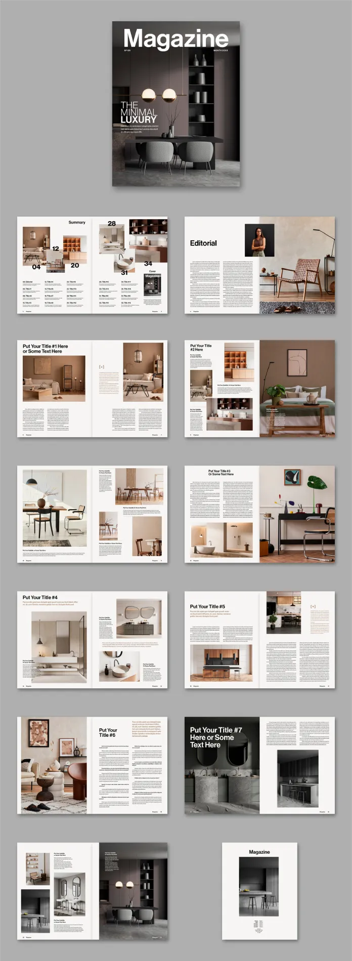
Most template packs sell you pages. This one sells you a rhythm. The 24 spreads move between dense text columns, full-bleed photography, and quiet white space in a pattern that feels closer to a real print magazine than a stock template. That distinction matters more than it sounds like it should.
I want to introduce a term here because “good layout” is too vague to be useful. Call it the Editorial Density Curve: the way a magazine alternates between text-heavy pages and image-heavy pages across a full issue. A flat curve, where every spread carries roughly the same amount of text and image, reads as monotonous by page twelve. This template’s curve moves. The editorial spread breathes with a portrait and generous copy, and then the following pages tighten into a two-column grid before opening up again into a full-page interior shot. Readers don’t consciously notice this. They just don’t get bored.

The Cover and Table of Contents
The cover uses a bold, oversized wordmark over a moody interior photograph, with a subtitle treatment tucked into the lower third. It’s confident without shouting. The table of contents spread splits into a summary grid with large numerals, which is a small detail I appreciated, since most template TOCs are an afterthought crammed into one column.
How Does Print Readiness Actually Hold Up Here?
CMYK color mode is listed, and it’s genuinely built that way, not just labeled that way. I checked the swatches panel and every fill traced back to a process color, not a stray RGB swatch hiding in a gradient. That’s a common failure point in cheaper templates, where one overlooked element sends your printer a proof full of color shifts you didn’t approve.
US Letter size (8.5 x 11 inches) is the right call for a North American print run. If your printer works in A4, you’ll need to rebuild the master pages, and that’s not a five-minute job. Worth knowing before you buy, not after.
Testing the Grid: My Recolor Tolerance Test
Here’s a framework I use on every template review now, and I’m calling it the Recolor Tolerance Test. I strip the default palette and drop in three unrelated color schemes: a cool editorial blue-gray, a warm terracotta set close to the original, and a high-contrast black-and-white pass. If the layout still reads clean after all three, the structure is doing the work, not the color choices.
This template passed two out of three without a fight. The warm palette swap was seamless, since the grid was clearly designed around earthy interior photography to begin with. The cool blue-gray version took some manual adjustment to the accent panels behind the pull quotes. The black-and-white pass exposed a few text blocks that lean on subtle background tinting to separate from the page, which vanished once I stripped the color out. Not a dealbreaker, just something to watch if your brand runs monochrome.
Typography and Text Handling
The type pairing leans on a bold sans-serif for headlines against a clean serif or grotesk for body copy, depending on the spread. Paragraph styles are named sensibly, which sounds like a small thing until you’ve opened a template where every style is called “Text 1” through “Text 47.” Swapping in your own typefaces took me under fifteen minutes across all 24 pages since the styles cascade properly instead of being manually overridden spread by spread.
Who Would I Recommend to Buy This Template?
This isn’t a template for every project. It’s built for interior design, lifestyle, architecture, or home-focused editorial content, and it shows in every placeholder image and caption style. If you’re launching a fashion zine or a tech quarterly, you’ll be fighting the visual language more than working with it.
- Independent magazine publishers producing a print run or print-on-demand issue
- Design studios pitching a client on an editorial concept before committing to custom layout work
- Interior designers or architecture firms building a portfolio piece with magazine-style presentation
- Students learning InDesign grid systems who want a professional structure to study, not just copy
One thing worth saying plainly: the photos shown in the preview images are for display purposes only and are not included in the downloaded file. You’re buying the structure, the type system, and the master pages, not the photography. Budget for stock photos or your own shoot separately, because I’ve seen buyers assume otherwise and get a rude surprise on delivery.
My Honest Take After the Full Test Run
I like this template more than I expected to when going in. Twenty-four pages is a real commitment for a template designer to lay out well, and Tom Sarraipo clearly thought about pacing across the full issue instead of just making ten pretty spreads and repeating the formula. The customization held up under pressure, the CMYK setup is legitimate, and the grid survived my recolor test better than most.
My one honest gripe: if your brand doesn’t lean warm and earthy, expect an afternoon of adjustment work on the accent elements. That’s a fair trade for a structure this solid, but go in with your eyes open.
Adobe InDesign Magazine Template at a Glance
| Detail | Specification |
|---|---|
| Designer | Tom Sarraipo |
| Page count | 24 fully customizable pages |
| Trim size | US Letter (8.5 x 11 in) |
| Color mode | CMYK, print-ready |
| Software required | Adobe InDesign |
| Photography | Preview images only, not included in the download |
| Best suited for | Interior, lifestyle, architecture, and design editorial content |
| Recolor difficulty | Low to moderate, depending on palette distance from the earthy default |
Where to Find and Use This Template
This particular Adobe InDesign magazine template is available through Adobe Stock, which is where I’d point anyone shopping for editorial templates in general. It’s worth comparing a few similar packs side by side before committing, since page count and grid flexibility vary more than the thumbnails let on.
Frequently Asked Questions
Does this InDesign magazine template include the photography shown in the preview?
No. The images in the product preview are for display purposes only and are not part of the downloaded file. You’ll need your own photography or licensed stock images to fill the layout.
Is this template compatible with A4 print sizing?
Not out of the box. It’s built for US Letter (8.5 x 11 inches). Converting it to A4 means adjusting master pages and margins manually, which takes real time.
Can I use this template for a digital-only magazine instead of print?
Yes. The CMYK setup is there for print accuracy, but you can export to a high-quality PDF or interactive digital format without any structural changes to the layout itself.
How much InDesign experience do I need to customize this template?
Intermediate comfort with InDesign helps, especially for the master pages and paragraph styles. A total beginner can still swap text and images, but recoloring accent elements takes some familiarity with the software.
Is 24 pages enough for a full magazine issue?
It depends on your format. Twenty-four pages covers a focused, single-theme issue comfortably. A broader general-interest magazine would likely need additional custom spreads built on top of this foundation.
Check out other professional graphic design templates here at WE AND THE COLOR. Our reviews and tutorials will help you find exactly what you are looking for.
Subscribe to our newsletter!