This post contains affiliate links. We may earn a commission if you click on them and make a purchase. It’s at no extra cost to you and helps us run this site. Thanks for your support!
Petr’s business set beats most infographic templates I have used, and the reason is almost boring. The set follows its own rules from the first artboard to the last. I first featured these infographics on WE AND THE COLOR in November 2019. This month I downloaded the set again from Adobe Stock and rebuilt several modules for custom infographics of my own.
And yes, I know that today’s AI-driven chart generators can produce polished infographics in seconds, but they often hand you flattened images. A working designer still needs paths and live type. That’s why I still prefer a well-built vector infographics kit.
Please note that this vector template requires Adobe Illustrator to be installed on your computer. You can get the latest version from the Adobe Creative Cloud website. Just have a look here.
Below, I explain how you can edit the set in Adobe Illustrator and where it falls short. I also define a few terms, because editable infographics need sharper vocabulary than “easy to customize.”
Why Do These Infographics Still Edit So Cleanly?
The set obeys one rule. I name it the Palette Lock. A Palette Lock means a template restricts every module to one small group of colors. Any two modules can then share a page without clashing.

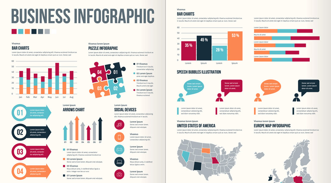
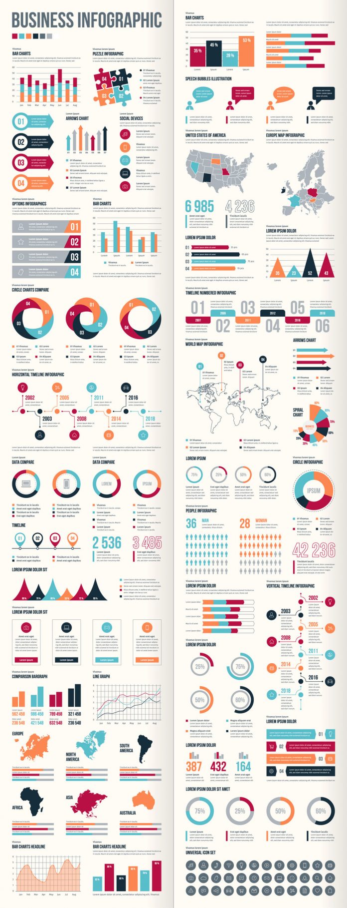
Petr’s infographics lock in seven swatches. You can count them in the strip below the title on the Adobe Stock preview. There is crimson, teal, orange, navy, slate gray, light gray, and white. Gradients never touch these infographics. As a result, a bar chart and a timeline pin look like relatives.
Flat Geometry Ages Better Than Gradients
Here is my first opinion, and I will not hedge it. Flat geometry is the only safe style for business infographics that must survive several redesigns. Gradients date a template fast. Flat shapes in seven colors simply sit there, unbothered, beside whatever layout trend arrives next.
Petr also built these infographics in Illustrator for use in Illustrator. Nothing needs translating. You open the file, and the artwork already speaks Illustrator’s language of paths and swatches.
What “Fully Customizable” Actually Means
Marketing pages overuse the phrase, so I use a stricter definition. Vector infographics count as fully editable only when four conditions hold.
- Every shape stays a vector path.
- Live type carries all labels and numbers.
- Any color remaps in a single step.
- Each icon sits in its own group.
These infographics meet all four in the modules I opened. That matters, because many cheap templates outline their type or flatten their icons into single compound paths.
What Is Inside the Set of 40 Infographics?
Petr packs 40 design options into one set of infographics. Charts dominate. Bar charts, a line graph, arrow charts, and progress rings cover most business data. Maps of the United States, Europe, the world, and six continents follow. A people pictogram and a grid of round icons fill the remaining space.
The Timelines Carry the Set
Skip the bar charts for a moment. The timeline infographics are the reason to download this kit. The horizontal version places eight milestones on alternating sides of a center line. The years 2002, 2005, 2011, and 2016 sit above it, while 2003, 2008, 2014, and 2018 sit below.
Each milestone gets a round badge with its own icon. The vertical version reuses the same eight years and the same badges. So you can flip a timeline from horizontal to vertical without rewriting a single caption. A third module stretches six steps across oversized numerals, from 01 to 06, with years between 2007 and 2018.
This is where I would spend your attention. Alternating labels above and below the line solve the hardest problem in timeline design, which is caption collision. Petr solved it with geometry alone.
I call the cost of clearing a template’s sample data Placeholder Debt. Timeline infographics carry very little of it. Each milestone holds only a year and a caption. However, the sample years end at 2018, so update those first.
Bar Charts and Other Infographics
The bar charts and the line graph run from January to August on their axes. Progress rings appear at 25, 50, 60, and 75 percent, in several sizes and styles. The maps and icons get one sentence from me, because they matter less than the timelines.
How Do You Edit These Infographics in Illustrator?
Editing infographics goes fast when you order the work correctly. I use what I call the Four-Pass Edit. It runs data, geometry, color, and type, in that order. Each pass touches one property, so no pass undoes the last.
The order has a reason. Numbers decide shapes. Shapes decide how much room the type gets. Color never changes layout, so it can wait. Type comes last because word length shifts everything.
Pass 1: Set the Data
Start by checking whether a chart in these infographics is a native Illustrator graph. Select it and open Object > Graph > Data. If the menu item is active, you edit numbers in a spreadsheet window. If it stays gray, the chart is plain shapes. Run this check on every chart before you plan a layout.
Then look at the numbers themselves. The sample figures, such as 6 985 and 42 236, use a space as the thousands separator. US readers expect commas. A few modules also put a space before the percent sign, while others do not. Pick one style and fix the rest.
Pass 2: Fix the Geometry
Here the infographics need manual work. If a ring is a shape, its label and its arc do not talk to each other. Change 75% to 62% in the text, and the ring still shows three quarters. So resize the arc yourself.
Use the Transform panel for exact values instead of dragging by eye. Set the reference point to the bottom edge first, so bars grow upward. Double-click a group to enter Isolation Mode, which keeps stray clicks away from neighboring shapes.
Before you scale anything, check Preferences > General > Scale Strokes & Effects. Keep it off, or your line weights will drift.
Pass 3: Recolor in One Move
Select the infographics you want to change and open Edit > Edit Colors > Recolor Artwork. Because of the Palette Lock, the dialog lists a short group of colors instead of dozens of near-duplicates. Remap each one to a brand color, then click OK.
Then check contrast. White numerals on a pale brand color fail quickly. Aim for a contrast ratio of at least 4.5:1 for small text and 3:1 for large numerals. Those are the WCAG 2.1 AA thresholds.
Pass 4: Set the Type
The preview shows a condensed sans-serif for headings and Lorem Ipsum for body copy. If Illustrator warns about missing fonts on opening, use Type > Resolve Missing Fonts. Then swap in your own typeface.
Long words break small text boxes fast. Watch for the red plus sign on the box edge, which flags overflow in area type. Then widen the box or trim the copy.
Why Is Adobe Illustrator the Best Software for These Infographics?
The short answer is that the set speaks Illustrator natively. Petr built it there, so nothing gets lost on the way in. That alone settles the question for me.
The longer answer has four parts. Recolor Artwork remaps a whole palette at once. The graph tools keep data live when a chart is a native graph. Isolation Mode lets you edit one grouped module without touching its neighbors. Adobe Illustrator also stores your recolored swatches in Creative Cloud Libraries. The same brand colors then follow you into InDesign and Photoshop.
Other vector editors open many vector files. However, they may not carry every swatch and group across intact. Illustrator removes that risk. You can also export infographics as SVG for the web or PDF for print from the same file.
Where Do These Infographics Fall Short?
Now the disagreeable part. The continent silhouettes are the weakest infographics in the set. They read as decorative outlines instead of data maps. Use them on a slide, and redraw them for anything an editor will fact-check.
The people pictogram bothers me more. It splits every figure into men and women, with sample values of 36 and 28. Most audience data today needs more categories. Rebuild that module or skip it.
The universal icon set is generic, but it saves time when you need a quick pictogram.
Business Infographics Set at a Glance
| Feature | Detail |
|---|---|
| Set title | Business Infographic Set |
| Contributor | Petr (Adobe Stock) |
| Design options | 40 editable vector infographics |
| Built in | Adobe Illustrator, for Adobe Illustrator |
| Palette | Seven flat swatches, no gradients (Palette Lock) |
| Strongest infographics | Horizontal, vertical, and numbered timelines |
| Weakest infographics | Continent maps and the people pictogram |
| Editing method | Four-Pass Edit: data, geometry, color, type |
| Best use | Annual reports, presentations, custom infographics |
| First featured on WATC | November 26, 2019 |
What Comes Next for Editable Infographics?
I expect two shifts. First, AI chart generators will export editable vector infographics, and designers will compare that output against kits like this one. A generated chart that arrives as a flat image loses to a template with live paths. Second, marketplaces will start advertising the Palette Lock, because brand teams need infographics that recolor in one pass.
Here is the standard I will apply from now on. An infographic template is production-ready when a designer can swap data and brand colors without redrawing a single shape. Petr’s set clears that bar in every module I rebuilt.
Frequently Asked Questions About These Infographics
What is the Business Infographic Set by Petr?
It is a collection of 40 editable vector infographic designs by Adobe Stock contributor Petr. He built it in Adobe Illustrator. The set includes charts, timelines, maps, a people pictogram, and an icon grid.
How many infographics does the set contain?
The set contains 40 design options. All of them are fully customizable vector graphics.
Can I edit these infographics in Adobe Illustrator without redrawing them?
Yes. Text, colors, and icons in these infographics can be edited directly. Rings and plain-shape bar charts need manual resizing, which the Four-Pass Edit covers in Pass 2.
How do I change the colors of vector infographics in Illustrator?
Select the artwork and open Edit > Edit Colors > Recolor Artwork. Remap the seven original colors to your brand palette, then check text contrast.
Can I enter real data into the charts of these infographics?
That depends on the chart. Select it and open Object > Graph > Data. If the item is active, you can type in numbers. If it stays gray, scale the shapes with the Transform panel.
Can I use these infographics commercially?
Adobe Stock licenses the set under its own terms. Read the current license for your use case before you publish. I am not a lawyer, so treat this as a pointer, not legal advice.
Do I need Illustrator to use these infographics?
Petr built the set in Illustrator, so Illustrator is the safest choice. Other vector editors may open the files, but check swatches and groups afterward. Open the horizontal timeline first. If all eight badges land in place, the rest will behave.
Don’t hesitate to browse WE AND THE COLOR’s graphic design and templates categories for more. Our reviews will help you to find professional design assets for different creative needs.
Subscribe to our newsletter!