
This post contains affiliate links. We may earn a commission if you click on them and make a purchase. It’s at no extra cost to you and helps us run this site. Thanks for your support!
Most designers have been there. A client emails at 9 AM asking for a polished presentation by noon. Your stomach drops. Your coffee gets cold. And then you remember: Adobe Stock templates exist for exactly this moment.
Building a strong client presentation doesn’t have to mean burning three hours on spacing, color theory, and font pairing. Not anymore. With the right system, you can move from blank slide to boardroom-ready deck in under 30 minutes — and still look like you spent a week on it.
This article breaks down exactly how. Not the vague, inspirational version. The actual, step-by-step workflow that works in real-world conditions, under real pressure, with real clients.
We recommend using Adobe InDesign. Whether you use Mac or PC, the latest version is available on the Adobe Creative Cloud website—take a look here.
What Makes a Client Presentation Fail Before It Even Starts?
Before we talk about speed, we need to talk about failure. Because the biggest mistake most creatives make isn’t spending too much time — it’s spending time on the wrong things.

A weak client presentation fails at three structural levels. First, it lacks visual hierarchy, so the client doesn’t know where to look. Second, it buries the value proposition inside too much copy. Third, it looks inconsistent, which signals amateur execution before a single word gets read.
Adobe Stock templates solve all three problems simultaneously. They’re built on established design principles. They already have hierarchy, rhythm, and balance baked in. Your job is to redirect that structure — not build it from scratch.
The Template Redirection Method: the practice of using a professionally designed framework as your visual and structural starting point, then redirecting its DNA toward your client’s specific context, brand, and message.
It saves time. More importantly, it elevates quality.
The 30-Minute Client Presentation Framework
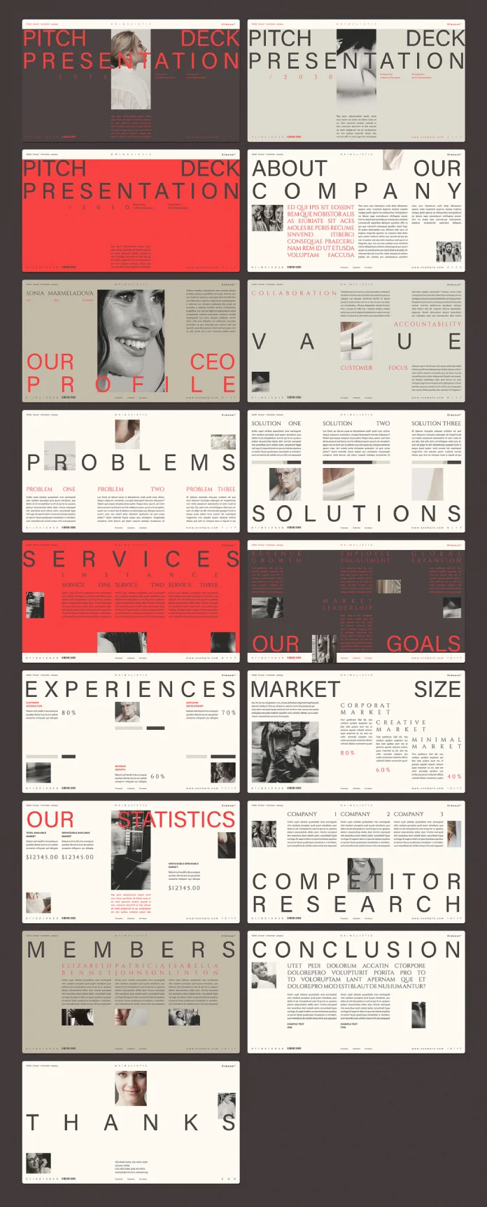
Step 1 — Find the Right Template (Minutes 1–5)
Open Adobe Stock. Type keywords that match the tone of your presentation, not just the topic. “Clean corporate pitch deck” hits differently than “presentation template.” So does “minimal agency proposal slides.”
Filter by file type: PowerPoint or Keynote, depending on your workflow. Then apply one more filter most people skip — look for templates with at least eight to ten slides. Fewer than that, and you’ll spend extra time building slides that should already exist.
Pro tip: Look for templates that include a “Why Us” or “Our Process” slide. These are the hardest to design under pressure and the ones clients scrutinize most carefully.
Download your top two or three candidates. You’ll know which one to use the moment you open them side by side.
Step 2 — Apply the Brand Layer (Minutes 6–15)
This is where most people slow down unnecessarily. They try to match the client’s exact hex codes, fonts, and logo treatment all at once. Instead, use the 3-Point Brand Injection approach.
3-Point Brand Injection: Change only the primary color, the headline font, and the logo placement — nothing else, at least not yet.
Why? Because professional templates are built with proportional contrast and spacing that works. When you change too many variables at once, you break the internal logic of the design. You introduce inconsistency. You undo hours of professional design work in minutes — and not in a good way.
So start with the primary color. Replace the template’s dominant hue with the client’s brand color. Most PowerPoint and Keynote templates let you do this globally in under two minutes. Next, swap the headline font if the client has a brand typeface. If they don’t, keep the template’s font — it’s already chosen for legibility and visual weight. Finally, place the client’s logo on the master slide so it appears consistently throughout.
At this point, the presentation already looks custom. That’s the power of the 3-Point Brand Injection.
Step 3 — Build the Narrative Spine (Minutes 16–22)
A client presentation is a story with a persuasion arc. The slides are just the containers. The narrative is the engine.
Every strong client presentation follows what design strategists call the Problem–Proof–Promise structure. Here’s how it works in practice:
The first third of your deck (roughly slides 1–4) establishes the problem. You’re showing the client that you understand their challenge, their market, and their pain point. This builds trust and frames everything that follows.
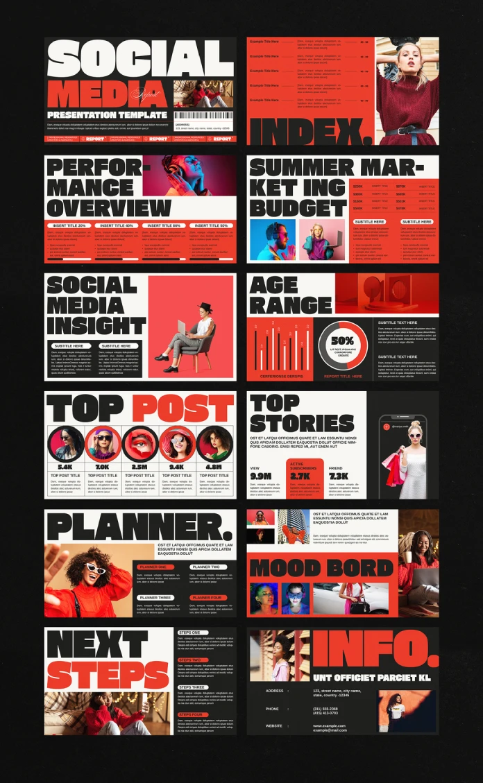
The middle section (slides 5–8) delivers the proof. Case studies, process overviews, relevant credentials — this is where you show, not just tell. Use visuals heavily here. Data visualizations, before/after comparisons, and real imagery from Adobe Stock all do more work than body copy ever will.
The final section (slides 9–12) makes the promise. This is your proposed solution, your timeline, your deliverables. It answers the implicit question every client carries into a pitch: “So what will I actually get?”
The Problem–Proof–Promise structure isn’t new. But most designers ignore it when working quickly. They drop in content without checking whether the narrative arc still holds. Don’t make that mistake.
Step 4 — Replace Stock Images Strategically (Minutes 23–27)
Here’s a counterintuitive move: don’t replace all the stock images in the template. Replace only the ones on slides where clients are most likely to focus — your hero slide, your case study slide, and your CTA slide.
Adobe Stock makes this easy because every image inside a licensed template is already cleared for commercial use. But the images included in the template are generic by design. So on your three most critical slides, swap in images that feel more specific to the client’s industry.
A real estate presentation should feel different from a tech startup pitch. The color palette might overlap, but the imagery shouldn’t. A well-chosen stock photo signals contextual awareness. It tells the client you thought about them, not just about the deck.
Use Adobe Stock’s visual search feature to find images that match the tone, lighting, and color palette of your template. This keeps everything cohesive. And it takes less than five minutes when you know what you’re looking for.
Step 5 — Final Polish and Export (Minutes 28–30)
With two minutes remaining, run a fast consistency check. Scroll through every slide and look for three things only: font inconsistencies, color breaks, and text overflow.
Font inconsistencies happen when you paste content from a Word document without stripping formatting. Color breaks appear when a single element didn’t update during your global color change. Text overflow shows up on slides where your copy is slightly longer than the template’s placeholder.
Fix what you see. Then export as PDF for the formal send, and keep the editable file ready for live presentation mode.
That’s your 30 minutes. That’s your finished client presentation.
Why Adobe Stock Templates Are Changing How Agencies Work
This workflow isn’t just a shortcut. It’s a philosophical shift in how creative professionals define value.
For years, the design industry treated “built from scratch” as a synonym for “better.” Custom meant quality. Templates meant laziness. But that framework was always more about ego than outcomes.
Clients don’t pay for effort. They pay for results. A client presentation that converts, that communicates clearly, that looks polished and professional — that’s what generates trust and earns the next project.
Adobe Stock templates, especially the premium editorial collections, are built by professional designers who specialize in presentation design. Using their work as a foundation isn’t a shortcut. It’s collaborative efficiency. You bring the strategy, the narrative, the client knowledge, and the brand sensitivity. The template brings the structural and visual intelligence.
Together, that combination produces work that neither could produce as well alone.
The Rise of Presentation-First Client Communication
Here’s a forward-looking prediction worth tracking: by 2027, the majority of client-facing creative agencies will adopt a presentation-first communication model — where structured slide decks replace long-form proposals as the primary document of record in client relationships.
Why? Because decision-makers are increasingly visual thinkers. Because attention spans in procurement meetings are shrinking. And because a well-designed presentation communicates hierarchy, sequence, and emphasis in ways that paragraphs of prose simply cannot.
Adobe Stock is positioned to become the infrastructure layer for this shift. Its template library is expanding rapidly across industries, file formats, and creative styles. The agencies that build systematic workflows around these assets now will have a significant operational advantage within the next few years.
Common Mistakes That Undermine a Client Presentation
Even with the best templates and a solid framework, certain habits consistently undermine the final product.
Overloading slides with text is the most common error. A slide is not a document. Each slide should carry one idea, one visual, and one takeaway. If you find yourself shrinking font sizes to fit more content, that’s a sign the content needs to be cut — not compressed.
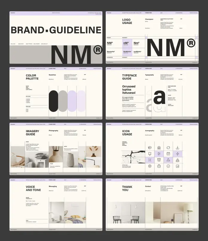
Ignoring the client’s brand hierarchy is the second major mistake. Applying a client’s primary color to the template is necessary. But also check their brand guidelines for secondary colors, approved typeface combinations, and logo clearance rules. These details signal professionalism.
Skipping a proof round is the third. Even in a 30-minute build, take 90 seconds to read every headline out loud. You’ll catch awkward phrasing, missing words, and tonally inconsistent copy much faster than by reading silently.
Finally, exporting at the wrong resolution is a surprisingly common problem. Always export at 150 DPI minimum for screen presentations, and 300 DPI if the presentation will be printed or screenshared on a 4K display.
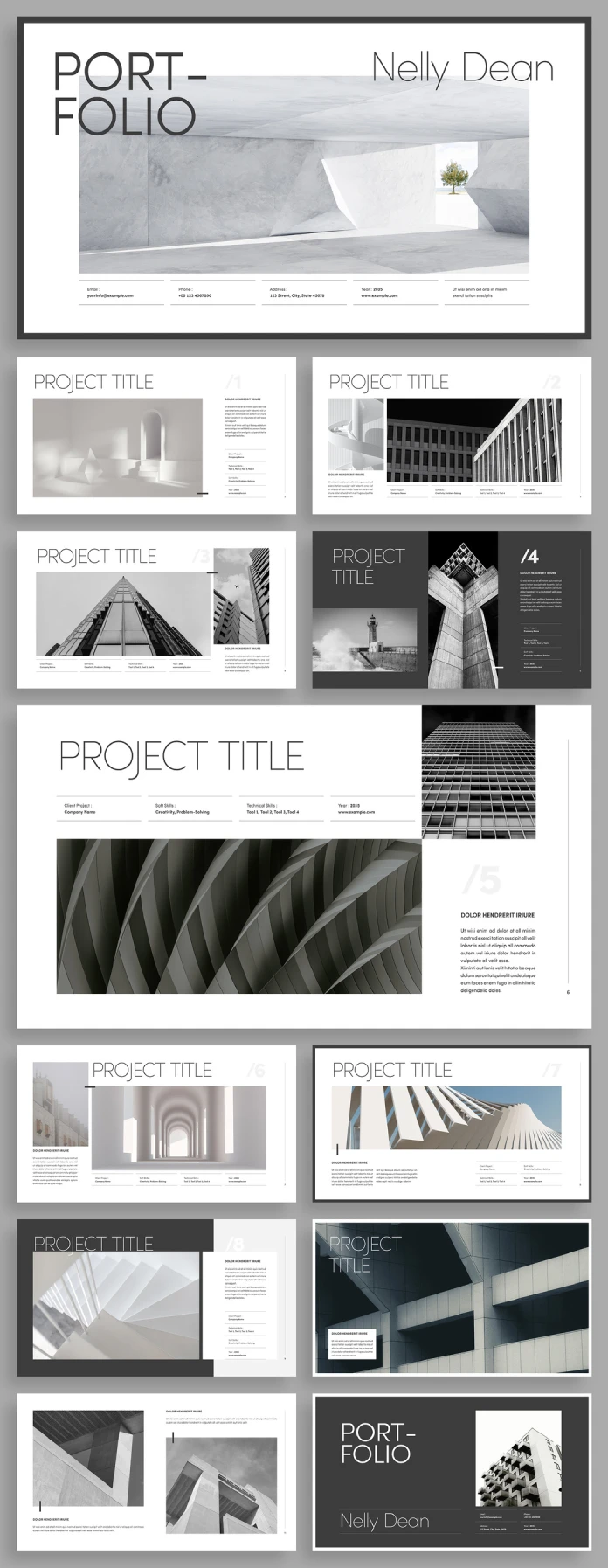
How to Choose the Best Adobe Stock Presentation Templates for Client Work
Not all Adobe Stock templates are created equal. Some are designed for editorial use. Others are built for commercial pitching. Knowing the difference saves significant time in the selection phase.
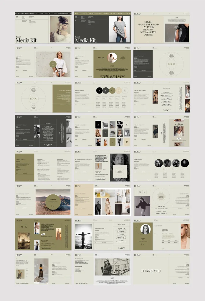
Look for templates with modular slide architecture. This means each slide type — title, section break, content, data visualization, closing CTA — exists as a standalone unit that can be rearranged without breaking the design logic. Modular templates adapt to any narrative structure you bring to them.
Also, prioritize templates with editable master slides. If the master isn’t editable, global changes — color, font, logo — require manual updates on every slide. That’s a workflow killer under time pressure.
Finally, favor templates that include infographic and data visualization slides. These are the slides that take the most time to build from scratch and the ones that add the most perceptual credibility to any client presentation.

Long-Tail Scenarios Where the 30-Minute Workflow Applies
The framework above works for more than just pitch decks. Here are five specific presentation types where this workflow delivers outsized value in minimal time:
Quarterly business review templates adapt well to the Problem–Proof–Promise structure by reframing the problem as “current performance gaps” and the promise as “recommended actions.”
Creative agency capability decks benefit enormously from strong visual templates, since the presentation itself is a demonstration of design sensibility.
Freelance proposal presentations convert better when built on professional templates because they signal studio-level execution even from a solo operator.
Brand strategy presentations use the narrative spine to walk clients from the current state through the brand audit to the recommended positioning.
Partnership pitch decks for B2B contexts benefit from clean, neutral templates that don’t feel too personality-driven — which is exactly what premium Adobe Stock editorial templates provide.
FAQ: Building a Client Presentation Using Adobe Stock Templates
How long does it really take to build a professional client presentation using Adobe Stock templates?
With the Template Redirection Method and the 3-Point Brand Injection system outlined above, most experienced designers can produce a polished, on-brand client presentation in 25 to 35 minutes. The timeline assumes you have the client’s brand assets ready and a clear sense of the narrative structure before you open the template.
Can I use Adobe Stock templates for commercial client work?
Yes. Adobe Stock’s standard commercial license covers templates used in client-facing presentations, proposals, and pitches. However, always verify the specific license terms attached to any asset you download, as extended licenses may apply for large-scale distribution or broadcast use.
What’s the difference between a presentation template and a pitch deck template on Adobe Stock?
The terminology overlaps significantly, but pitch deck templates typically include investor-specific slides like “Market Opportunity,” “Funding Ask,” and “Competitive Landscape.” General presentation templates tend to be more flexible across use cases. For client pitches in agency or service contexts, standard presentation templates usually serve better.
Should I always customize the template’s color scheme for each client presentation?
Yes, and specifically through the 3-Point Brand Injection method: primary color, headline font, and logo placement. These three changes produce the most visible customization for the least amount of time. Additional customization is valuable if time allows, but these three changes are the non-negotiables.
What slide count is ideal for a client presentation built in 30 minutes?
Ten to twelve slides is the optimal range. This number supports the full Problem–Proof–Promise narrative arc without requiring so many slides that customization becomes unwieldy under time pressure. Most Adobe Stock premium templates include 12–20 slides, giving you flexibility without overwhelming the process.
Do Adobe Stock templates work in both PowerPoint and Keynote?
Most Adobe Stock presentation templates are available in multiple formats, including PowerPoint, Keynote, and sometimes Google Slides. Always check the file format availability on the asset detail page before downloading. Cross-platform compatibility can affect font rendering and animation behavior, so test the file in your presentation software before finalizing.
How do I find Adobe Stock templates that match a specific industry?
Use keyword combinations that include both industry and tone: “clean tech startup pitch deck,” “luxury real estate presentation template,” or “minimal healthcare proposal slides.” Adobe Stock’s search algorithm responds well to tone-based modifiers alongside industry terms. Also, use the visual search feature to find templates that match a reference image you already like.
What makes a client presentation template worth using versus building from scratch?
A professional-grade template brings pre-solved design problems: spacing rhythm, typographic hierarchy, color contrast, and layout logic. Building from scratch is appropriate when a client has highly specific brand requirements that no existing template can accommodate. For most presentations, especially under time pressure, a well-chosen template will outperform a rushed custom build every time.
Check out other popular graphic design templates here at WE AND THE COLOR.


