
This post contains affiliate links. We may earn a commission if you click on them and make a purchase. It’s at no extra cost to you and helps us run this site. Thanks for your support!
It’s no secret that typography dictates a brand’s voice before a consumer reads a single word. The Paris Editorial font duo creates a specific auditory hallucination for the viewer. It whispers rather than shouts. Designers want typefaces that look credible without feeling cold. Letter Fresh provides this solution. This handmade sans-serif and script font duo offers a distinct advantage in the current design landscape. We categorize this aesthetic advantage as “Visual Empathy.” This article analyzes the Paris Editorial font duo through this new framework. We will examine how this specific playful combination drives engagement.
You can purchase the font duo for a very low budget on these platforms:
Why Does Handmade Typography Matter More Than Ever in Digital Design?
Digital homogeneity creates opportunity. Consider how many brands now look identical—same grotesques, same geometric sans serifs, same corporate neutrality. The Paris Editorial duo disrupts this pattern through what we might call Dual-Voice Typography: the strategic deployment of contrasting yet harmonious typefaces that establish both authority and approachability simultaneously.
The rounded sans serif delivers structural integrity. Meanwhile, the script component introduces human variability. This combination solves a problem many designers face daily: how to appear professional without seeming distant.
You can purchase the font duo for a very low budget on these platforms:

The Architecture of Approachability
Letter Fresh built this duo on a specific principle. Call it Tactile Contrast Theory. The concept is simple: when you pair geometric structure with organic movement, you create cognitive resonance. Readers perceive both competence and warmth.
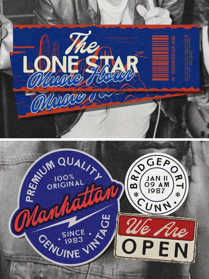
The Paris Editorial sans serif uses rounded terminals strategically. These aren’t purely decorative choices. Research in typography perception shows that rounded letterforms reduce perceived aggression while maintaining legibility. Consequently, the typeface communicates friendliness without sacrificing readability at small sizes.
The script component operates differently. It introduces rhythm and personality through varied stroke weights and natural connections. However, Letter Fresh maintained discipline here. This isn’t a wild calligraphic display face. It’s a functional script designed for real-world applications.
How Does the Paris Editorial Font Duo Actually Work in Practice?
Understanding application matters more than aesthetic appreciation. This duo excels across specific use cases that demand both distinction and clarity.
Product Packaging Applications
Product labels require instant communication. The Paris Editorial font duo solves the hierarchy problem elegantly. Deploy the sans serif for product names and functional information. Use the script for emotional messaging and brand storytelling. This creates visual separation that guides consumer attention naturally.
Artisanal food brands benefit particularly. The combination suggests craftsmanship without appearing pretentious. Beauty products gain sophistication through the script’s elegance while maintaining clarity through the sans-serif’s structure.
Social Media Content Strategy
Instagram and Pinterest prioritize visual impact. The Paris Editorial duo delivers what we call Scroll-Stop Typography: letterforms distinctive enough to halt mid-scroll browsing. The script’s flowing nature creates movement within static posts. Meanwhile, the sans serif anchors headlines and calls-to-action with bold clarity.
Brands targeting millennial and Gen Z audiences need authenticity markers. Handmade fonts signal genuine human effort. This duo provides that signal without appearing amateurish or unprofessional.
Logo Design Framework
Logo creation demands versatility. The Paris Editorial font pairing enables what design theorists call Adaptive Brand Voice: the ability to shift between formal and casual contexts while maintaining identity coherence.
Primary wordmarks can utilize the rounded sans serif exclusively for corporate applications. Then, introduce the script in customer-facing materials, packaging, and social content. This creates a brand system rather than a static identity.
What Technical Considerations Define Professional Font Duo Usage?
Typography selection requires more than aesthetic judgment. Technical execution determines whether designs succeed or fail in production environments.
File Format Compatibility
Letter Fresh provides both OTF and TTF formats. This matters significantly. OpenType features enable advanced typographic controls, including ligatures, alternates, and contextual substitutions. TrueType ensures compatibility across older systems and basic design software.
Professional designers should prioritize OTF files. These formats support expanded character sets and advanced features accessible through Adobe Illustrator’s Glyph Panel or Photoshop’s OpenType Character Panel. This access unlocks the full expressive potential of the Paris Editorial script font.
Licensing Requirements for Commercial Projects
Many designers overlook licensing implications. Letter Fresh explicitly requires license upgrades for specific applications: books, television, commercial exhibitions, films, games, and print-on-demand products. This isn’t optional.
Understanding licensing prevents legal complications. Moreover, it respects the designer’s labor. Handmade typefaces require significantly more development time than algorithmic font generation. Proper licensing supports continued creation of quality typography.
Where Does the Paris Editorial Duo Fit Within Contemporary Design Movements?
Context matters. This font duo emerges from a broader shift toward Neo-Humanist Typography: a movement rejecting pure geometric rationalism in favor of designs acknowledging human imperfection and warmth.
The Counter-Digital Aesthetic
Digital tools enable perfect curves and mathematical precision. Yet audiences increasingly crave imperfection. The Paris Editorial script’s handwritten qualities satisfy this desire. It’s not accidental. It’s strategic positioning against algorithmic uniformity.
Brands using this duo signal values. They’re saying: “We prioritize human connection over corporate efficiency.” This messaging resonates particularly with consumers skeptical of tech-dominated industries.
Post-Minimalism and Decorative Revival
Minimalism dominated design discourse for over a decade. Now, we’re witnessing Expressive Simplicity: the integration of decorative elements within clean, uncluttered layouts. The Paris Editorial duo enables this balance perfectly.
The rounded sans serif maintains minimalist sensibilities through generous negative space and clean geometry. However, the script introduces flourish and personality. This combination lets designers be both restrained and expressive simultaneously.
How Should Designers Approach Paris Editorial Font Duo Implementation?
Theory matters less than execution. Here’s a practical framework for deploying this typeface pairing effectively.
The Hierarchy Decision Matrix
Establish clear rules before beginning any project. Primary information should typically use the sans serif. Secondary, emotional, or narrative content works better in the script. This isn’t absolute, but it provides a starting point.
Consider reading order. Eye-tracking research shows readers process bold, geometric letterforms faster than script faces. Therefore, lead with the sans serif for critical information. Follow with script for supporting messages.
Scale and Spacing Principles
The Paris Editorial sans serif performs well across size ranges. Use it confidently from business cards to billboards. However, the script requires more careful consideration. Below 14 points, legibility decreases significantly. Reserve script usage for display sizes in print materials.
Digital applications need different approaches. Screen resolution affects script readability dramatically. Test thoroughly across devices. Mobile displays may require larger script sizes than anticipated.
Color and Contrast Strategies
Both typefaces feature relatively thick strokes. This characteristic limits certain color combinations. Avoid light weights on dark backgrounds for the script, particularly. The Paris Editorial script font maintains legibility best with dark-on-light pairings.
Experiment with color separately for each typeface. The sans serif can handle more aggressive color contrasts. Meanwhile, the script benefits from softer palettes that complement rather than compete with its organic forms.
What Makes This Font Duo Different From Generic Script-Sans Pairings?
The market offers countless script and sans-serif combinations. Most fail because they lack intentional design relationships. The Paris Editorial duo succeeds through specific differentiators.
Coherent Stroke Philosophy
Letter Fresh didn’t simply bundle two separate typefaces. Both fonts share underlying stroke weight relationships and rhythmic patterns. This creates harmony despite stylistic differences. Notice how the rounded terminals of the sans serif echo the script’s natural curves.
This coherence enables seamless integration. Designers can intermix both typefaces within single compositions without creating visual discord. That’s rare among commercial font duos.
Optimized for Modern Production
Many handmade fonts ignore practical production requirements. They look beautiful but fail in real workflows. The Paris Editorial duo prioritizes functionality. Clean vector paths ensure reliable print output. Extensive character sets support multiple languages and special characters.
Additionally, the OpenType programming enables intelligent behavior. Ligatures connect automatically in the script. Alternate characters provide stylistic variation. These features save time while improving output quality.
Who Benefits Most From the Paris Editorial Font Duo?
Not every typeface suits every designer or project. This duo serves specific audiences particularly well.
Independent Creative Professionals
Freelance designers, illustrators, and photographers need versatile tools that deliver premium results across varied projects. The Paris Editorial font duo provides that versatility without requiring extensive font libraries. Two well-designed typefaces often accomplish more than dozens of mediocre options.
Budget-conscious creatives appreciate the value proposition. One purchase enables branding projects, social media templates, client presentations, and personal promotion materials.
Small Business Owners and Entrepreneurs
Non-designers building their own brand assets face overwhelming typography choices. This duo simplifies decisions through its built-in compatibility. Business owners can create cohesive visual identities without deep typographic knowledge.
The approachable aesthetic suits businesses prioritizing customer relationships. Coffee shops, boutiques, consultants, and lifestyle brands all benefit from the warmth this pairing communicates.
Wedding and Event Designers
Invitation design demands romantic sophistication balanced with practical clarity. The Paris Editorial script delivers elegance. The sans serif provides the necessary information hierarchy. Together, they create invitation suites that feel cohesive across multiple pieces.
Event branding extends beyond invitations. Signage, programs, menus, and thank-you cards all require typographic consistency. Having two complementary typefaces enables variation without chaos.
What Are the Limitations and Considerations?
Honesty matters in typography recommendations. No typeface solves every problem. The Paris Editorial duo has specific limitations designers should understand.
Style Specificity Constraints
This pairing carries inherent personality. That personality works beautifully for certain brands but poorly for others. Tech startups pursuing ultra-modern aesthetics should look elsewhere. Law firms needing traditional authority will find better options.
The rounded friendliness reads as casual in conservative contexts. Consider your audience carefully. What feels approachable to one demographic may seem unprofessional to another.
Script Readability Challenges
All script typefaces sacrifice some legibility for aesthetic appeal. The Paris Editorial script performs better than many alternatives. However, it’s still a script face. Avoid extended text settings. Never use script fonts for body copy, legal text, or technical specifications.
Accessibility considerations matter too. Readers with dyslexia or visual impairments struggle with script typography. Always provide sans-serif alternatives for critical information.
How Will Handmade Typography Evolve in the Coming Years?
Predicting design trends requires analyzing current trajectories. Several signals suggest where typography like the Paris Editorial duo fits in the future.
The Authenticity Economy
Consumer skepticism toward corporate communication continues to intensify. Brands respond by emphasizing authenticity and human connection. Handmade typography serves this strategy perfectly. Expect continued demand for fonts signaling human craftsmanship over algorithmic generation.
However, authenticity becomes performance when everyone adopts the same signals. The Paris Editorial font duo maintains relevance only if designers deploy it genuinely, not cynically. Audiences detect performative authenticity quickly.
Variable Font Integration
Typography technology evolves rapidly. Variable fonts enable dynamic weight, width, and style adjustments within a single font file. Future iterations of handmade duos might incorporate variable technology. Imagine adjusting the Paris Editorial script’s slant or weight contextually based on layout needs.
This technological integration won’t replace current offerings immediately. But designers should anticipate more sophisticated, flexible handmade typefaces emerging.
Cross-Platform Performance Demands
Web, mobile, print, and emerging platforms all require typography adaptation. Successful typefaces increasingly need to perform well everywhere. The Paris Editorial duo’s clean vector construction positions it well for this multi-platform reality.
Expect future updates to include webfont optimization, improved hinting for screen rendering, and additional character support for expanding global markets.
What Concrete Steps Should You Take Next?
Information without action creates no value. Here’s how to actually implement what we’ve discussed.
Audit Your Current Typography
Review your existing projects and brand materials. Identify where the Paris Editorial duo could replace less cohesive font pairings. Look specifically for projects balancing professional credibility with an approachable personality.
Create a priority list. Which projects would benefit most from a typographic refresh? Start there rather than attempting comprehensive changes simultaneously.
Develop Application Guidelines
Download the fonts and experiment extensively before committing to client projects. Create a personal style guide documenting successful pairings, size relationships, and color combinations. This reference prevents inconsistent application later.
Test across different media. Print samples at various sizes. Display mockups on different screens. Send test files to commercial printers if you work in packaging or publication design.
Expand Your Typography Literacy
One font duo won’t solve all design challenges. Use this as an opportunity to deepen your understanding of typographic principles. Study why certain pairings work while others fail. Analyze professional design work featuring script-sans combinations.
You can purchase the font duo for a very low budget on these platforms:
Consider investing in quality type foundries beyond Letter Fresh. Explore work by independent type designers. Building a curated font library takes time but dramatically improves your design capabilities.
Frequently Asked Questions (FAQ):
Q: What file formats does the Paris Editorial font duo include?
A: Letter Fresh provides both OTF (OpenType Font) and TTF (TrueType Font) formats. OpenType offers advanced typographic features accessible through professional design software. TrueType ensures broader compatibility across various systems and applications.
Q: Can I use the Paris Editorial font duo for commercial projects?
A: Yes, but license upgrades are required for specific commercial applications. Standard licenses typically cover basic commercial use, like client branding and marketing materials. However, you’ll need extended licenses for applications, books, television, films, games, and print-on-demand products. Always contact Letter Fresh directly for licensing clarification.
Q: How do I access special characters and alternates in the script font?
A: Access extended characters through Adobe Illustrator’s Glyph Panel or Adobe Photoshop’s OpenType Character Panel. These interfaces display all available glyphs, ligatures, and alternates. Most professional design applications offer similar functionality. Consult your software’s documentation if you’re unfamiliar with accessing OpenType features.
Q: What’s the minimum size I should use for the Paris Editorial script?
A: For print materials, avoid using the script below 14 points. Legibility decreases significantly at smaller sizes. Digital applications require even larger sizes due to screen resolution limitations. Test thoroughly across devices. Mobile displays, particularly, may require 18-24 point sizes for comfortable readability.
Q: Does this font duo support multiple languages?
A: The Paris Editorial duo includes extended Latin character sets supporting many Western European languages. Check the character map for specific language support. If you need Cyrillic, Greek, or other non-Latin scripts, contact Letter Fresh to verify availability or request custom additions.
Q: Can I pair the Paris Editorial fonts with other typefaces?
A: While designed as a duo, these fonts can work with additional typefaces in complex projects. The rounded sans serif pairs well with neutral grotesques for body copy. However, avoid introducing additional scripts or decorative faces. Multiple display typefaces typically create visual confusion rather than harmony.
Q: What makes the Paris Editorial duo better than free font alternatives?
A: Commercial fonts undergo extensive refinement that free alternatives rarely receive. Letter Fresh optimized spacing, kerning, and character construction for professional applications. Additionally, proper licensing protects you legally. Free fonts often carry unclear licenses that create risk in commercial contexts. Quality and legal clarity justify the investment.
Q: How often does Letter Fresh update this font duo?
A: Typography products typically receive periodic updates for bug fixes, expanded character support, or technical improvements. Register your purchase with Letter Fresh to receive update notifications. Most foundries provide free updates to licensed users, though policies vary.
Feel free to find other trending typefaces in the Fonts category here at WE AND THE COLOR.
Subscribe to our newsletter!


