
This post contains affiliate links. We may earn a commission if you click on them and make a purchase. It’s at no extra cost to you and helps us run this site. Thanks for your support!
Let’s Explore Juana Sans: The Modern Typeface System Your Designs Have Been Waiting For
Typographic excellence today demands more than just a pretty face; it requires a complete, versatile system. The Juana Sans font family, a masterwork from the Latinotype foundry, delivers precisely that. This is not merely another font. Instead, it is a comprehensive typographic toolkit designed for the modern creator. Juana Sans provides an elegant solution that balances contemporary style with exceptional clarity. It represents a thoughtful evolution in type design, offering a harmonious and functional system that feels both current and enduring.
What Defines the Juana Sans Font Family?
So, what is the Juana Sans font family? At its core, it is a contemporary sans-serif typeface created by designer Ely Hernández alongside the Latinotype team. However, its true power lies in its role within a larger, integrated typographic system. This system includes the original high-contrast serif, Juana, the impactful Juana Display for headlines, and the highly readable Juana Text for long-form content. Consequently, this family is engineered for seamless interaction, allowing designers to build rich, cohesive visual narratives across diverse projects.
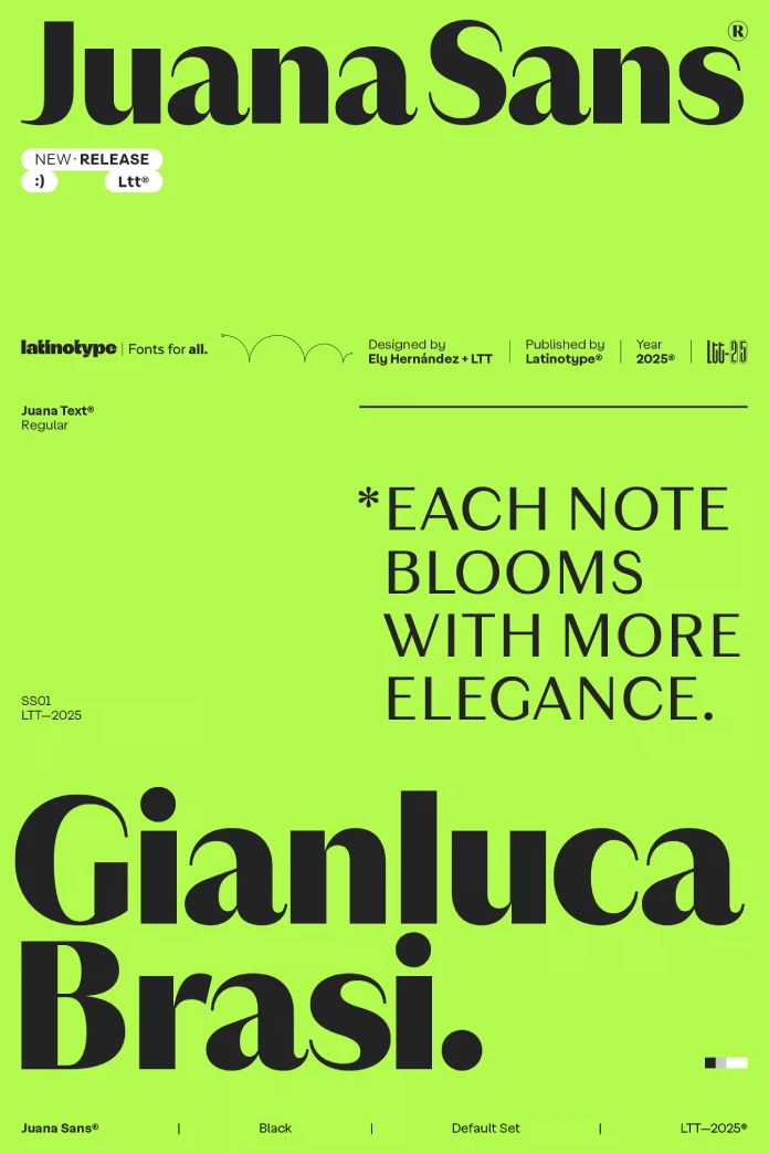
The journey to Juana began with an earlier typeface, Jazmín, and evolved into this more sophisticated and adaptable system. Juana Sans specifically showcases a beautiful fusion of geometric structure and organic warmth. This combination results in a clean, stylish, and supremely functional typeface. Latinotype’s own description, “modern elegance, total clarity,” perfectly captures the essence of its design philosophy.
A Complete Typographic Ecosystem
Understanding Juana Sans requires looking at its place within the complete Juana ecosystem. Each variant serves a distinct purpose while contributing to a unified aesthetic. This structure provides designers with an incredible amount of creative freedom.
Juana and Juana Display: A Foundation of Elegance
The original Juana is a stunning serif font. It features extreme contrast between its thick and thin strokes. This design choice gives it a remarkably stylish and harmonious quality. Therefore, it is an excellent choice for branding, editorial layouts, and distinctive logos. Juana Display then amplifies these traits. It boasts even higher contrast and precisely drawn curves, making it perfect for titles that need to command attention.

Juana Text: The Workhorse for Ultimate Readability
Juana Text, on the other hand, is built for endurance. It purposefully softens the contrast and reinforces the finer strokes. This ensures a smooth, comfortable reading experience in long paragraphs of text. For this reason, it is an ideal selection for books, magazines, and web articles where legibility is paramount. It manages this functionality while still preserving the stylized, editorial character that defines the entire family.
Juana Sans: The Versatile and Modern Counterpart
This brings us back to Juana Sans. This member of the family provides a clean, modern alternative that brilliantly complements its serif siblings. Its versatility allows it to function powerfully on its own or pair effortlessly with other Juana variants. Furthermore, it comes in an extensive range of weights, from a delicate Thin to a powerful Black, each with corresponding italics. This gives designers a rich palette for establishing clear visual hierarchy and creating dynamic emphasis.
The Creative Mind Behind the Font
Ely Hernández is the talented designer who led the creation of the Juana Sans font family. A graduate in Communication Sciences from Mayor University, Hernández has been an essential part of the Latinotype team since 2015. Her impressive portfolio also includes other notable typefaces like Jazmín, Hernández Bros., and Princesa. Her work consistently contributes to the vibrant landscape of contemporary Latin American type design.
Why Choose Juana Sans for Your Next Project?
Selecting the right typeface is a critical decision that can dramatically influence a design’s success. The Juana Sans font family offers several compelling advantages for a wide array of creative applications. Its thoughtful design solves many common typographic challenges.
- Unmatched Versatility: The comprehensive nature of the Juana system is its greatest strength. With its serif, display, text, and sans-serif options, it is incredibly adaptable. You can confidently use it for print, digital, branding, or editorial work.
- Aesthetic Cohesion: The ability to mix and match styles within the Juana family while maintaining a consistent feel is a massive benefit. This allows for complex and visually engaging designs that still feel perfectly harmonious.
- Modern Elegance: With its clean lines and balanced proportions, Juana Sans brings a touch of modern sophistication to any project. Its design feels both contemporary and timeless, ensuring your work will not look dated.
- Exceptional Readability: The inherent clarity of Juana Sans makes it highly legible across many sizes and mediums. This is absolutely crucial for creating a positive user experience in digital spaces and ensuring clear communication in print.
- Extensive Language Support: Finally, the Juana family supports over 200 Latin-based languages. This makes it a practical and intelligent choice for global brands and international publications.
How to Use the Juana Sans Font Family Effectively
To truly unlock the potential of the Juana Sans font family, consider a few practical approaches. Strategic implementation can elevate your design work from good to exceptional. You can start by exploring combinations within the family itself.
Pairing Juana Sans Within Its Own Family
One of the most powerful features of the Juana system is its internal harmony. For a sophisticated and unified look, try pairing Juana Sans with its serif counterpart. For example, use the high-impact Juana Display for major headlines, the very readable Juana Text for body copy, and Juana Sans for subheadings, captions, or interface elements. This method creates a rich typographic texture that is both visually interesting and easy for the reader to navigate.
Considering Long-Tail Applications
Think about using specific weights of Juana Sans for targeted purposes. The lighter weights, such as Thin and Light, are perfect for elegant, minimalist designs that require a delicate touch. Meanwhile, the heavier weights, like Bold and Black, can create a powerful, assertive tone for calls to action or major announcements. Specific applications, such as “Juana Sans Light for luxury brand websites” or “Juana Sans Bold for impactful event posters,” demonstrate its focused versatility.
A Personal Reflection on Juana Sans
From a design critic’s viewpoint, the Juana Sans font family is a truly refreshing and significant contribution. What stands out is not just the superb quality of the sans-serif itself, but the holistic and intelligent approach to the entire system. Latinotype has created a versatile and coherent family that empowers designers to work with both creative freedom and structural consistency. The subtle blend of geometric precision and organic warmth gives Juana Sans a unique personality. It feels approachable yet deeply professional. This is a typeface that seems meticulously engineered but, most importantly, retains a human touch. It is designed for communication, not just decoration.
In conclusion, the Juana Sans font family is an intelligently designed system that addresses the complex needs of modern visual communication. Its elegance, versatility, and profound readability make it a valuable asset for any designer seeking to create meaningful and beautiful work. Whether you use it on its own or in concert with its serif companions, Juana Sans is undoubtedly a modern classic in the making.
Check out other amazing typefaces here at WE AND THE COLOR, or take a look at our selection of the 100 best typefaces for designers in 2026.
Subscribe to our newsletter!


