
This post contains affiliate links. We may earn a commission if you click on them and make a purchase. It’s at no extra cost to you and helps us run this site. Thanks for your support!
Let’s Explore Everything’s Peachy: The Whimsical Handwritten Font That Brings Personality to Every Design
Typography is more than visual decoration. It defines mood, sets tone, and gives words an emotional shape. In a design landscape increasingly dominated by sterile minimalism and AI-generated perfection, Everything’s Peachy by Nicky Laatz feels refreshingly human. Its hand-drawn charm reminds designers that imperfection can be a form of beauty — a reminder that warmth and authenticity still have a place in modern branding.
What Makes Everything’s Peachy So Irresistible
At first glance, Everything’s Peachy looks simple — even playful. But beneath its effortless appearance lies the careful craftsmanship of one of the design world’s most beloved type designers, Nicky Laatz. Known for fonts that blend artistry with usability, she has once again captured the emotional side of typography.
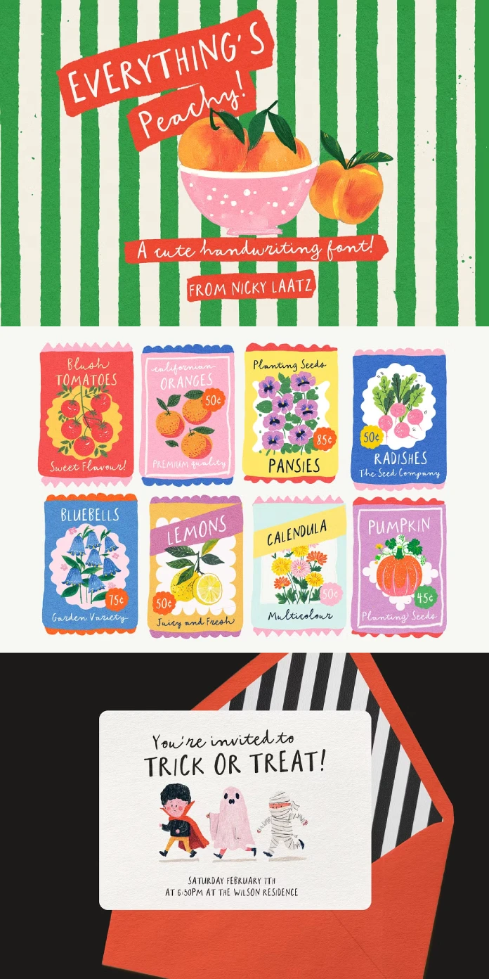
This font isn’t a single-style typeface. It’s a Script and Caps Duo, designed to work together seamlessly. Typing in uppercase produces a bold all-caps look suitable for logos or packaging headlines. Switching to lowercase reveals a smooth, handwritten script ideal for personal touches — from whimsical wedding invitations to charming product labels.
The true magic lies in its versatility. Designers can mix the two styles to create compositions that feel spontaneous yet balanced. Whether used for boutique branding, artisanal packaging, or social media graphics, Everything’s Peachy manages to feel both polished and personal.
Why Designers Are Turning to Handwritten Fonts Again
Digital design has become sleek and algorithmic, but that precision can sometimes feel distant. Everything’s Peachy speaks directly to the desire for something more emotional. Its hand-lettered rhythm mimics the way people actually write — slightly uneven, full of motion, full of life.

Why does this matter? Because authenticity is trending. Audiences crave designs that look crafted rather than manufactured. In branding, this translates to warmth and approachability. Everything’s Peachy brings that feeling to life. It invites connection. It turns words into gestures.
This is especially powerful for creative entrepreneurs, independent brands, and illustrators seeking to express individuality. In a marketplace flooded with generic sans-serifs, a font like this one immediately distinguishes your visual voice.
Exploring the Details: OpenType Features and Extras
What makes Everything’s Peachy truly functional — beyond its charm — are its technical refinements. Nicky Laatz included a range of OpenType extras that elevate its usability. You’ll find gentle beginning and ending swashes for lowercase letters, giving words a natural flow. The subtle ligatures connect characters beautifully, avoiding the mechanical feel that can occur with basic script fonts.
For users working in design tools like Canva, the font is PUA-encoded, meaning all those swashes and special characters are easily accessible. You don’t need professional design software to unlock its full personality — a thoughtful touch that makes this font as inclusive as it is beautiful.
Language support is another strength. Everything’s Peachy covers a wide range of European languages, including Danish, German, French, Spanish, Portuguese, and more. That makes it suitable for international projects without compromising its unique handwritten spirit.
Where Everything’s Peachy Truly Shines
Designers often ask: Where does a handwritten font like this fit best? The answer is almost everywhere that needs warmth, whimsy, or personal character.
Think greeting cards, illustrative posters, children’s books, branding for handmade goods, social media content, or wedding invitations. In packaging design, Everything’s Peachy works wonders on labels for cosmetics, candles, organic foods, or artisan beverages. Its natural, slightly imperfect strokes evoke care, craft, and authenticity — qualities every modern brand wants to convey.
In digital design, it pairs beautifully with minimal layouts, acting as the expressive accent in an otherwise clean composition. Use the uppercase for strong statements and the script for personality-driven details.
The Emotional Value of Handwritten Typography
What makes Everything’s Peachy stand out isn’t just its design quality — it’s the emotion it communicates. There’s something universally appealing about handwriting. It connects to memory, personality, and presence. When digital design becomes too polished, a font like this reminds us of the human behind the screen.
From a typographic critic’s view, Everything’s Peachy represents a growing movement back to warmth and individuality in design. It’s part of a larger typographic trend where organic forms, imperfect details, and gestural lettering are regaining popularity. This shift isn’t nostalgic — it’s a response to the homogenization of design driven by automation.
A Personal Perspective: Why Everything’s Peachy Works
What’s most impressive about Everything’s Peachy is its honesty. It doesn’t pretend to be elegant or avant-garde. Instead, it celebrates simplicity and charm. It’s confident enough to be casual. That’s rare.
Nicky Laatz has long mastered this balance — creating fonts that feel both friendly and professional. Everything’s Peachy continues that legacy, offering a font that adapts to mood, message, and medium without losing its handmade character.
As a creative, one can’t help but admire how naturally it integrates into visual storytelling. Every curve feels intentional. Every stroke tells a story. That’s what good typography does — it amplifies voice without overpowering it.
Final Thoughts: Why Everything’s Peachy Deserves a Place in Your Toolkit
If your next project needs sincerity, charm, and a touch of whimsy, Everything’s Peachy is worth exploring. It’s not just another cute handwritten font — it’s a thoughtfully designed tool for visual storytelling.
It bridges analog emotion with digital clarity. It’s expressive without being chaotic, sweet without being naive, and stylish without losing readability. Most importantly, it reminds designers that beauty often lies in imperfection.
In a creative economy where authenticity is currency, Everything’s Peachy delivers exactly what modern design needs — personality, craft, and heart.
Feel free to browse WE AND THE COLOR’s Fonts category or take a look at our selection of the 100 coolest fonts for graphic designers in 2026.
Subscribe to our newsletter!


