Beyond the Arrow: How i-Thrive’s Logo Design Redefined Healthspan Branding
The modern wellness industry is moving beyond quick fixes and toward a more profound goal: increasing healthspan. This new frontier focuses on the quality of life, not just its length. Within this evolving market, healthspan clinics are emerging as vital hubs for personalized, data-driven health. Consequently, a brand’s visual identity has become its most crucial asset for building trust. The recent branding project for i-Thrive by Holman Design provides a powerful example of this. It demonstrates how strategic logo design can create a narrative of transformation, positioning a brand as a true leader.
The health sector often presents a fragmented experience for consumers. People typically seek diagnostic services in one place and coaching or therapy in another. i-Thrive, a UK-based clinic founded by Jodi and Mark Zibser, directly addresses this disconnect. The clinic offers advanced diagnostics like DEXA scans and metabolic testing. Furthermore, it combines these services with personalized coaching for fitness, nutrition, and longevity. This integrated model is their unique strength. However, they needed a cohesive brand identity to communicate this value, especially to a demanding audience of executives, professionals, and athletes.

The Strategic Blueprint for a Modern Health Brand
Holman Design’s engagement began with a deep strategic foundation. The team first conducted extensive sessions to understand the founders’ vision and market positioning. Following this, they performed in-depth research into branding trends and consumer behavior within the wellness space. This initial phase moved the project beyond mere aesthetics. It established a clear mission: to build a visual system that embodies i-Thrive’s integrated, scientific, and transformative approach. This strategic foresight is what separates enduring brands from temporary ones. What does your brand promise, and how does your visual identity deliver on that promise?
Deconstructing the i-Thrive Logo Design
The resulting identity system is a model of clarity and intelligence. At its center is a logo that is both simple and deeply meaningful. It is a perfect fusion of form and function.
The Monogram as a Symbol of Progress
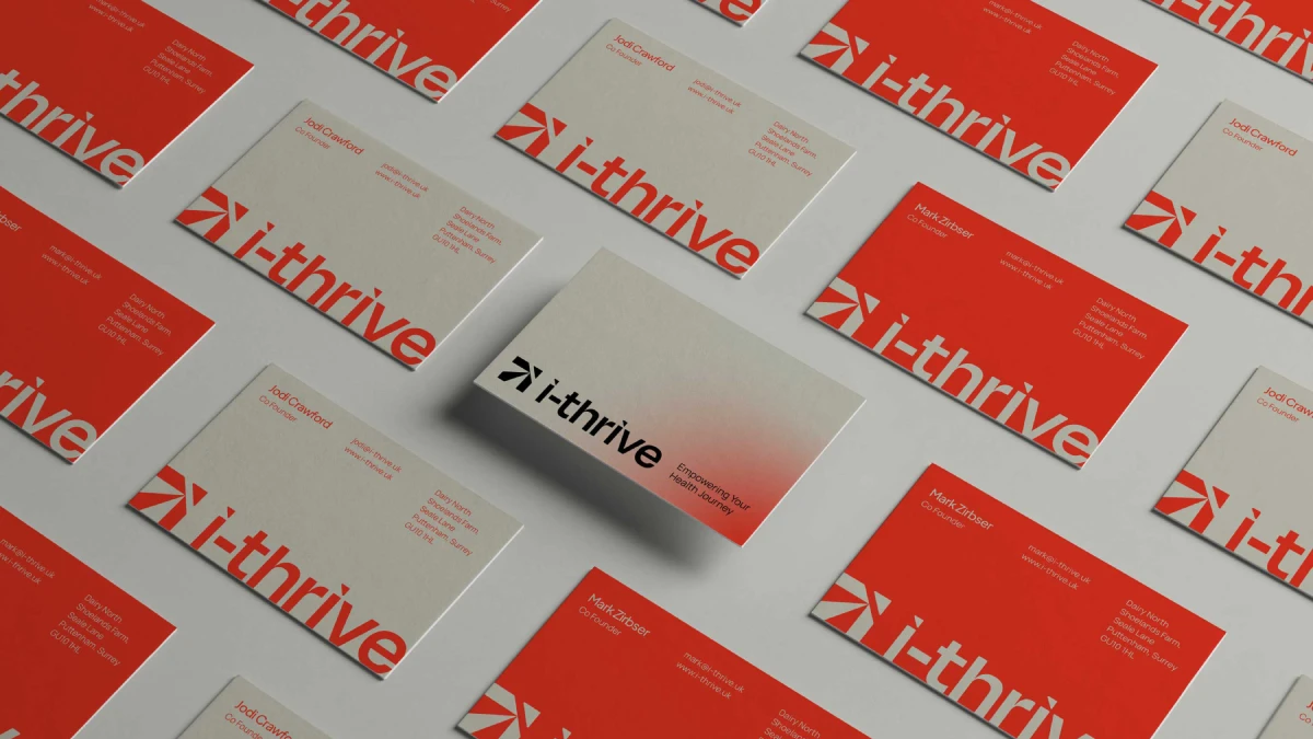
The logo’s core is a monogram formed from the letters “i” and “T.” These geometric shapes cleverly combine to create a distinct, upward-pointing arrow. This arrow is a powerful and universal symbol of growth and positive transformation. For a brand dedicated to improving health and performance, this visual metaphor is incredibly effective. It immediately communicates the forward momentum that clients seek on their wellness journey. Thus, the mark becomes a visual shorthand for the clinic’s core promise.
Typography and Color That Speak Volumes
The monogram is paired with a clean, contemporary wordmark. The choice of a bold, geometric typeface reinforces the scientific precision of i-Thrive’s methods. It feels modern, trustworthy, and evidence-based. In addition, the color palette boldly departs from industry conventions. Instead of muted blues or greens, the brand uses a vibrant coral red. This energetic hue reflects vitality and proactive health. The palette is then balanced with sophisticated neutral tones and subtle gradients, adding a premium feel. The combination is both dynamic and reassuring, perfectly capturing the brand’s essence.
How a Strong Identity Translates into Business Growth
The impact of this rebranding effort was both immediate and significant. The new visual identity firmly positioned i-Thrive as a distinct leader in the competitive UK healthspan market. It provided a clear, consistent language that articulated their unique integration of diagnostics and coaching.
This cohesion directly strengthened their digital presence. As a result, i-Thrive saw enhanced engagement across platforms like Instagram and Facebook, along with a boost in conversions. More importantly, the branding fundamentally shifted how the audience perceived the clinic. Clients no longer saw i-Thrive as just a place for tests. Instead, they viewed it as a comprehensive partner in their personal health transformation. This evolution from a transactional service to a trusted guide is the ultimate goal of strategic branding.
In my view, the i-Thrive logo design is a masterclass in modern brand building. Its success comes from a relentless focus on strategy and meaning. Every design element—from the arrow in the monogram to the energy of the color palette—is purposeful. It avoids fleeting trends in favor of timeless communication principles. This project serves as a powerful reminder that in the new era of wellness, a brand must not only look good but also stand for something meaningful.
All images © Holman Design. Feel free to browse WE AND THE COLOR’s Graphic Design and Branding categories for more.
Subscribe to our newsletter!

