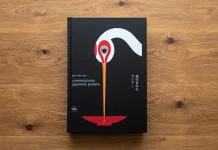
This post contains affiliate links. We may earn a commission if you click on them and make a purchase. It’s at no extra cost to you and helps us run this site. Thanks for your support!
My copy of The Graphic Design Bible has a coffee ring on page 214. It sits right on top of the Swiss grid systems spread. That feels almost too fitting for a book about structure and order. I didn’t skim this one for a quick opinion piece. I read every chapter, cover to cover, over about three weeks. Sticky tabs multiplied by the day, like they were reproducing on their own.
So here’s the review. It’s hands-on, specific, and built to answer what most people actually type into Google before spending thirty dollars on a design book. Is Theo Inglis’s Graphic Design Bible worth the shelf space? Short answer, yes. But there are real caveats, and I’ll walk through every one of them.
Here’s why that question matters more now than it did when the book landed in October 2023. AI image tools can spit out a logo in ten seconds flat. Half my former clients think that counts as design work. It doesn’t. A solid reference book is one of the clearest ways to explain the difference between generating an image and actually designing something. Visual literacy is getting rarer right when it’s needed most. That’s the timely part.
What Is the Graphic Design Bible, Exactly?
The Graphic Design Bible is a 320-page hardcover published by Prestel in October 2023. It costs around $30 and was written by designer, writer, and lecturer Theo Inglis. It covers roughly 150 years of graphic design. That’s everything from early printing and the Industrial Revolution through Bauhaus, postmodernism, and straight into social media design. Inglis has taught graphic design at the University of Suffolk. He also wrote Mid-Century Modern Graphic Design before this one, so this isn’t someone’s first attempt at design history writing.
The book runs on five broad chapters: History, Theory, Practice, Typography, and Mediums. Each topic gets its own two-page spread, packed with images, a short essay, a pull quote or two, and a small further-reading list. Think of it less as a novel you read start to finish. It’s closer to a shelf of encyclopedia entries that someone with real taste actually edited.

The Five Chapters, In Plain English
History covers the roots of graphic communication, moving from stone carving and manuscripts up through Bauhaus and digital design. Theory tackles the thinking behind the work, things like Gestalt principles and semiotics. Practice is supposed to cover the business and process side. Typography walks through type anatomy, classification, and how letterforms actually function on a page. Mediums closes things out with posters, packaging, branding, and social media.
Eye Magazine called it an all-rounder’s book. One that plays to Inglis’s strengths as a designer, historian, and educator all at once. That’s a fair summary. It also explains both the book’s biggest strength and its biggest weakness, which I’ll get to.
What It’s Actually Like To Hold And Use
Specs matter less than how a book feels in your hands, so let’s talk about that. It measures roughly 6.6 by 8.2 inches and weighs about 1.8 pounds. That’s light enough to read in bed, but sturdy enough to survive a work bag. The paper stock is matte and slightly heavier than a typical paperback. Color reproduction on those Bauhaus and Swiss poster spreads actually holds up because of it. No glare, no washed-out blues.
I threw it in my backpack for three weeks straight, dragged it to two coffee shops, and let a colleague borrow it overnight. The binding held. No cracked spine, no loose pages, and the corners survived one unfortunate drop onto tile. For a $30 hardcover, that’s a genuinely good build quality. Cheaper design books fall apart faster than that.
Why I Actually Picked This Book Up Now
I didn’t buy this for nostalgia. I bought it because I kept fielding the same question from junior designers on my team. What should I actually read to understand where any of this design language comes from? Most design education right now leans hard into tools and trends. Figma tutorials. Prompt engineering for Midjourney. Nobody’s teaching the Bauhaus anymore, at least not outside of design school.
That gap is exactly where a book like this earns its keep. You can’t judge whether an AI-generated layout is any good if you’ve never seen a Massimo Vignelli grid. Or read about why Swiss design took over corporate branding in the 1960s. Context builds judgment. Judgment is the one thing generative tools still can’t fake.
I actually put this to a test. I pulled three spreads on Bauhaus, Gestalt theory, and postmodern design and used them to prep a short internal workshop for my team. I also spot-checked a few dates and names against other sources I trust, just to see how careful the fact-checking was. Everything held up. No sloppy errors, no outdated claims. That’s not a small thing in a book covering 150 years of material in 320 pages.
How The Book Actually Performs, Chapter By Chapter
I needed a way to grade this thing beyond “I liked it” or “I didn’t.” So I built a small framework while reading, mostly to keep myself honest about which chapters were genuinely useful and which ones just looked good on the page.
The Primer Density Index: A Framework For Grading Reference Books
I’m calling it the Primer Density Index, or PDI. It scores each chapter from 1 to 10 across five criteria. Those are Historical Grounding, Visual Evidence, Actionable Takeaway, Further-Reading Depth, and Cross-Chapter Callback. That last one just means whether a topic connects back to something covered earlier in the book. Average those five numbers and you get a chapter score. Average the chapter scores and you get the book’s overall PDI.
Here’s how The Graphic Design Bible scored on my read-through. History lands at 8.4, strong on grounding and visual proof. Typography scores even higher at 8.8, the clear standout of the book. Mediums comes in at 7.9. Theory sits at 7.6, solid but occasionally abstract. Practice drags the average down at 5.2, mostly because it’s thin on Actionable Takeaway. That gives the book an overall PDI of roughly 7.6 out of 10. That’s a genuinely good score for a single-volume primer.
The Bible Paradox
Here’s a thesis worth naming, because it applies to more than just this book. Any reference title that calls itself a “Bible” is making a promise of completeness. But a 320-page format built on two-page spreads physically forces triage. Something has to get cut. I’m calling this tension the Bible Paradox: the title promises totality, and the page count enforces selection. Inglis is upfront about this himself, noting that entire sections here could each fill their own book. That honesty is refreshing. It’s also the built-in ceiling on how deep this particular book can go.
How It Stacks Up Against Other Design Reference Books
I pulled two other staples off my shelf to compare directly. A lot of people ask how this one fits next to the classics, so here’s the honest breakdown.
| Feature | The Graphic Design Bible | Meggs’ History of Graphic Design | Thinking with Type |
|---|---|---|---|
| Author | Theo Inglis | Philip B. Meggs, Alston W. Purvis | Ellen Lupton |
| Scope | History, theory, practice, typography, and mediums | Pure design history, academic depth | Typography only |
| Page Count | 320 pages | Around 700 pages, 6th edition | 256 pages, 3rd edition |
| Format | Hardcover, illustrated spreads | Hardcover, academic textbook | Paperback, workbook style |
| Price | Around $30 | Around $90 to $95 | Around $30 to $35 |
| Best For | Broad, fast-moving overview | Design students, deep academic study | Working typographers, editors |
The pattern is pretty clear once you see it laid out. The Graphic Design Bible sits in the middle. Not as deep as Meggs, not as narrow as Lupton. That middle spot is exactly where most working designers actually live day to day.
What Surprised Me (Not All Of It Good)
The Practice chapter is the weakest link, and I’m not alone in thinking that. Several reader reviews online make the same point I did while reading. Practice often reads like a continuation of theory rather than a genuinely separate, hands-on section. I expected process breakdowns, client workflows, and maybe pricing conversations. Instead, I got more conceptual material dressed up under a different header.
Some readers have also noted that the Theory and Practice chapters lean into the social and political sides of design work. Things like protest graphics and identity-driven movements come up more than once. I found that framing genuinely useful context for understanding design history. Other readers going in expecting a purely technical manual may find it heavier on commentary than they expected. Worth knowing before you buy, whichever camp you’re in.
What surprised me in a good way was the Typography chapter. It’s the tightest, most useful section in the whole book. If Inglis ever spins that chapter out into its own standalone title, I’d buy it without thinking twice.
Who Should Actually Buy This Book
Design students get the most value here. Especially anyone who needs a fast, visual crash course before diving into denser academic texts. Self-taught designers and career switchers benefit too, since the book fills historical gaps that bootcamps and YouTube tutorials tend to skip entirely. Working professionals who want a refresher, or something to hand a junior hire on day one, will also get plenty out of it.
Who should skip it? Anyone hunting for a step-by-step process manual or a book focused purely on business practice and client management. Practice is the one chapter that won’t deliver on that front. Go find a book built specifically for that instead.
Where Design Reference Books Are Headed Next
Here are three predictions, based on where the market and the tools are both moving right now.
First, print design references will become more valuable, not less, as AI-generated content floods every feed. A physical book someone actually edited, fact-checked, and curated becomes a mark of credibility. That’s a strange but real reversal from where things stood five years ago.
Second, expect the next edition of The Graphic Design Bible, or a competitor title, to add a section on AI-assisted design tools. Prompt-based workflows are already changing how junior designers work. Leaving that gap unaddressed for long would be a missed opportunity, given how fast the category is moving.
Third, the Practice chapter gap I mentioned earlier is a genuine opening. I expect a companion volume, from Inglis or someone else entirely, focused purely on the business side of design work. That book doesn’t really exist yet in this same accessible format. Someone will write it.
Frequently Asked Questions About The Graphic Design Bible
Is The Graphic Design Bible good for absolute beginners?
Yes. The spread format and heavy visual approach make it approachable even if you’ve never taken a design class. It works well as a first purchase before moving on to denser academic texts.
How does it compare to Meggs’ History of Graphic Design?
Meggs goes far deeper into pure history across roughly 700 pages and costs about three times as much. The Graphic Design Bible trades that depth for breadth. It covers theory, practice, typography, and mediums in one more affordable, more approachable volume.
Does it cover digital and UI or UX design?
It touches on digital design and social media within the Mediums chapter, but it isn’t a UI or UX design manual. Readers looking specifically for interface design guidance should pair this with a dedicated digital design resource.
Is it suitable as a college textbook?
It works well as a supplementary text or an entry-level primer. For upper-level design history courses, instructors will likely still want to pair it with a deeper academic resource like Meggs.
How long does it take to read cover to cover?
Reading every spread closely took about three weeks at a relaxed pace. Since each topic stands alone, most readers use it more as a reference to dip into. It’s not really built to finish in one sitting.
Is there a paperback or ebook version available?
Yes. The Graphic Design Bible ships as a hardcover, and it’s also available as an ebook for around four dollars. That makes it easy to keep a copy on your desk and a copy on your tablet.
What’s the single best chapter to start with?
Start with Typography if you want the highest-value section first. It’s the tightest, most practical chapter in the whole book and the one I flagged most while reading.
Does the book include a bibliography or further reading list?
Yes. Every spread ends with a short list of suggestions for going deeper on that specific topic. It’s genuinely useful for building your own reading list over time, one spread at a time.
Bottom line: The Graphic Design Bible earns its spot on a design shelf, coffee rings and all. It won’t replace a proper history textbook, and it won’t teach you how to run a client meeting. What it does, it does well: giving you enough context, fast enough, to actually understand where the visual language you use every day actually came from.
Check out other book reviews here at WE AND THE COLOR.
Subscribe to our newsletter!