This post contains affiliate links. We may earn a commission if you click on them and make a purchase. It’s at no extra cost to you and helps us run this site. Thanks for your support!
Why Does Mid-Century Modern Design Still Win Every Argument About Good Taste?
Mid-century modern design keeps winning because it never tried to impress anyone. That’s the short answer. The longer answer is that a style built between roughly 1945 and 1969 solved problems designers are still fighting today: too much noise, too little function, and materials that pretend to be something they’re not. I’ve spent years covering design trends for WE AND THE COLOR, and almost nothing ages as gracefully as a well-proportioned Eames chair or a Saarinen table. Meanwhile, half the “innovative” UI kits from three years ago already look embarrassing.
And don’t worry. This isn’t a nostalgia piece. I’m not here to tell you to buy a teak sideboard (though, honestly, go ahead). I want to pull apart what actually made mid-century modern design work, structurally and psychologically, and hand you a set of tools you can use whether you’re designing a chair, a logo, a website, or a living room. Some of these ideas have names nobody else uses yet. That’s on purpose. Vague praise doesn’t teach anyone anything.
For the full historical arc, from the postwar boom to its current comeback, my earlier article on the complete history of mid-century modern design covers the icons and the timeline in depth. This new article picks up where that one leaves off and asks a sharper question: what does this movement actually train your eye to do?
What Is Mid-Century Modern Design, Really?
Mid-century modern design describes the furniture, architecture, and graphic work produced mostly in the United States and Scandinavia after World War II, roughly from 1945 through the late 1960s. Designers like Charles and Ray Eames, Eero Saarinen, Florence Knoll, and Arne Jacobsen led the charge. They combined the discipline of European modernism with a much warmer, more livable sensibility.
Here’s the part most articles skip. Mid-century modern design wasn’t a single aesthetic. It was a response to a specific set of constraints: new manufacturing techniques, plywood and fiberglass molding, postwar housing shortages, and a cultural mood that wanted optimism instead of ornament. Every clean line and tapered leg came from somewhere practical. That’s the lesson buried under all the walnut veneer. Good style isn’t decoration layered on top. It’s the visible residue of solving a real problem well.

The Difference Between Mid-Century Modern and Plain Modernism
Bauhaus modernism stripped things down until only function remained, sometimes at the cost of comfort. Mid-century modern design took that same discipline and added warmth back in: curved plywood instead of rigid steel, organic shapes instead of pure geometry, and materials that felt good to touch. I call this gap the Structural Warmth Principle. It states that rigor and comfort aren’t opposites. They’re supposed to sit in the same object at the same time.
You can test this principle on almost anything you design. Does your layout, your product, or your room have the discipline of modernism and the warmth of a lived-in space? If it only has one, it’s not mid-century modern in spirit, no matter how many hairpin legs you bolt onto it.
The Restraint Ratio: A Framework for Borrowing From the Past Without Copying It
Most attempts at mid-century modern design fail for one reason. They overcommit. Starburst clocks, orange everything, and a hairpin leg on every single object turn a serious style into a themed restaurant. I’ve seen this happen to logos too when someone discovers a retro typeface and suddenly every letterform has to look like a 1962 travel poster.
So here’s a framework I use when I review interiors, brand identities, or furniture lines that lean on this era: the Restraint Ratio. For every strongly period-specific element you introduce (a starburst motif, a specific saturated color, a very literal historical reference), you need at least three neutral, contemporary elements to balance it. One bold vintage gesture, three quiet modern ones. Break that ratio, and the work stops reading as confident and starts reading as costume.
Walnut and teak illustrate this well. The strongest mid-century modern interiors right now don’t drown a room in dark wood. They use it as an anchor material, a credenza here, a table there, and let pale walls and stone-look surfaces carry the rest of the room. That’s the Restraint Ratio in physical form, and it applies just as cleanly to a website’s color palette or a packaging system’s typography.
Why Restraint Photographs Better Than Excess
There’s a practical reason restraint wins online too. A disciplined, well-edited room photographs better than a cluttered one, and that matters enormously now that real estate listings and design content live or die by a single scroll-stopping image. Buyers and readers respond to spaces that feel bright and thoughtfully edited, not maximalist. The same rule governs a portfolio site or an Instagram grid. Editing is the actual skill. Everyone already owns the same fonts and the same stock furniture references.
The Object Permanence Test: Would This Still Matter in Twenty Years?
Here’s a question I ask about every new project I look at, whether it’s a chair, an app icon, or a brand refresh. Would this still make sense in twenty years? I call it the Object Permanence Test, and mid-century modern design passes it more reliably than almost any other movement in the last century.
An Eames lounge chair from 1956 doesn’t look like a period piece sitting in a 2026 apartment. It looks like a good decision. Compare that to plenty of design trends from even five years ago: gradient mesh backgrounds, aggressive skeuomorphism, and that one specific shade of millennial pink, all of which now read as immediately dated. The difference isn’t taste. It’s structure. Mid-century modern design prioritized proportion, material honesty, and function over decoration, and those three things don’t have expiration dates. Trend-driven decoration always does.
If you’re a designer today, run your own work through this test before you ship it. Strip away the current color trend, the current type pairing, the current UI pattern. What’s left? If the answer is “not much,” you’ve built a trend, not a design. Mid-century modern furniture survived because the bones were sound underneath whatever surface treatment came and went.
A Personal Note on Furniture That Refuses to Die
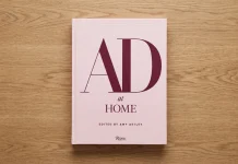
I reviewed Jenna McKnight’s book on this exact era a while back, and one thing stuck with me from that read. The pieces that survived weren’t necessarily the most famous ones at launch. They were the ones that solved a genuinely annoying problem, like how to mold plywood into a shape a human spine actually wants. My full take on that book, and what it reveals about the era that still shapes every living room, is over here if you want the longer version. It’s one of the better single volumes on the subject, and I don’t say that about many design books.

The One-Material Rule: How to Design With Fewer Ingredients and More Confidence
Mid-century modern interiors and objects tend to lean on a small, disciplined material palette. Walnut, teak, brass, glass, leather, maybe one bold upholstery fabric. Rarely more than that at once. I call this discipline the One-Material Rule: pick a single dominant material to carry the identity of a piece, then let everything else act as quiet support. This is harder than it sounds, because most designers, myself included on a bad brief, want to prove range by throwing in every texture available. Mixed metals, three different woods, a marble accent, and a velvet cushion, and suddenly the room or the layout has no center of gravity. Mid-century modern design avoided this by treating material choice as a decision with consequences, not a decoration to be layered indefinitely.
Apply this to a brand identity, and the logic holds. Pick one dominant typographic voice. Pick one dominant color relationship. Everything else supports that choice instead of competing with it. The best mid-century modern furniture pieces read as confident precisely because they aren’t negotiating between five ideas at once.
Color Behavior in Mid-Century Modern Design: Earth Tones as a Load-Bearing Choice
The mid-century palette gets flattened into “mustard and olive” by lazy mood boards, but the actual color logic is more interesting. These interiors typically pair a calm, earthy base, browns, warm grays, muted greens, with one or two saturated accent colors that get used sparingly. Mustard yellow, burnt orange, or turquoise doesn’t cover a wall. It shows up in a single chair, a single piece of art, and a single throw pillow.
That’s a color strategy, not a color scheme. The neutral base does the structural work. The accent color does the emotional work. Split those two jobs cleanly and almost any palette starts to feel more intentional, whether you’re painting a room or building a UI color system with a primary neutral and a single brand accent doing all the heavy lifting.
| Mid-Century Modern Principle | What It Actually Means | Where You Can Apply It Today |
|---|---|---|
| Structural Warmth Principle | Discipline and comfort belong in the same object | Product design, interiors, brand voice |
| The Restraint Ratio | One bold reference, three quiet modern supports | Retro-inspired branding, styled interiors |
| The Object Permanence Test | Would this still make sense in twenty years? | Any design decision before it ships |
| The One-Material Rule | One dominant material or voice, everything else supports it | Furniture, typography systems, packaging |
| Neutral base, sparing accent | Color has a structural job and an emotional job | Interior palettes, UI color systems |
| Function-first form | Shape follows a real, specific problem | Product design, layout, furniture |
Function-First Form: The Habit Every Great Mid-Century Modern Designer Shared
Eero Saarinen didn’t design the Tulip Table because pedestal bases looked cool. He designed it because he hated the “slum of legs” under a normal table, his words, not mine. Every leg competing for floor space, every chair scraping against every other chair. The tulip base solved that specific, annoying, physical problem, and the elegance came second.
That order of operations matters. Function first, elegance as a byproduct, not elegance first with function bolted on afterward. Most design that fails today fails because it inverted that order. Someone wanted something to look a certain way, then reverse-engineered a justification. Mid-century modern design, at its best, never worked that way. Ask what’s actually annoying about the object, the space, or the interface you’re building. Solve that. The elegance tends to show up on its own if the discipline is real.
Where This Breaks Down in Modern Practice
I see this inversion constantly in branding work. Clients see a mid-century modern reference, love the look, and want the aesthetic without touching the underlying strategy. That’s backward. You can’t borrow the surface of a movement built entirely on solving structural problems and expect it to carry any weight. If the strategy underneath is muddled, the tapered legs and warm wood tones are just costume, same as I said earlier about the Restraint Ratio. The look was never the point. It was the evidence.
Why Mid-Century Modern Design Is Booming Again in 2026
A few forces are converging right now, and none of them are random nostalgia. First, sustainability. Mid-century modern furniture was built to last; often solid wood construction meant to survive decades, which appeals directly to anyone tired of replacing particleboard furniture every few years. Second, the mixed-wood-tone trend has loosened up what used to be a strict “match everything” rule, making the style easier to blend into a home that isn’t a period recreation. Third, and this is the part designers underestimate, mid-century modern design performs exceptionally well on camera. It photographs cleanly for real estate listings, product shoots, and social feeds because the forms are legible at a glance, even at thumbnail size. That third point deserves more attention than it usually gets. In a feed built for half-second scrolling, a cluttered maximalist room loses. A disciplined mid-century modern space, with one dominant wood tone, a controlled palette, and clean silhouettes, wins the scroll because the eye can parse it instantly. Legibility isn’t just a UX term. It’s why this particular style keeps outperforming louder alternatives on Pinterest and Instagram alike.
How to Actually Use Mid-Century Modern Design Principles Without Faking It
Don’t start with the furniture catalog. Start with the four frameworks above and apply them to whatever you’re actually building.
Run the Object Permanence Test on your current project before you finalize anything. Apply the One-Material Rule and cut your palette down until one material or voice clearly leads. Check your Restraint Ratio if you’re borrowing any period-specific references at all. And ask, honestly, whether the form you’ve chosen grew out of solving a real problem or whether you copied a silhouette because it looked good in a mood board. If you want a genuinely thorough physical reference instead of another listicle, I reviewed what I still think is the best single sourcebook on the era and explained exactly why it earns that claim in this breakdown of the complete sourcebook on 1950s and ’60s design. It’s the book I actually keep on my desk, not just the one I recommend.

Frequently Asked Questions About Mid-Century Modern Design
What defines mid-century modern design?
Mid-century modern design is defined by clean geometric or gently organic forms, function-first construction, natural materials like walnut and teak, and a deliberate balance between modernist discipline and human warmth. It emerged roughly between 1945 and 1969.
Is mid-century modern design still popular in 2026?
Yes. Mid-century modern design remains one of the most requested interior and product styles in 2026, driven by demand for sustainable, durable furniture and a color and material approach that photographs well for real estate and social media.
What’s the easiest mistake to make with mid-century modern design?
Overcommitting to period references. Too many starburst motifs, too much orange, and too many literal vintage accessories turn a serious design language into a theme room. The Restraint Ratio in this article addresses exactly that failure point.
Can mid-century modern principles apply outside of furniture and interiors?
Absolutely. The core habits—function before decoration, one dominant material or voice, a disciplined color strategy, and durability that survives changing trends—translate directly to branding, product design, and digital interfaces.
Who were the most influential mid-century modern designers?
Charles and Ray Eames, Eero Saarinen, Florence Knoll, and Arne Jacobsen are widely regarded as the movement’s defining figures, each pairing new manufacturing techniques with a strong sense of human comfort.
Browse WE AND THE COLOR’s Architecture and Interior Design categories for more.
Subscribe to our newsletter!