Canwei Lai created some modern and minimalist brand visuals for Varmhome.
Varmhome is devoted to producing unique designs that are both stylish and of the highest quality. They encourage people to create a sense of warmth in their homes, allowing for comfortable, peaceful, and cozy living spaces with distinct emotional character.
Canwei Lai 赖灿伟 was commissioned to work on a suitable brand identity for Varmhome. The Chinese name symbolizes the tranquil and cozy home, similar to migratory birds that always return to their soft Southern habitat. The company wants every product they offer to not only be a single item but also form part of a larger collection which ultimately creates an enhanced lifestyle for our customers.
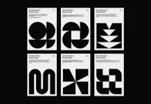
The logo’s ingenuity is sourced from the initial “V” of the company name and furniture design, granting both brand and product ambiguous visual language. Is it a four-corner side table? A chair? Lockers maybe? Storage box if you will – what matters is that its abstract symbolism aptly reflects their mission statement to assemble an improved life! Diverse products and varying shapes are perfectly entwined in an expressive graphic representation.

All images © by Canwei Lai 赖灿伟.
Customer: Varmhome窝候
Design:赖灿伟 LAI_CANWEI
Year:2021


