
This post contains affiliate links. We may earn a commission if you click on them and make a purchase. It’s at no extra cost to you and helps us run this site. Thanks for your support!
This Template is a Minimalist Marvel for Your Next Publication or Portfolio Presentation.
Looking at this design, you can’t help but notice the clean lines, right? It’s definitely going for that minimalist vibe. It’s the kind of thing that says, “We’re all about the content,” and does it with style. Have you ever seen a design that just makes you feel calm and focused? That’s this template by GraphicArtist, a talented Adobe Stock contributor who specializes in a wide range of graphic stock items.
Please note that this template requires Adobe InDesign installed on your computer. Whether Mac or PC, the latest version is available on the Adobe Creative Cloud website—take a look here.
What’s the Deal?
This particular template was whipped up by GraphicArtist, and it’s sized for A4 paper. That’s a standard size. So, it makes printing a breeze. It comes with 16 ready-made pages. It’s designed for all sorts of publications. Think books, magazines, or maybe even a snazzy portfolio. But, get this – it’s not set in stone. Every single page is totally customizable.
Easy Peasy to Use
Seriously, it’s user-friendly. The designers made it so you can just jump right in. See all those images and texts? They’re only placeholders. They are there to help you visualize your content. The cool part is that you can add your own content in just minutes. Sounds good, huh? It’s designed to make your publishing process easy.
Print-Ready Magic
And let’s talk about the color. It’s all set up with CMYK color mode. Do you know what that means? It means it’s ready for printing. No headaches with colors looking weird when you print them. That’s always a huge plus. The design team really thought everything through.

Let’s break down the elements and layouts:
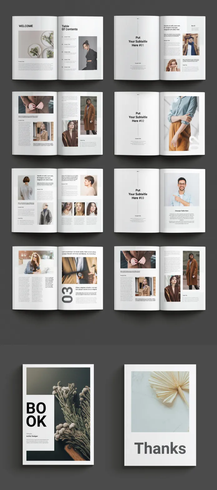
- Opening Pages: Notice how the opening spread is all about introducing the reader to the content. The “Welcome” and “Table of Contents” pages are laid out in an elegant and organized manner. That first photo on the “Welcome” page? It is a subtle and appealing touch. Isn’t it interesting how a single image can enhance the text and grab your attention right away? The “Table of Contents” side has a very classic look. You can clearly see the layout is easy to read, with a clear hierarchy between titles and the numbers.
- Subtitled Sections: Then, you have pages where you’re prompted to “Put Your Subtitle Here #01,” #02, #03… and so on. This really is what makes this template so versatile. You can easily drop in your own section headings. See how each of these subtitle pages has a different but equally minimalistic design. There is enough white space to keep your readers focused on the information being presented.
- The layouts on the right-hand side pages have an image and text, but on the left side it is just text. Do you know why this design decision might be useful?
- The pages numbered #01 and #02 include a person portrait. There are some very well-chosen fonts. Do you think the choice of fonts is successful?
- In all these subtitle pages, notice how the number appears in the upper right corner and is bold and bigger than the rest of the text? This detail enhances the structure and organization.
- Text-heavy pages: On the other hand, the template includes some pages where there is no image. These are completely text-based. They also include subtle numbered headlines to indicate the flow of the content and maintain the clear visual structure. Does this make it more inviting to read?
- Image-centered pages: Some pages are designed to showcase images as the central element of the design. This template is balanced!
- Closing Pages: Lastly, there are the closing pages. The main “Book” cover page uses a dark background, with a single and centered image of a dried branch and a small title. Then we see the closing page with the simple, minimalist, and polite “Thanks.” The team definitely took a mindful approach to the ending. How does this simple approach make you feel?
Who is it for?
This design would be excellent for people who value clean design. This includes entrepreneurs, academics, writers, photographers, designers, or anyone looking for a polished, modern look to publish their content. It’s versatile enough for many different projects. Think of it as a blank canvas for your creativity.
A Quick Summary
To wrap up, it’s clear this InDesign template is a solid option if you’re aiming for something that looks modern and professional. It’s well-designed and easy to use. It’s ready to go for printing. It offers the perfect balance between customization and structure. It would be a great tool to publish your content with a clean, minimalist aesthetic.
So, what do you think? Ready to give it a try?
All images © by Check out other amazing graphic design templates on WE AND THE COLOR.
Subscribe to our newsletter!


