This post contains affiliate links. We may earn a commission if you click on them and make a purchase. It’s at no extra cost to you and helps us run this site. Thanks for your support!
I spent three weeks building the same career story twice. Once as a classic A4 resume format, laid out for print. Once as a full-screen presentation resume format, built for a monitor. Same job history, same skills, same photo, two completely different documents. Then I sent both versions to five people whose job is reading resumes for a living: two recruiters, a creative director, an HR generalist at a manufacturing company, and a friend who screens applications for a regional bank. Their reactions split almost perfectly down the middle, and that split is the whole story of resume format choice right now. Nobody agrees anymore on what a normal application even looks like, and that disagreement is costing job seekers interviews they’d otherwise get.
Why Do Two Completely Different Resume Formats Now Compete for the Same Job?
Ten years ago, this wasn’t a real question. You wrote a resume, you printed it or attached it as a PDF, and everyone read it the same way, on the same kind of screen or the same kind of paper. That single shared resume format is gone. Hiring now happens across three different reading environments at once: a phone screen during a commute, a 27-inch monitor during a portfolio review, and occasionally, still, a printed stack on a conference table before a panel interview.
Each environment rewards a different resume format. A document built for paper looks cramped and undersized on a wide monitor. A document built for a monitor looks broken the moment someone tries to print it on standard office paper. That mismatch is where most job seekers lose points before a human even reads a single line of qualifications.
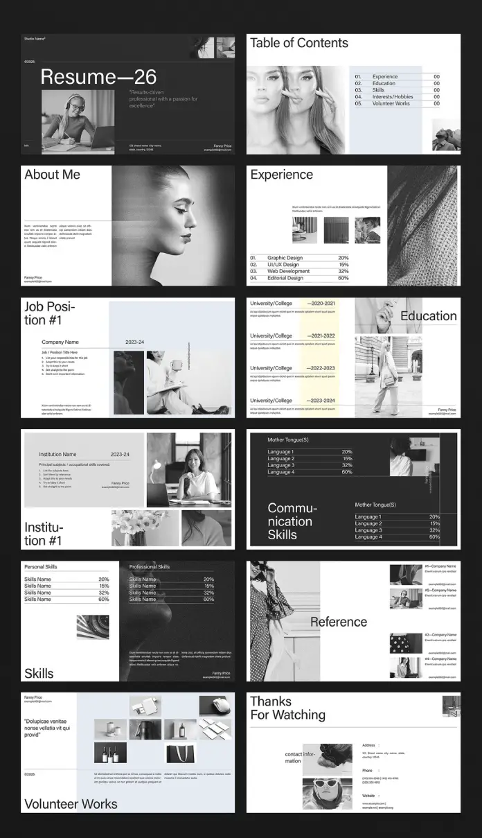
The two templates I tested represent the extremes of this split, and both come from Adobe Stock. The A4 resume and cover letter template from Designcy Studio is built in Adobe InDesign for CMYK print output and exports as a clean, two-page PDF. The Resume 26 template by E-Type takes the opposite approach entirely. It’s built at 1920 by 1080 pixels, styled as a black-and-white presentation deck, and designed to be viewed on a screen from the first slide to the last.
The Format Fit Score: A Quick Way to Know Which Resume Format You Actually Need
I built a small scoring system while testing both templates, because “it depends” isn’t useful advice to anyone applying for a job this week. Call it the Format Fit Score. It’s not an industry standard, just a framework I now use whenever I judge application materials for this publication. You score your own situation from zero to two points across four questions, then add the total.

First, how will the document actually be opened? If it’s an applicant tracking system or a printed stack, that’s zero points toward a presentation resume format. If it’s a portfolio review on a screen, that’s two points.
Second, does the role require visual proof of skill, not just a description of it? Design, architecture, and content roles score two points here. Finance, operations, and legal roles score zero, almost without exception.
Third, is the company culture conservative or experimental? Score honestly, not aspirationally. A startup that still uses a rigid corporate portal behaves like a conservative company for this purpose.
Fourth, are you early in your career and need to stand out, or senior and need to signal restraint? Early career leans toward two points for the presentation resume format.
Add the numbers. Anything under four points means stick with the A4 resume format. Anything above five means the screen presentation format is worth the extra build time it demands.
The Two-Second Recognition Test
Every recruiter I interviewed for this piece described the same reflex, even though none of them used identical words for it. They know within about two seconds whether a document was made with care, regardless of which resume format they’re holding. I now call this the Two-Second Recognition Test, and it applies equally to both formats without favoring either one.
For A4 resumes, the test checks margins, font consistency, and whether the layout survives a print job without shifting or clipping text. For presentation resumes, the test checks whether slide one looks intentional or looks like a hastily reformatted Word document dropped into a template.
Format doesn’t decide who passes the test. Craft does. A sloppy presentation resume fails just as fast as a badly kerned A4 page, and a beautifully printed A4 resume beats a lazy sixteen-slide deck every single time.
The Classic A4 Resume Format, Tested
I built my print version using the structure from the Designcy Studio template, and the strict two-page limit forced real editing almost immediately. One page for the cover letter, one page for the resume, and nothing more allowed. That constraint is the entire argument for this resume format. You can’t hide behind volume or padding. You either know what matters in your own career, or you don’t yet.
CMYK color mode was the detail that actually mattered once I moved from screen to paper. My first draft looked fine on my monitor and printed with washed-out, muddy blues when the bank contact ran it through her office printer. That’s not a hypothetical problem invented for this article. Applicant tracking systems and old-fashioned print rounds still exist inside plenty of large organizations, and a resume format that ignores them creates unnecessary friction for no real benefit.
Where the A4 Resume Format Still Wins
- Applicant tracking systems parse a clean PDF far more reliably than a converted presentation file ever will.
- Conservative industries, including finance, law, healthcare administration, and government roles, still expect a traditional document by default.
- Panel interviews sometimes print applications for reviewers who never open a laptop during the actual meeting.
- Recipients without design software can open a standard PDF instantly, on any device, without formatting quietly breaking.

The Screen Presentation Resume Format, Tested
The Resume 26 build turned into a different exercise entirely. Instead of editing text down to a strict page limit, I spent most of my time arranging work samples, skill percentage bars, and monochrome photography across sixteen slides. It felt less like writing a resume and more like assembling a short portfolio talk for a room I couldn’t see yet.
The creative director in my test group responded to this format immediately, almost instinctively. She opened it during our call, scrolled through in under a minute, and asked two specific follow-up questions about one project image. That reaction never happened with the A4 version, not once. The bank contact, on the other hand, admitted she genuinely wasn’t sure what to do with a sixteen-slide deck attached to a job application email, and that hesitation matters more than any design opinion I could offer.
Where the Presentation Resume Format Wins
- Design, architecture, and UX roles where visual communication is the actual job requirement, not a bonus skill.
- Portfolio review meetings, where slides support a live conversation instead of standing on their own.
- Content creation and social media roles, where campaign metrics and visuals genuinely need a home.
- Freelance client pitches, where a presentation resume format doubles neatly as a proposal document.
The Portfolio Bleed Problem
Presentation resumes create a specific failure mode I started calling Portfolio Bleed while testing this resume format. It happens when a document meant to summarize a career quietly turns into a full portfolio instead, and the actual qualifications get buried under an avalanche of work samples. My first draft had this problem badly, and I didn’t notice until a second read.
By slide nine, a reviewer had already seen six images and maybe four real facts about my work history. Portfolio Bleed is easy to avoid once you can name it, though. Every slide needs exactly one job: state a fact or show one piece of proof, never both at length on the same slide. The moment a slide tries to do everything at once, the resume format stops working as a resume and starts working like a slow-loading portfolio site nobody actually asked to browse.
Who Should Use Which Resume Format? The Application Format Ladder
After testing both formats end to end, I built a simple decision ladder instead of a flowchart. Climb it from the bottom, and stop the moment you reach a rung that actually fits your situation.
Rung one: if the job posting mentions an applicant tracking system, a portal upload, or a large corporate HR department, use the A4 resume format. No exceptions worth making.
Rung two: if the industry is design, architecture, content, or marketing, and the application goes to a named human rather than a portal, consider the presentation resume format seriously.
Rung three: if you’re early in your career with a thin work history, the presentation format lets visual proof compensate for a short resume honestly.
Rung four: if you’re applying for a senior or executive role, default back to the A4 resume format. Restraint reads as seniority at that level, almost every single time I’ve tested it.
| Scenario | Better Resume Format | Why It Wins |
|---|---|---|
| Application via corporate HR portal or ATS | A4 print resume | Parses cleanly, no format confusion |
| Design, UX, or architecture role, direct submission | Screen presentation resume | Visual proof matches job requirements |
| Senior or executive-level application | A4 print resume | Restraint signals seniority |
| Early-career creative with a thin work history | Screen presentation resume | Visuals compensate for limited experience |
| Freelance or agency client pitch | Screen presentation resume | Doubles as a proposal document |
| Finance, law, healthcare admin, or government role | A4 print resume | Matches conservative industry norms |
| Live portfolio review meeting | Screen presentation resume | Supports a guided conversation |
| Panel interview with printed materials | A4 print resume | Reliable, consistent print output |
My Actual Verdict
Here’s where I land after three weeks of building both documents from scratch. The A4 resume format isn’t old-fashioned; it’s infrastructure. It works everywhere, breaks almost nowhere, and never once confuses a recruiter about what they’re looking at on their screen. The screen presentation format is a specialized tool, brilliant in the right hands, and genuinely damaging when it lands in the wrong context.
If you only have time to build one document, build the A4 version first. It’s the resume format that every hiring system on earth can still read reliably. Build the presentation version second, and only if your industry and career stage actually reward the extra effort. Keep both ready in a folder. Send whichever one the situation calls for, not whichever one you personally prefer to build.
What Comes Next for Resume Format Design
Interactive PDFs are already blurring the line between the two formats. A PDF can now carry embedded video links, clickable navigation, and small portfolio galleries while still opening reliably in any inbox, on any device. I expect the next real change in resume format isn’t A4 versus screen at all. It’s static versus interactive, with both formats eventually offering a lightweight interactive layer underneath.
My prediction, for whatever it’s worth: the all-print resume and the all-slide resume deck will likely converge into one flexible file format within the next few hiring cycles, built once and exported differently depending on whichever channel the specific job actually needs that week.
Frequently Asked Questions About Resume Format
Is a screen presentation resume actually a resume, or is it a portfolio?
It’s genuinely both, and that’s deliberate. A presentation resume format blends career facts with visual proof of skill on the same slides, which is exactly why it only works well for roles where visual proof actually matters to the hiring decision.
Will an applicant tracking system read a presentation-style resume format correctly?
Rarely, and don’t count on it happening. Keep a traditional A4 PDF ready for any application that routes through a portal or tracking system, and save the presentation format for direct human review instead.
Can I convert my A4 resume into a presentation format later on?
Yes, but treat it as a rebuild, not a simple resize. The two formats organize information very differently, and stretching an A4 layout onto a widescreen slide usually looks unfinished and thin.
Do recruiters actually prefer one resume format over the other?
Preference splits by industry, not by generation or personal taste, based on everyone I spoke with. Conservative sectors expect the A4 format. Creative and portfolio-driven fields increasingly expect, or at least welcome, a presentation format instead.
What file size should a presentation resume format stay under?
Aim for five to eight megabytes so it survives corporate email filters intact. Anything larger risks getting silently blocked before a human reviewer ever opens the file.
Is it risky to send a presentation resume to a conservative company?
Somewhat, yes. It signals confidence in creative fields and signals a misread of the room almost everywhere else. When genuinely in doubt, default to the A4 resume format and let a separate portfolio link carry the visual case instead.
How many slides should a presentation resume format actually include?
Ten to fifteen slides is the practical ceiling worth respecting. Past that point, reviewers stop reading closely and start skimming fast, which quietly defeats the format’s entire advantage.
Resume format used to be a settled question, decided once and never revisited. It isn’t settled anymore, and pretending otherwise costs interviews you’d otherwise land. Test both formats against your own industry before you commit fully to one. The job description usually tells you which resume format it actually wants if you’re willing to read it that closely.
If Adobe InDesign is your preferred tool for creating resumes, feel free to take a look at our selection of the top 5 InDesign resume templates in 2026. In addition, check out other professional graphic design templates here on WE AND THE COLOR.
Subscribe to our newsletter!