
Big Cartel, a champion for independent artists and small businesses using its online store platform since 2005, recently faced a similar moment of reflection. This led to a significant transformation: the Big Cartel rebranding, expertly handled by the creative agency How&How. This wasn’t just a fresh coat of paint; it’s a strategic Big Cartel rebranding designed to recenter Big Cartel’s core mission – helping creators sell themselves and their unique work. Let’s explore how this exciting Big Cartel rebranding is set to redefine the platform for a new era of independent artist e-commerce.
Goodbye, Caution: The “Why” Behind the Big Cartel Rebranding
Big Cartel has always been about serious business for creatives. Since 2005, everyone from woodworkers to niche medieval tapestry artists has used its online store platform. They’ve collectively invoiced a staggering $2.5 billion! That’s a lot of passion turned into profit. However, the online world of portfolios, resale sites, and handmade stationery has become incredibly bustling. Think of it as a vibrant, but sometimes overwhelming, bazaar. In this lively market, Big Cartel realized its voice needed a bit of a boost. This is where the How&How design agency stepped in. Their mission? To help Big Cartel do for itself what it does so well for others: stand out and sell its unique value. This Big Cartel rebranding was born out of a need to cut through the noise and clearly communicate its enduring value.
From “The Was” to “The How”: A New Vision Ushered in by the Big Cartel Rebranding
There’s a common belief in business, isn’t there? That a perfect plan is the ultimate key to success. A plan to dissolve fear, pave the way to glory, and guarantee triumph. But after two decades, Big Cartel learned that reality is far more nuanced. The truth, they found, is “anything but” simple adherence to a rigid plan. So, with an expanding array of affordable plans and intuitive tools, Big Cartel was already giving founders a genuine head start, not just a run for their money. What was missing? A brand identity design that could shout from the rooftops: “Yes, it really IS this simple to get started!” The recent Big Cartel rebranding aimed to create exactly that.
How&How’s approach to this significant project wasn’t just about a new look but about breathing new life into the platform. They focused on dismantling the barriers that often stop entrepreneurs from taking that first big leap. The goal of the Big Cartel rebranding was to position Big Cartel as the undeniable go-to for anyone daring to launch their dream, making it clear how How&How rebranded Big Cartel for artists with such precision. Now, no idea is too quirky, too ambitious, too grand, or too modest. The brand emphatically supports this.
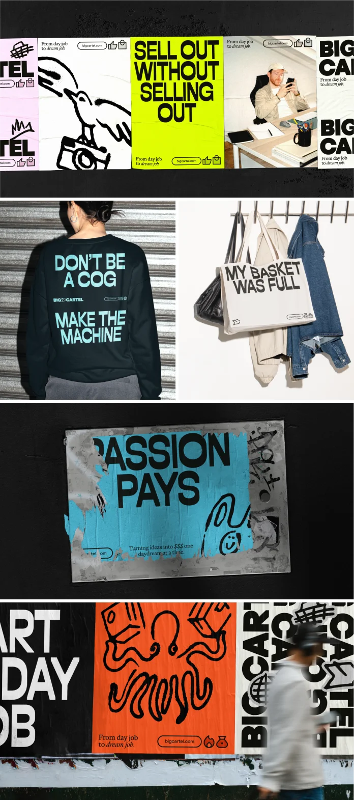
Deconstructing the “Scrapper” Identity: The New Big Cartel Rebranding Elements
So, what does this revitalized Big Cartel look and feel like after the Big Cartel rebranding? The team at How&How design agency describes the new identity as a “real scrapper.” This term perfectly captures its energetic, determined, and slightly unconventional spirit. The core of the visual aspect of the Big Cartel rebranding is a central illustration style. Are you someone who scribbles ideas in notebooks? This style is inspired directly by those raw, authentic moments of creation. It hits the mark perfectly, establishing a free-spirited tone that influences every other element of this brand identity design.
Think about the voice. It’s punchy. It motivates members to get out there and market their wares. The headline style? It’s designed to cut through any doubt, making a clear and confident statement. You’ll also notice risograph textures. These speak to Big Cartel’s indie roots, giving a nod to DIY and independent publishing aesthetics. This is a clever touch, grounding it in authenticity. And the color palette? It’s a rich bank of colors, heralding Big Cartel’s new point of difference and adding vibrancy. Every piece of this new identity works together. It creates a world that feels as self-made and unique as the artists and entrepreneurs it champions.

The Cherry on Top: A Re-Thought Logo within the Big Cartel Rebranding
And what about the logo, the very face of the brand, following the Big Cartel rebranding? How&How delivered a “rabble-rousing, re-thought logo.” The new logo and branding skillfully carry 20 years of noughties goodwill into the present day. It’s a testament to the idea that you don’t need to be “picture-perfect” to get your creations online. This part of the Big Cartel rebranding is crucial. It proves that authenticity and a bit of grit are valuable assets in the digital space. This approach makes the online store platform feel more accessible and less intimidating, doesn’t it? The message is clear: come as you are, and Big Cartel will help you shine. The new identity thoughtfully preserves its heritage while boldly stepping forward.
More Than Just a Makeover: The Impact of the Big Cartel Rebranding for Artists
Callum Richards, Senior Designer at How&How design agency, shared his thoughts on the collaboration: “Working with the Big Cartel team has been an incredible experience. From day one, we were empowered to take bold risks and think beyond the limits. Together, we built something that not only propels Big Cartel into a new era but also stays true to its indie roots. This brand is the product of true collaboration.” This sentiment underscores the depth of the Big Cartel rebranding. It’s not merely a cosmetic update. It’s about empowering the platform itself to better empower its users.
The strategic intent behind the transformation is to attract more creatives to independent artist e-commerce who resonate with this “scrapper” spirit. It’s about making the tools feel even more intuitive and the community even more supportive. For existing users, this change likely feels like a fresh wave of energy and renewed commitment from the platform they trust. For new users, it’s an invitation to join a platform that truly gets the creative journey, showcasing the benefits of Big Cartel’s rebranding for small businesses.
Are You Ready to Stop Dreaming and Start Doing?
The press release ends with a powerful call to action: “So, go on, what’s holding you back? Stop dreaming. Start doing.” This perfectly encapsulates the revitalized spirit of Big Cartel, fueled by the Big Cartel rebranding. It asks a direct question, urging you, the reader, the potential entrepreneur, the artist with a vision, to take that step. Does this resonate with you? The entire effort is designed to make that “start doing” part feel simpler, more exciting, and fully supported. It’s about turning those notebook scribbles into real, thriving online stores.
Conclusion: A Bold New Chapter Shaped by the Big Cartel Rebranding
The Big Cartel rebranding by How&How design agency is more than just a successful design project; it’s a strategic masterstroke. It’s a repositioning that reaffirms Big Cartel’s commitment to independent creators. By embracing a “scrapper” identity, simplifying its message, and staying true to its indie roots through this comprehensive Big Cartel rebranding, Big Cartel is poised to inspire a new generation of entrepreneurs. This transformation demonstrates a keen understanding of its audience and the evolving digital landscape of independent artist e-commerce. What do you think of the new direction established by Big Cartel’s new logo and branding? One thing is certain: this significant update has set the stage for an exciting future for both the online store platform and the countless artists it serves. If you want to explore the new branding further, check out How&How’s work at www.how.studio or specifically at www.how.studio/branding/big-cartel.
All images © How&How. Feel free to browse WE AND THE COLOR’s Graphic Design and Branding categories for more creative inspiration.
Subscribe to our newsletter!


