
This post contains affiliate links. We may earn a commission if you click on them and make a purchase. It’s at no extra cost to you and helps us run this site. Thanks for your support!
Helvetica is a titan of typography. Its clean lines and neutral presence have made it the default choice for countless brands, signs, and documents for over 60 years. But its very success presents a modern design challenge. When a typeface is everywhere, how can a design feel unique? This is where the search for compelling Helvetica alternatives begins. It’s not about finding a direct copy; instead, it’s about discovering typefaces that capture its minimalist spirit while offering something more—more character, better on-screen performance, or simply a different story to tell.
This isn’t a rejection of a classic. On the contrary, it’s an appreciation of its legacy. We are looking for fonts that stand on the shoulders of this giant. The goal is to find a typeface that feels just as clear and reliable but adds a distinct voice to your project. Are you looking for a font with a bit more warmth? Or perhaps one engineered specifically for crisp digital displays? The world of neo-grotesque and Swiss-style fonts is vast. Let’s explore ten fantastic Helvetica alternatives that provide a fresh perspective without sacrificing that timeless, modern feel.
What Makes a Great Helvetica Alternative?
Before we get to the list, what are we even looking for? A good alternative should share some of Helvetica’s core DNA. This usually means it’s a sans-serif, specifically a neo-grotesque, with uniform stroke widths and a clean, geometric structure. However, the best options distinguish themselves with subtle details. These might be a slightly larger x-height for better readability, more open apertures (the spaces inside letters like ‘c’ or ‘e’), or a unique historical backstory. The key is finding a balance between familiarity and novelty.
The Top 10 Best Helvetica Alternatives for Designers
Here is a curated selection of typefaces that serve as excellent Helvetica alternatives. Each one offers a unique reason to be chosen, whether for its historical significance, digital optimization, or sheer aesthetic charm.
1. Neue Haas Grotesk: The Authentic Original

Many people don’t realize that the Helvetica we use today is a modified version of the original. Neue Haas Grotesk is the digital restoration of Max Miedinger’s 1957 masterpiece, before it was altered for different typesetting systems.

What makes it a superior choice? In short, authenticity. Neue Haas Grotesk has a subtlety and warmth that was somewhat lost in later versions of Helvetica. Its spacing is tighter and more rhythmic, and the letterforms have a slightly more organic feel. It feels less like a corporate machine and more like a finely crafted tool. If you love Helvetica’s concept but want a version with more soul, this is your font. It’s the connoisseur’s choice, perfect for high-end branding and print work where nuance matters.
2. Akzidenz-Grotesk: The Predecessor and Inspiration
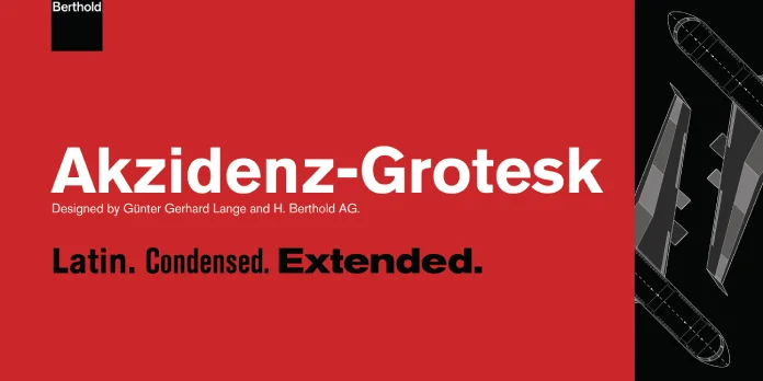
To understand Helvetica, one must know Akzidenz-Grotesk. Released by the Berthold Type Foundry in 1898, it is one of the first widely used sans-serif typefaces and was a direct inspiration for Helvetica.
So, why choose the ancestor? Akzidenz-Grotesk is less polished and more idiosyncratic. It has a raw, industrial quality that feels incredibly authentic and powerful. The letterforms are slightly more condensed and irregular, giving it a character that Helvetica smoothed over. Using Akzidenz-Grotesk is a nod to design history, making it an excellent choice for projects that aim for a timeless, utilitarian, and effortlessly cool aesthetic. It’s a classic that never went out of style.
3. Univers: The Structured Competitor
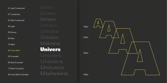
Released in the same year as Helvetica, Adrian Frutiger’s Univers was designed with a different philosophy. While Helvetica was developed as a single font, Univers was conceived as a comprehensive system of 21 weights and styles from the very beginning.
This systematic approach is its greatest strength. Every weight, from ultra-light to extra-black, is designed to work in perfect harmony. This makes Univers an incredibly versatile and reliable choice for complex design systems, such as corporate branding, wayfinding, and publications. Its letterforms are more geometric and refined than Helvetica’s, giving it a calm and sophisticated presence. If you need a cohesive font family that can handle any task you throw at it, Univers is an unmatched option.
4. Inter: The Ultimate Digital-First Helvetica Alternative

Designed specifically for computer screens by Rasmus Andersson, Inter is a free, open-source powerhouse available on Google Fonts. It was engineered from the ground up to be exceptionally legible at all sizes, especially in user interfaces (UI).
What makes Inter one of the best Helvetica alternatives for web and app design? It features a tall x-height, which makes lowercase letters easier to read. Furthermore, it includes contextual alternates and other OpenType features that automatically adjust spacing for better clarity. It feels like Helvetica’s modern, screen-savvy cousin. For any digital product—from a complex web app to a simple mobile interface—Inter provides unparalleled readability and a clean, neutral tone. It’s a practical, no-compromise choice for the digital age.
5. Roboto: The Android Standard
Another fantastic free option from Google Fonts, Roboto was developed by Google as the system font for its Android operating system. It blends the geometric forms of classic grotesques with the friendly, open curves of humanist sans-serifs.
This hybrid nature is its secret weapon. Roboto feels mechanical yet friendly, a quality that makes it incredibly versatile. It doesn’t have the rigid neutrality of Helvetica; instead, it has a natural reading rhythm that works beautifully for long passages of text on screens. If you’re looking for a free Helvetica alternative that is less imposing and more approachable, Roboto is a superb pick. Its wide family of weights makes it suitable for everything from headlines to body copy.
6. San Francisco (SF Pro): The Apple Ecosystem Font
If you’ve used an Apple device in the last few years, you’ve seen San Francisco. It’s Apple’s proprietary system font, and it’s a masterclass in functional typography. Like Inter, it was designed for ultimate screen legibility across a massive range of sizes and resolutions.
Its key feature is optical sizing. The system automatically switches between “SF Pro Text” for smaller sizes and “SF Pro Display” for larger ones, ensuring every letter is perfectly rendered for its context. The tracking (letter-spacing) also adjusts dynamically. While its license restricts use to apps developed for Apple platforms, it’s a benchmark for what modern Helvetica alternatives should aspire to. For iOS or macOS development, it’s the only choice you need.
7. Aktiv Grotesk: The Modern Workhorse
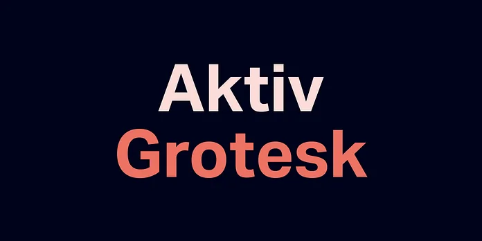
Designed by Bruno Maag, Aktiv Grotesk was created as a direct response to Helvetica’s perceived flaws. Maag aimed to strip away the “blandness” of 20th-century grotesques and create something more functional and charismatic for the 21st century.
The result is a typeface that feels both classic and contemporary. It has a more open and clear structure than Helvetica, with improved legibility, especially in digital contexts. Its tone is international and confident, without the baggage of its predecessors. Think of Aktiv Grotesk as a modernized, globalized version of the Swiss style. It has become a favorite among tech companies and global brands for its clean, forward-looking, and highly functional aesthetic.
8. Work Sans: The Quirky, Optimized Alternative

Here is another brilliant free option from Google Fonts. Work Sans is a sans-serif typeface family based on early grotesques. What makes it unique is its optimization for screen use, particularly at medium sizes (14px-48px).
Work Sans has a friendly and slightly quirky character, especially in its heavier weights, which are great for display purposes. The lighter weights, however, are simplified for better performance as web body text. This versatility makes it a fantastic, cost-free solution for designers who need a font that works well for both headlines and paragraphs. It’s one of the best Helvetica alternatives if you want a touch of personality without sacrificing professionalism.
9. Nimbus Sans L: The Free and Direct Alternative
Nimbus Sans L is a typeface that looks remarkably similar to Helvetica. It was created by URW++ in 1987 and is one of the most well-known free “look-alikes.” It’s often included in open-source operating systems as a substitute for standard licensed fonts.
If your primary concern is finding a free font that is visually almost identical to Helvetica, Nimbus Sans is your answer. It captures the same weight, proportions, and overall feel. This makes it a practical choice for projects on a tight budget that require that specific Swiss modernist aesthetic. It’s a pragmatic solution when you need the Helvetica look without the license fee.
10. Arial: The Ubiquitous One (Handle with Care)
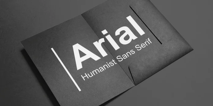
It’s impossible to discuss this topic without mentioning Arial. Designed in 1982 for Microsoft, it was created to be metrically compatible with Helvetica. This means a document set in Arial will have the same character widths and line breaks as one set in Helvetica, making it a seamless substitute.
However, the design details are different. Arial’s curves are softer and its terminals (the ends of strokes) are cut at an angle, whereas Helvetica’s are typically horizontal or vertical. These changes make Arial feel, to many designers, like a less refined imitation. Is it a viable Helvetica alternative? Yes, in a functional sense. It’s universally available and gets the job done. But if you’re aiming for typographic excellence and a unique voice, the nine other options on this list offer far more character and sophistication.
How to Choose Your Perfect Helvetica Alternative
Making the right choice depends entirely on your project’s needs. Ask yourself a few questions:
- What is the primary medium? For digital UI, prioritize fonts like Inter or Roboto. For high-end print, consider Neue Haas Grotesk or Akzidenz-Grotesk.
- What is the budget? If it’s zero, Google Fonts like Inter, Roboto, and Work Sans are professional, world-class options.
- What personality are you trying to convey? For a serious, systematic feel, Univers is perfect. For something more modern and confident, look at Aktiv Grotesk.
- How important is historical context? Using Akzidenz-Grotesk or Neue Haas Grotesk tells a story of design history and authenticity.
Moving beyond Helvetica opens up a world of expressive, functional, and beautiful typography. It’s a chance to make a deliberate choice that elevates your design from something generic to something truly memorable. So, which alternative will you choose to tell your next story?


