
Rebranding projects always capture our attention. They offer a unique glimpse into strategic design thinking. Specifically, the recent Zürich Card rebranding by Studio Marcus Kraft stands out. This project is timely and relevant. It shows how visual identity can elevate a city’s appeal. It demonstrates how design impacts tourism. The studio’s approach offers valuable lessons. What makes this particular redesign so effective? How does it speak to a modern audience?
The Zürich Card Rebranding: A Closer Look
The Zürich Card, Zurich Tourism’s official city pass, recently received a fresh look. This new visual identity launched this summer. Studio Marcus Kraft, a renowned Zurich design studio, led the Zürich Card rebranding. The studio previously developed Zurich Tourism’s overall visual identity in 2017. Their long-standing relationship with the brand is evident. They understand its core values.
The card’s offerings have expanded significantly. For example, it now includes free entry to most Zurich museums. This growth demanded a more flexible visual system. The new design needed to communicate these benefits clearly. It also needed to do so with emotional resonance. Studio Marcus Kraft achieved this balance. They used a clever combination of typography and imagery.
Strategy and Emotion
A strong brand identity is crucial for any product. For a city pass, it’s even more vital. The Zürich Card rebranding goes beyond aesthetics. It strategically addresses the card’s expanding value. Janine Rupf, Head of Marketing at Zurich Tourism, highlighted this. She noted the new design creates a “visual stage.” This stage showcases numerous benefits. These include free museum entry and public transport. Discounts on tours also feature prominently.
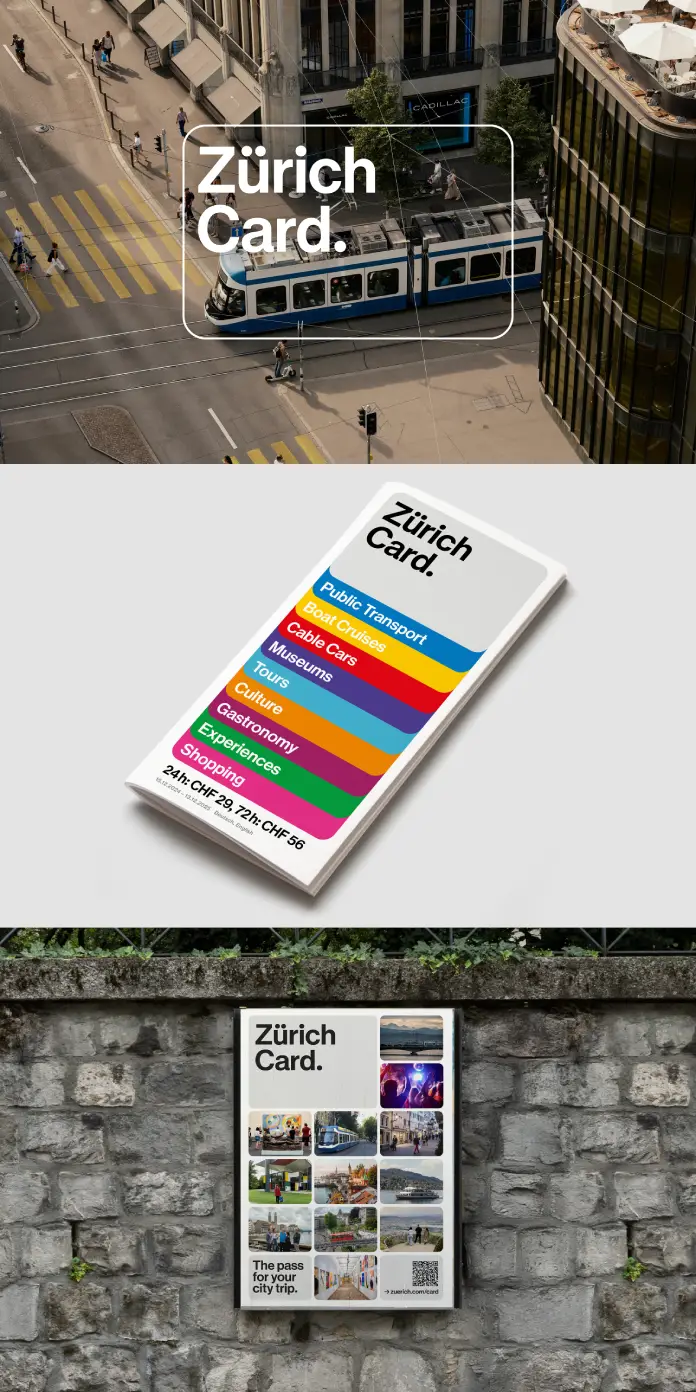
The design’s core element is a stylized card shape. This shape is incredibly versatile. It frames images effectively. It highlights specific content. It can also form a dynamic grid. This grid fills with various motifs and text elements. Marcus Kraft, Creative Director, emphasized their goal. They wanted to communicate the card’s value inspirationally. They also sought to showcase Zurich’s diversity. The design uses a concise visual language.
The “How”: A Seamless Rollout Across Channels
Implementing a rebranding project is complex. It requires meticulous planning. Studio Marcus Kraft managed this with expertise. The Zürich Card rebranding rolled out across many channels. This happened before the summer holidays. We saw it on posters and tram advertising. Digital screens also displayed the new look. The website and social media channels were updated. Video clips and web banners adopted the new style. Even the Zurich City Guide app reflects the change.

This comprehensive implementation ensures consistency. It creates a recognizable appearance everywhere. A unified brand experience is crucial for consumer trust. It helps users easily identify the Zürich Card. This consistency strengthens the brand’s presence. It simplifies communication for Zurich Tourism.
My Take: Flexible Design
I find this Zürich Card rebranding particularly insightful. It showcases a modern approach to brand identity. Studio Marcus Kraft didn’t just create a logo. They developed a flexible system. This system adapts to different messages and platforms. The stylized card shape is brilliant. It’s simple, yet highly functional. This element ties everything together visually. It becomes an instantly recognizable symbol.
The integration of emotional imagery is also key. It moves beyond purely functional communication. It invites potential users to imagine their experiences. This emotional connection is powerful. It makes the card more appealing. It transforms it from a utility into an experience. The design speaks directly to desires for exploration. It resonates with a sense of adventure. This project truly exemplifies thoughtful design. It meets both practical and emotional needs.
Looking Ahead: The Impact on Tourism and Engagement
The new look positions the Zürich Card for greater success. It makes it an even more attractive companion. Tourists and locals alike will benefit. They will find discovering Zurich more engaging. This rebranding enhances the card’s appeal. It also reflects Zurich’s dynamic evolution. The city is always expanding its cultural offerings. The card’s new identity mirrors this growth.
This project offers a blueprint for other tourism initiatives. It shows the power of strategic design. A well-executed rebranding can revitalize a product. It can attract new audiences. It can also deepen engagement with existing ones. The Zürich Card rebranding by Studio Marcus Kraft is a testament to this. It highlights design as a critical business asset. It fosters both information and inspiration.
All images © Studio Marcus Kraft. Feel free to find other interesting graphic design and branding projects here at WE AND THE COLOR.
Subscribe to our newsletter!


